• We have updated our Community Code of Conduct. Please read through the new rules for the forum that are an integral part of Paradox Interactive’s User Agreement.
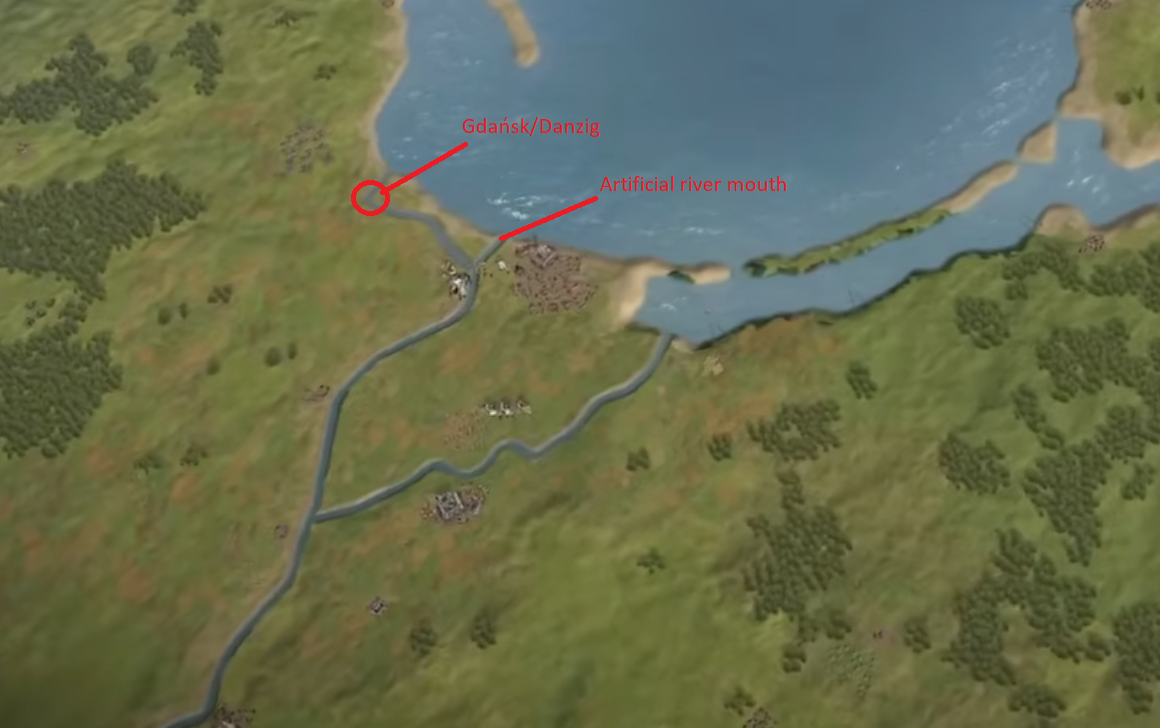
The Vistula river mouth looks a bit inaccurate for the time period. The current one was artificially dug in 1891-1895.
I also don't see Gdańsk/Danzig on the terrain map, strange considering other cities, but maybe it was misplaced.

Screenshot 2025-07-17 223110.png
 
  • 10Like
  • 4
Reactions:
I think it's mainly a texture problem. It looks the same because it has the same texture as the surrounding lowlands.
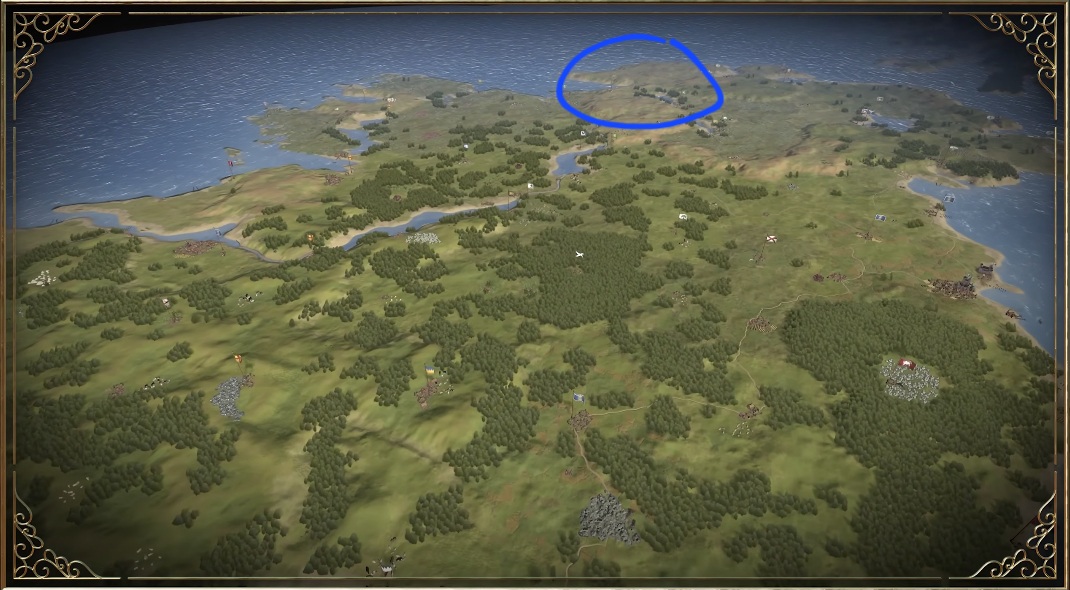
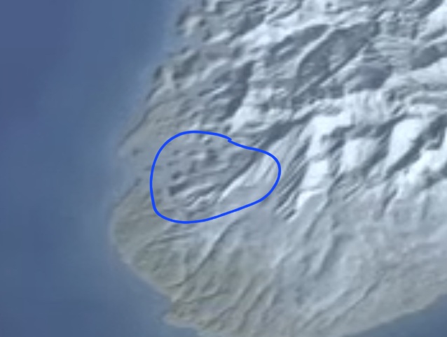
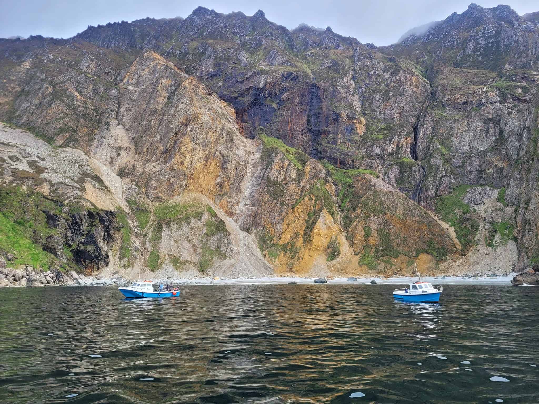
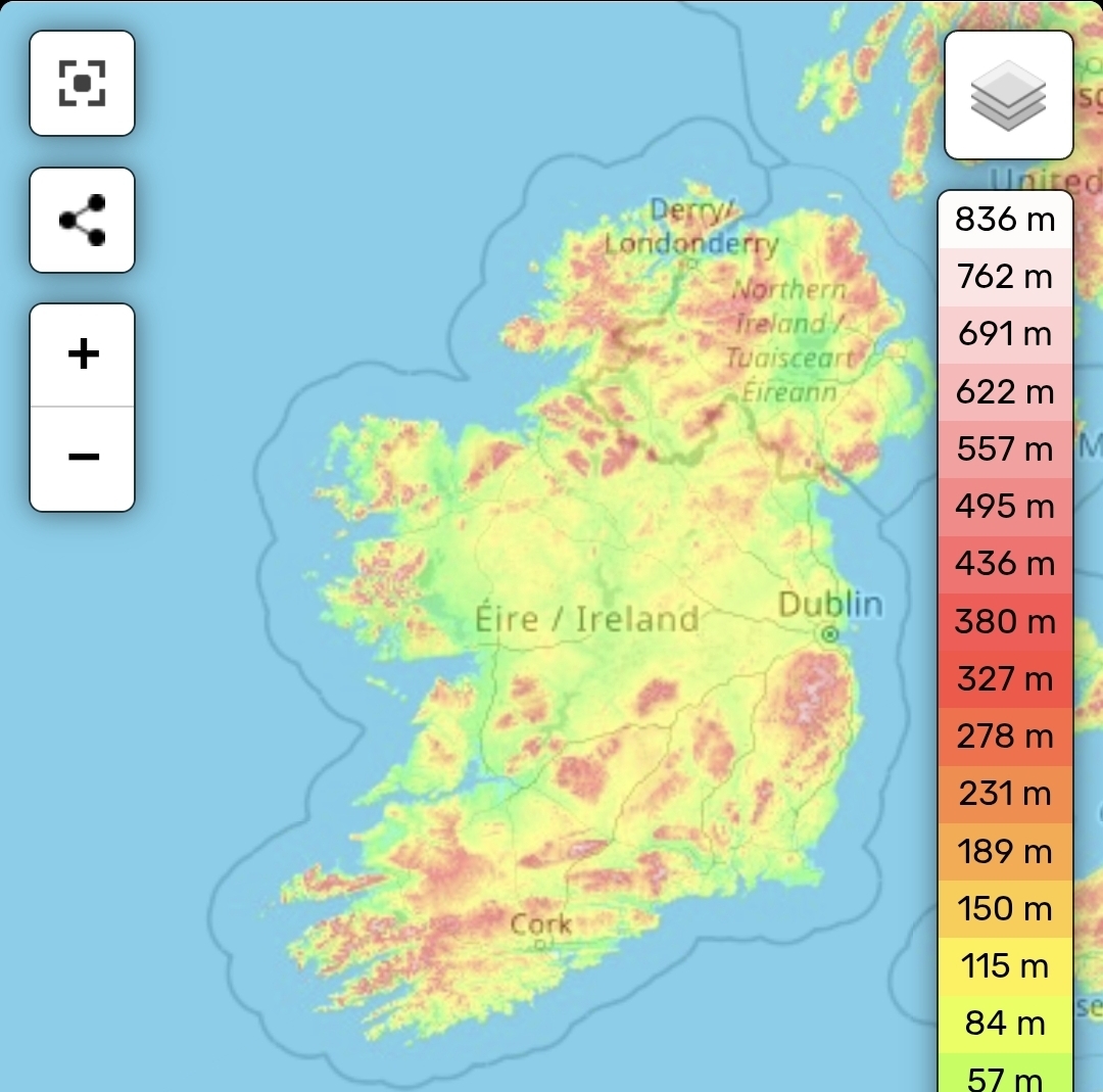
Its just looks displayed wrong as an example the largest cliff face in Europe is Sliabh Liag shown in the blue circle, its actually on the west side that basically looks entirely flat against the sea

1000026747.jpg


And here in Norway of similar height

1000026746.jpg


Here is them in real life. My point is not that they have to be the largest mountains in the game, just more accurate than displayed on the map.

1000026748.jpg
 
  • 6Like
Reactions:
Impressive, looks great. I like that you see volcanoes erupt, and also the seasons transitioning. I also like that you can see Etna easily. For Iceland i'm not exactly sure but shouldn't Vatnajokull stand out a bit more (largest glacier in Iceland), especially if it would be summer in Iceland?
 
  • 1Like
Reactions:
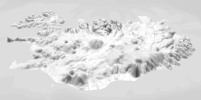
The Scandinavian mountains in the Nordics and Iceland simply just don't look like the Scandes. These look more like the rockies. The mountains in Scandinaviawere sanded down by Ice Age glaciers, so they typically aren't as jagged as some more southernly ranges. The Icelandic mountains are especially bad here. They don't resemble the real deal even the slightest. You couldn't point to the Jökulls even if you knew where they were.

The heightmap is not 16k x 8k, its 32k x 16k. This is needed to get the resolution up.

If you have a 32x16k heightmap, then it'd be awesome to see it shine through some more. At the moment I feel it is wasted due to the overreliance on the stylisation.
I'm not saying it has to replace the stylised textures, but I think a 50/50 blend between the two would I think be a lot better: styles that emphasize the IRL DEM features for visual clarity.
Considering how Iceland's looking atm, I think Greenland's wasteland, among others, will look comically strange.

iceland-png.1335369
1752791225522.png
 

Attachments

  • Iceland.png
    Iceland.png
    1,1 MB · Views: 0
  • 1752791225522.png
    1752791225522.png
    332,6 KB · Views: 0
  • 9Like
  • 5
  • 1
Reactions:
1752800115187.png

I believe there is to much trees on the snow white mountain peaks. I would appreciate if it would be reduced...
Other than that, I'm satisfied and any other objections were already mentioned
 
  • 9Like
  • 2
Reactions:
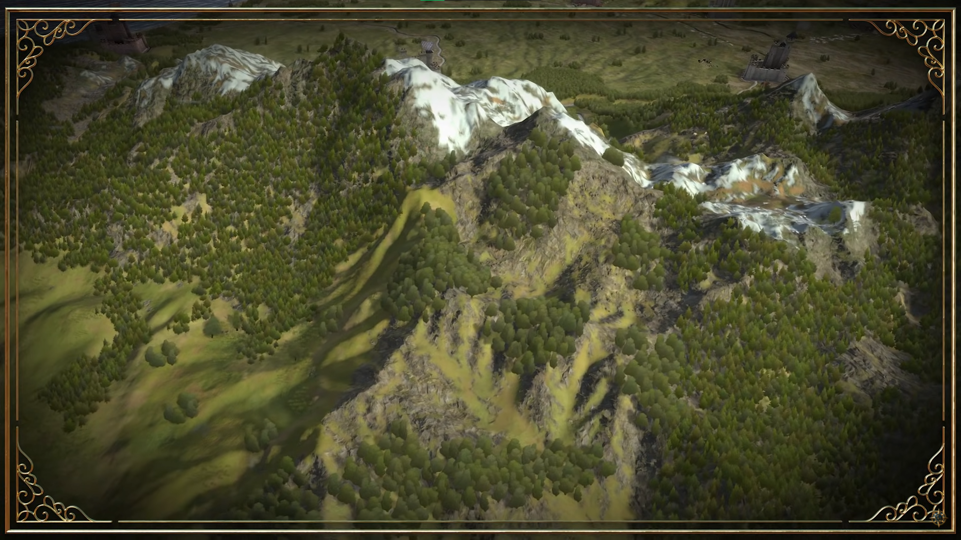
On a mountain tall enough to have snow and ice on it in summer, the tree line will be well below the elevation were you would find large patches of frozen water. Between the upper elevation limit of trees and the permanent snow cap, there will be first a band of elevation with grass and shrubs in summer then above that there will be land that is almost completely devoid of vegetation.
 
  • 2
Reactions:
1. The coastlines are too dramatic in the way that they all look like big cliffs with way too much sand
2. Everything is the same exact bland green, no matter if there's forests or grasslands or tundra etc. It's all the same color, and it's very boring.
3. The heightmaps look great and detailed (im not one to talk about accuracy), but even the mountains are the same green color. Let us see some mountain color, gray stone and white tops
4. You tried to give some texture etc by adding grass sprites, but they are basic (the same color) and make it look lower quality
5. The buildings are just cheesy and give me mobile game vibes, its quite terrible.

In general, it looks like they went way too heavy into the map size vs object size scale, where the things on the map are way too big and detracts from the scale of the world, which makes it look too mobile game-y.
 
  • 11Like
  • 7
  • 2
Reactions:
Actually you can sometimes get this where water from different oceans has differnet compositions and densities and so doesnt mix. You see this at the confluence of the Atlantic and Pacific, where its literally a line in the water with ocean water of one color on one side, and another color on another side. You can also see this effect when two major tributaries join into a single stream. The water from either tributary remains separate with distinct colors, until they get far enough downstream that enough mixing has occurred.

So like, the Med being a different color than the Atlantic isnt that wild a thing.

Here is a good example:


I got this recommended immediately after.
 
  • 1Like
Reactions:
Testers want to see where forts are when you zoom out.. its kind of vital :)
I think the way you should represent forts is with icons on map modes rather than have them cartoonishly sized. It just really doesn’t help with the realism, this way people can look at the terrain map when they want to and have it look nice, and whenever they are fighting a war they can still have all the relevant information.

I know you have the black dots or similar (can’t quite remember exactly), isn’t that enough? And who is fighting a war fully zoomed out anyway?
 
  • 11Like
  • 7
  • 1
Reactions:
I think the graphics need to change a bit... the biome shift from one location to another is very noticeable. At the same time, soldiers, trees, and cities look like "things on top of the map." They don't appear to be part of the map, and this is terrible.
 
  • 7Like
Reactions:
I didn't like the map, the coastlines and rivers looked very smooth and the rivers are also very thiny (i think they should be wider).

View attachment 1335449

Also i think you can add a erosion effect, maybe if it takes a lot of resources make it an option for the game settings. I mean something like this:

(image generated with wilbur)
View attachment 1335450
View attachment 1335451

I exaggerated the erosion to make it more visible, but if added i think it should be a lot less.
 
  • 2Like
  • 1
Reactions:
I actually loved the map, but I didn't play imperator which à lot of people seem to mention as being the gold standard for height map. I suppose most criticism I'd come to agree with after staring at the map for a lot of time but it didn't "scream" at me on a first video sight.

The one thing that I noticed however was that the trees looked "flat". I have the impression I'm looking at wooden cardboard trees rather than actual "fleshed out" trees. No idea how to give them more flesh but better to mention the feedback imo.
 
  • 6Like
  • 1
Reactions:
I did not think this looked good, reminds me very much of CK3 for some reason. This is the first thing that actually gave me any worry about this game - I see some comments echo this. Just look bland and not inspiring. Hopefully it's compression or something!!
 
  • 12Like
  • 3
Reactions:
I feel like the current map is way too Civilization with how it handles terrain. Like, that's a cool Iceland and all but that is not Iceland. That is not what Iceland looks like. It looks like what Civilization 5 or 6 would generate as Iceland.
 
  • 16
  • 4Like
Reactions: