• We have updated our Community Code of Conduct. Please read through the new rules for the forum that are an integral part of Paradox Interactive’s User Agreement.

Kotyk-durkotyk

Colonel
23 Badges
May 26, 2024
845
9.406
  • Europa Universalis IV: Rights of Man
  • Europa Universalis 4: Emperor
  • Crusader Kings III: Royal Edition
  • Crusader Kings III
  • Imperator: Rome - Magna Graecia
  • Imperator: Rome
  • Europa Universalis IV: Golden Century
  • Europa Universalis IV: Dharma
  • Europa Universalis IV: Rule Britannia
  • Europa Universalis IV: Cradle of Civilization
  • Europa Universalis IV: Third Rome
  • Europa Universalis IV: Mandate of Heaven
  • Europa Universalis IV
  • Europa Universalis IV: Mare Nostrum
  • Europa Universalis IV: Cossacks
  • Europa Universalis IV: Common Sense
  • Europa Universalis IV: Pre-order
  • Europa Universalis IV: El Dorado
  • Europa Universalis IV: Res Publica
  • Europa Universalis IV: Call to arms event
  • Europa Universalis IV: Wealth of Nations
  • Europa Universalis IV: Conquest of Paradise
  • Europa Universalis IV: Art of War
Disclaimer: I understand the UI is still a WiP, but I hope this feedback might be useful.

Hi there! I’ve been following the official EUV videos with great interest, and I just want to highlight how much I enjoy the text styles used in them.
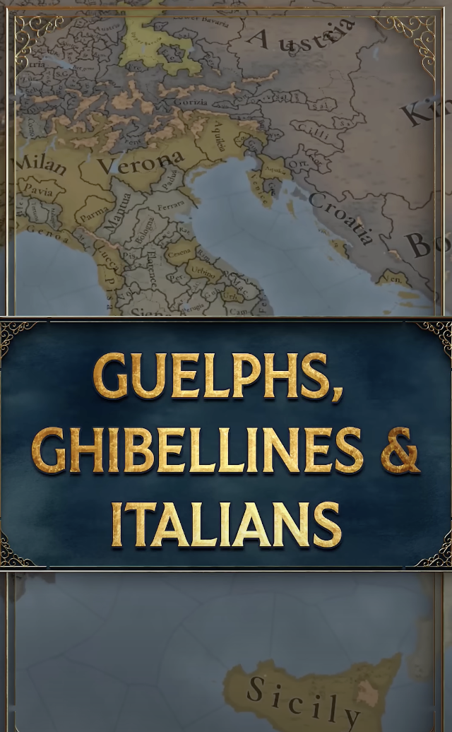
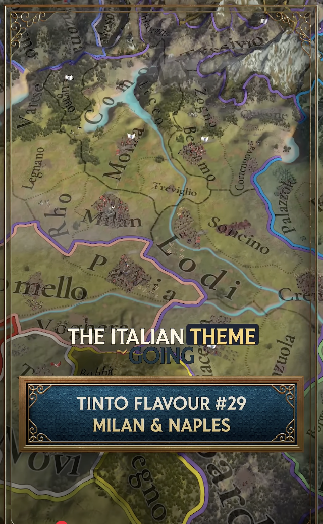
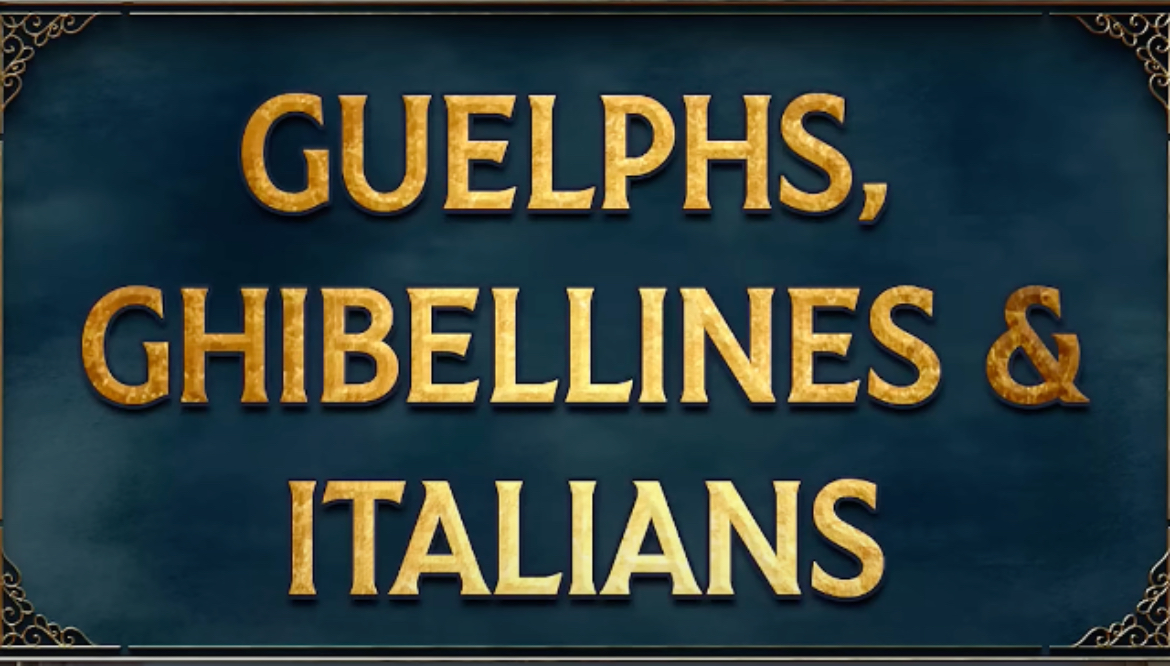
In short — that’s exactly the kind of style I’d love to see in-game. The vibrant colours, stronger saturation, textured backgrounds, and high contrast make the text far more readable and visually appealing.


Text Style 1
Text Style 2
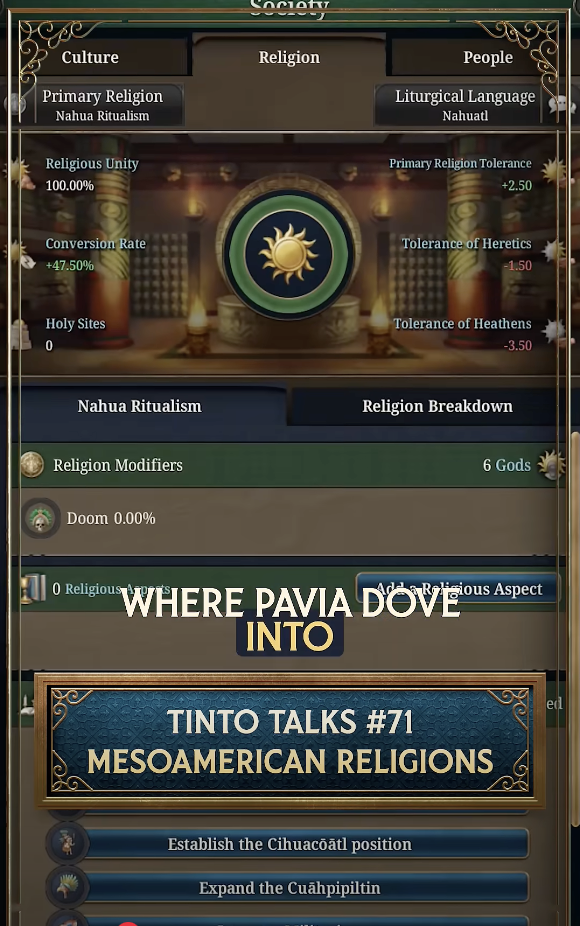
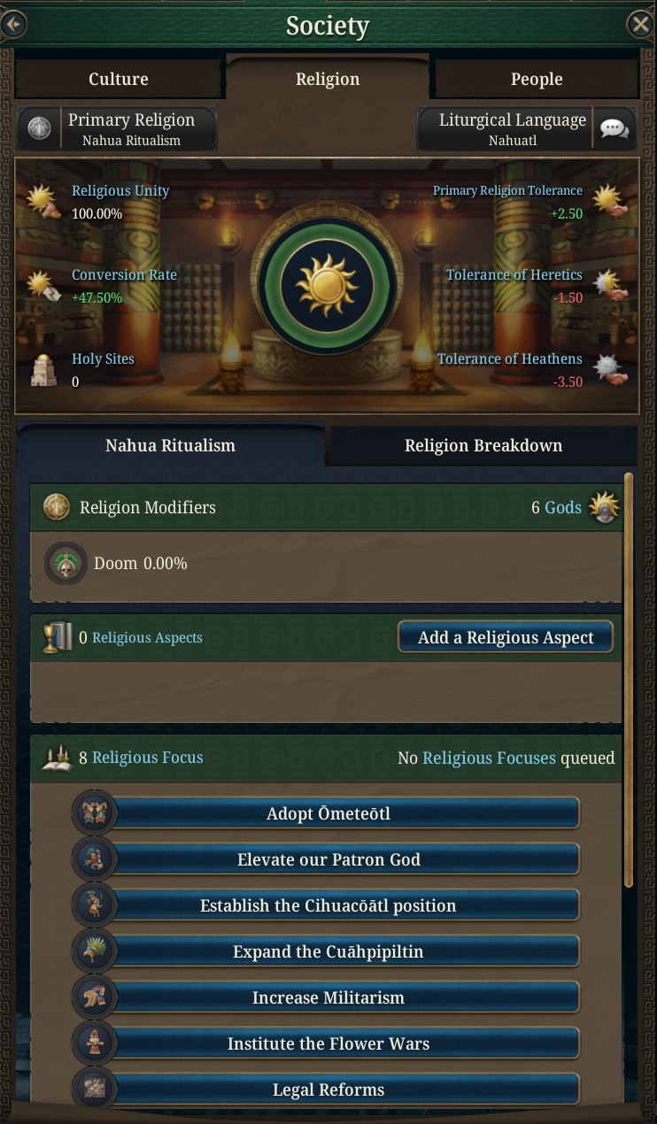
Text Style 2 vs. In-Game Text
Знімок екрана 2025-07-17 о 17.55.02.png
Знімок екрана 2025-07-17 о 17.55.42.png
Знімок екрана 2025-07-17 о 17.57.50.png

Screenshot 3 illustrates the difference quite clearly, in my opinion.
  • Part of it might be the current UI font — it reminds me of something I used in university reports or PhD thesis years ago, which gives it a rather academic feel.
  • It might also help if the buttons had background textures similar to what’s shown in Screenshots 1 or 2.
I think it could make a big difference in giving the UI that extra layer of style and immersion.
Thanks!
 
  • 20Like
  • 9
  • 5
  • 1
Reactions:
if we're talking about these tinto talks yt videos i'd like to see actual moving game footage instead of screenshots

It was not about the content, I only meant that those text boxes in the videos
IMG_1221.jpeg
IMG_1222.jpeg

look much more appealing than the text in the game:

IMG_1220.jpeg
 
  • 5Like
  • 2
  • 1
Reactions:
Disclaimer: I understand the UI is still a WiP, but I hope this feedback might be useful.

Hi there! I’ve been following the official EUV videos with great interest, and I just want to highlight how much I enjoy the text styles used in them.
In short — that’s exactly the kind of style I’d love to see in-game. The vibrant colours, stronger saturation, textured backgrounds, and high contrast make the text far more readable and visually appealing.


Text Style 1
Text Style 2
Text Style 2 vs. In-Game Text

Screenshot 3 illustrates the difference quite clearly, in my opinion.
  • Part of it might be the current UI font — it reminds me of something I used in university reports or PhD thesis years ago, which gives it a rather academic feel.
  • It might also help if the buttons had background textures similar to what’s shown in Screenshots 1 or 2.
I think it could make a big difference in giving the UI that extra layer of style and immersion.
Thanks!
I AGREE IT IS A VERY PRETTY CAPS FONT, BUT I THINK READING ALL CAPS IN UI WILL BECOME VERY TIRING AFTER A WHILE. IT IS PRETTY ANNOYING TO IDENTIFY INDIVIDUAL SENTENCES REGARDLESS OF PUNCTUATION, TOO.
 
  • 20Haha
  • 3Like
  • 1
Reactions:
Honestly for me the font looks AI generated. No ill will I bear, but it kinda looks off for me so I am surprised that others like this font. For me the current in-game font is way superior in every regard.

Edit: I actually retract my erroneous statement above, the font is indeed quite pretty the more I look into it, but I still highly prefer the standard serif font they currently use in-game.
 
Last edited:
  • 8
  • 3Like
  • 1Haha
Reactions:
I AGREE IT IS A VERY PRETTY CAPS FONT, BUT I THINK READING ALL CAPS IN UI WILL BECOME VERY TIRING AFTER A WHILE. IT IS PRETTY ANNOYING TO IDENTIFY INDIVIDUAL SENTENCES REGARDLESS OF PUNCTUATION, TOO.
Well, that's a valid point :D
But of course I didn't mean all caps. The emphasis was on textures, brightness, contrast, saturation and that kind of thing.
 
  • 7Like
  • 1
Reactions:
Honestly for me the font looks AI generated. No ill will I bear, but it kinda looks off for me so I am surprised that others like this font. For me the current in-game font is way superior in every regard.

To me the the in-game's font looks so soulless and dull that I'd rather call that one AI-like than what is suggested here (not that any of it looks AI-generated, I have seen AI-generated fonts and this ain't it Jeff, but I guess even people putting effort into something is now called AI-generated while just making an edit of existing fonts is high art). On some parts of the interface it doesn't even fit in well with the image behind, making it hard to read and looks like someone just opened the image in MS Paint and used it's textbox control to write the text (though considering the game isn't done yet, everything looking like it was stitched on isn't surprising).
 
  • 3
  • 2
  • 1Like
Reactions:
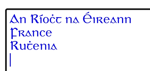
As a side note I hope with flavour DLCs you could maybe see stylised fonts i.e. Gaelchló if they do Gaelic flavour

View attachment 1335270
Please, don't do that.

You'll risk people not knowing those fonts not being able to read it.
And you also risk people whom do know the font/different annotations to also not be capabele to read it because they would know it actually means something different.
 
  • 1Like
Reactions:
Please, don't do that.

You'll risk people not knowing those fonts not being able to read it.
And you also risk people whom do know the font/different annotations to also not be capabele to read it because they would know it actually means something different.
More akin to vic3 as a feature to turn on for aesthetics like the outside of the map items or how you want the map to look only not EVERYTHING IN THE GAME MUST LOOK LIKE THIS FOR EVERYONE AND GOOD LUCK CHANGING IT.
 
  • 2Like
Reactions:
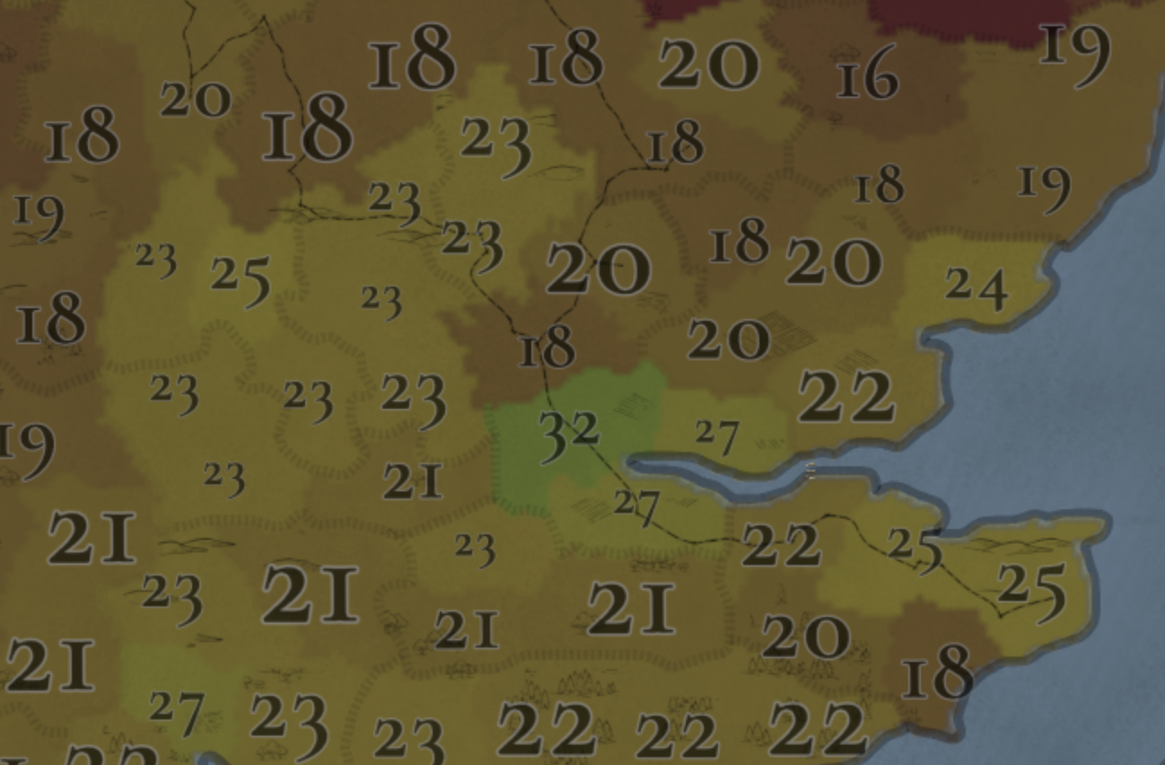
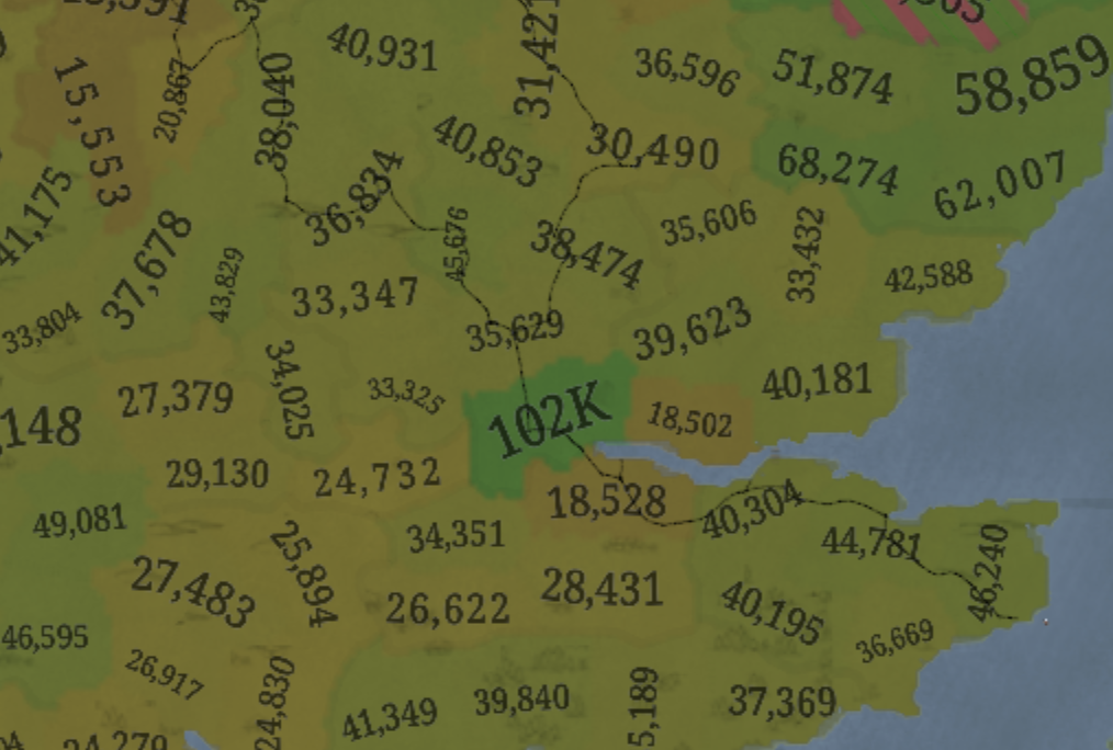
I agree with style and fonts too. Vic3 and CK3 both have fonts that feel unique only for this games. Here it is not like this so far, looks a bit generic. I hope maybe it is still placeholder.
What is unique and interesting 1500s font in the game are numbers on some maps like here:
1752841227717.png

but not everywhere:
1752841537234.png


As example for the game about similar period I would maybe use this font
1752842916283.png
 
  • 5Like
  • 2Love
  • 1
Reactions:
The font was definitely not generated by AI, but it does indeed only have uppercase characters and if I'm not mistaken only in the Latin alphabet. For use in the UI, I believe slight adjustments would be necessary, such as condensing the O and indenting the closing P slightly upwards.
 
  • 1Like
Reactions:
To me the the in-game's font looks so soulless and dull that I'd rather call that one AI-like than what is suggested here (not that any of it looks AI-generated, I have seen AI-generated fonts and this ain't it Jeff, but I guess even people putting effort into something is now called AI-generated while just making an edit of existing fonts is high art). On some parts of the interface it doesn't even fit in well with the image behind, making it hard to read and looks like someone just opened the image in MS Paint and used it's textbox control to write the text (though considering the game isn't done yet, everything looking like it was stitched on isn't surprising).
Then what kind of font makes it soulful and un-dull? The current font is a standard serif font, not particularly pleasing but well established in the eyes, unlike the capital font they use on the videos which is kind-of bordering between serif and sans-serif that gave me the ick (though my remark that it was "AI generated" was ungrounded at best), but a clear and concise font that gets the meaning across as many other PDX games before and during uses as well. You wouldn't call the classic sans-serif Stellaris font would be "dull" and the serif EU4 font as "soulless" (though they are harder to read). Moreover, we haven't even seen the lower letters for the video font, so I cannot say whether that particular video font is fitting for the game, or the current in-game standard font will do, which for me it does - easier readability, support for diacritics and other extensive characters, and so on.

Also, the font clashing with the image behind does not matter with the choice of the font, a simple drop shadow will easily fix the issue.
I mean I think “soulless” is maybe not the best word here, but the current font looks like a font I’d write a serious document in in Word, which definitely qualifies it as “dull.” It has neither immersive value nor any design flair. Personally I love the little mini-serifs, it makes it stand out and IMO looks nice.

I like that Paradox tends to use different fonts that very loosely match the game world - Stellaris with clean and minimalist sans-serif to match the space sci-fi futurism; CK3 with a slightly fancy slightly loopy slightly wonky font that sort of recreates the vibes of Carolingian minuscule. And while I can’t say whether the current font is historically accurate for the game era or not, I can personally say that the vibes I get from it are less “renaissance/early modern video game” and more “2010 school paper,” or at best “staid Victorian era document,” which itself would fit better with a Victoria than an EU. It’s not performing the same task as their fonts in other games of reinforcing the vibes of the game.

Even if they don’t use something fully custom like the trailer font, I’d love to see a font that either gives more loosely-era-appropriate immersion or has just a little more flair or uniqueness to it.
 
  • 2
Reactions:
if we're talking about these tinto talks yt videos i'd like to see actual moving game footage instead of screenshots
let me look at my NDA to see if I can share...

nope sorry I cannot, as the forum doesn't allow video uploads just screenshots

cory.png
 
  • 2Haha
Reactions:
I can personally say that the vibes I get from it are less “renaissance/early modern video game” and more “2010 school paper,” or at best “staid Victorian era document,” which itself would fit better with a Victoria than an EU
I mean, serif font like the current one is used extensively during the Renaissance era tho, but I can see where you're coming from. For me, the neat and orderly look of the current font is much better, but it is nothing more than my own preference, and I can adapt if the devs decide to change it or sth.
Even if they don’t use something fully custom like the trailer font, I’d love to see a font that either gives more loosely-era-appropriate immersion or has just a little more flair or uniqueness to it.
Designing unique font might be quite costly, especially considering the diacritics, weird letters, Cyrillic characters, Chinese characters, and so on and so forth, so I am not sure if I share the same optimism. I personally think the game nailed the font, and need to put their attention somewhere else, like terrain or GUI.
 
I mean, serif font like the current one is used extensively during the Renaissance era tho, but I can see where you're coming from.
I mean, I'm not opposed to a serif font. I'm not sure anyone in this thread has been, and in any case the trailer font that started this thread is serif.
Designing unique font might be quite costly, especially considering the diacritics, weird letters, Cyrillic characters, Chinese characters, and so on and so forth, so I am not sure if I share the same optimism. I personally think the game nailed the font, and need to put their attention somewhere else, like terrain or GUI.
It might be costly, but they commissioned a custom (or customized, at least) font for both CK3 and Victoria 3 (admittedly neither were used as the basic font for normal-size interface text). And while they need to support Latin diacritics and extra letters, they don't necessarily need to support other scripts, as the scripting allows them to define different font files for different languages under the same "meta-font" and both CK3 and Vic 3 do this.

For example this an abbreviated definition of the standard font in CK3, which in English is the unique, quirky, and medievalish (to me, at least) Gitan Latin, which has broad support for Latin but seemingly no support for other scripts. You can see that for other scripts they simply load a different font under the in-game meta-font "Gitan-Regular," which means they pick game fonts without having to limit themselves to the relatively small number of fonts that fully support like 5 major scripts:
Code:
### Gitan
fontfiles = {
    name = "Gitan-Regular"
    always_load = yes

    group = {
        languages = { "l_english" "l_french" "l_german" "l_spanish" "l_polish"}
        files = { "fonts/Gitan/GitanLatin-Regular.otf" "fonts/Open_Sans/OpenSans-SemiBold.ttf" "fonts/Noto_Sans_SC/NotoSansSC-Medium.otf" "fonts/Korean_fontset/IropkeBatangM.ttf" }
    }

    group = {
        languages = { "l_russian" }
        files = { "fonts/Open_Sans/OpenSans-SemiBold.ttf" "fonts/Noto_Sans_SC/NotoSansSC-Medium.otf" "fonts/Korean_fontset/IropkeBatangM.ttf" }
    }

    group = {
        languages = { "l_simp_chinese" }
        files = { "fonts/Noto_Sans_SC/NotoSansSC-Medium.otf" "fonts/Open_Sans/OpenSans-SemiBold.ttf" "fonts/Korean_fontset/IropkeBatangM.ttf" }
    }

    group = {
        languages = { "l_korean" }
        files = { "fonts/Korean_fontset/IropkeBatangM.ttf" "fonts/Open_Sans/OpenSans-SemiBold.ttf" "fonts/Noto_Sans_SC/NotoSansSC-Medium.otf" }
    }
}

Regardless though, I don't really care if it's custom or not. There are plenty of existing fonts to pick from, as proved by their other games. I just think the current pick is both pretty bland and doesn't make me think of the EU era. The video font accomplishes at least one of those things, but other fonts would too.

I also think the font is perfectly fine, I'm not gonna dislike the game because of it or anything and it certainly doesn't need to be a priority. But since there's a thread on it already I may as well add my two cents.
 
Last edited:
  • 2Like
Reactions: