

So it looks like we finally have screenshots from the 3D map and I think the map is pretty good overall!
I'm far less enthusiastic about the UX, but I'm curious to know what others think.
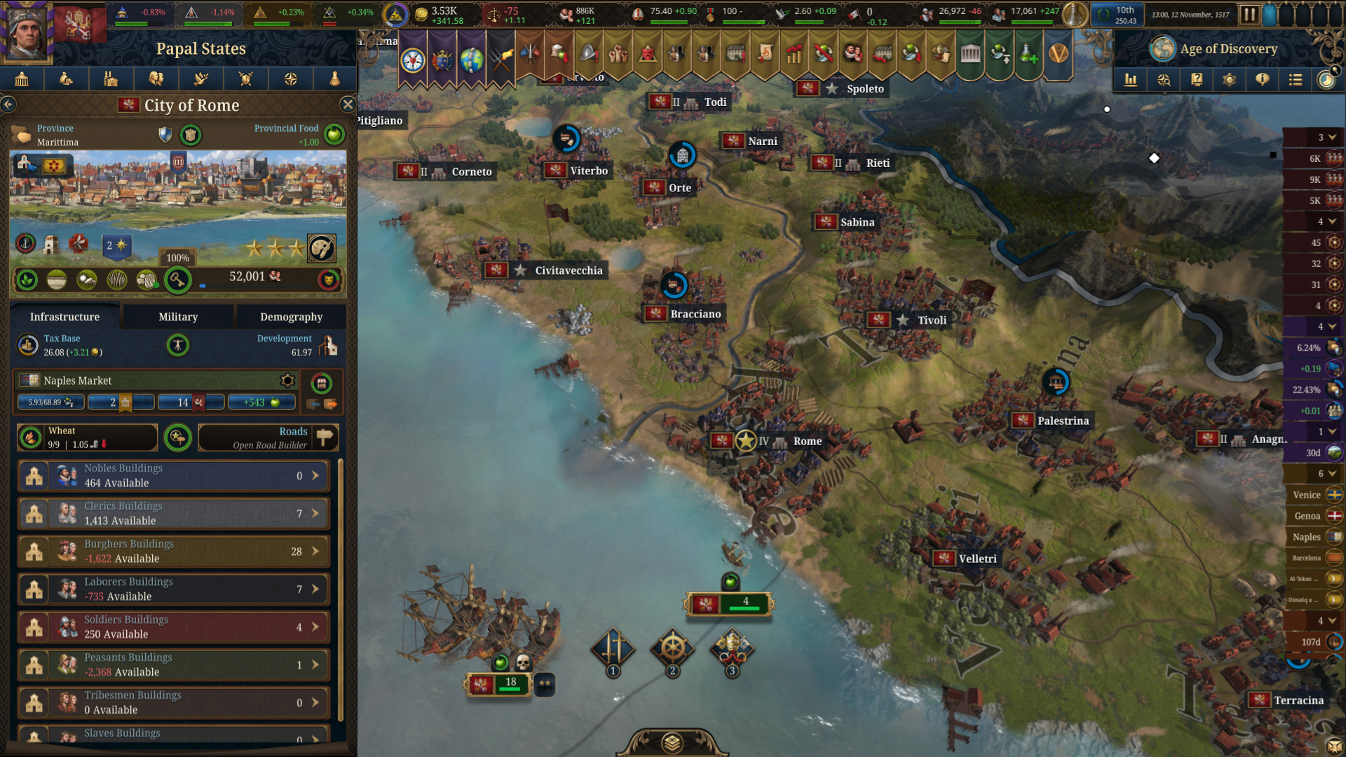
First thing that stands out to me here is the notification banners on the top of the screen. They seem intrusively large to me, but a welcome returning feature.
I'm hoping for a fair amount of UI customization here, as it seems like it might be cluttered. I'm particularly interested in how the top bar changes if more estates are introduced.
The cities here look good, but perhaps a little too large. I suspect this is a side-effect of high development, but slightly smaller models would not hurt in my eyes.
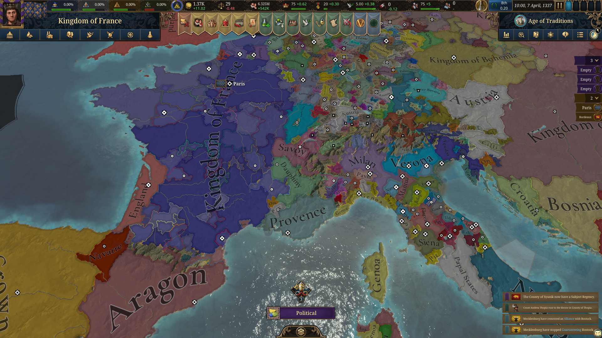
This is a really pretty, well saturated political map. It looks like the capitals of nearby nations are being indicated with diamonds.
The weather effect here is a great touch. I also like the opacity on the political mapmode.
I'm noticing the settlements here curving along the coasts, which is a lovely detail if intentional. Also note the army forming a column along the narrow landmass there. I suspect they're mid-animation moving between locations.
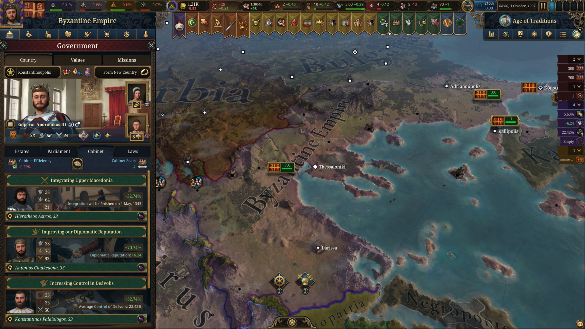
Greece is looking a little more arid than I'd expect around Larissa and the colours a little more washed out.
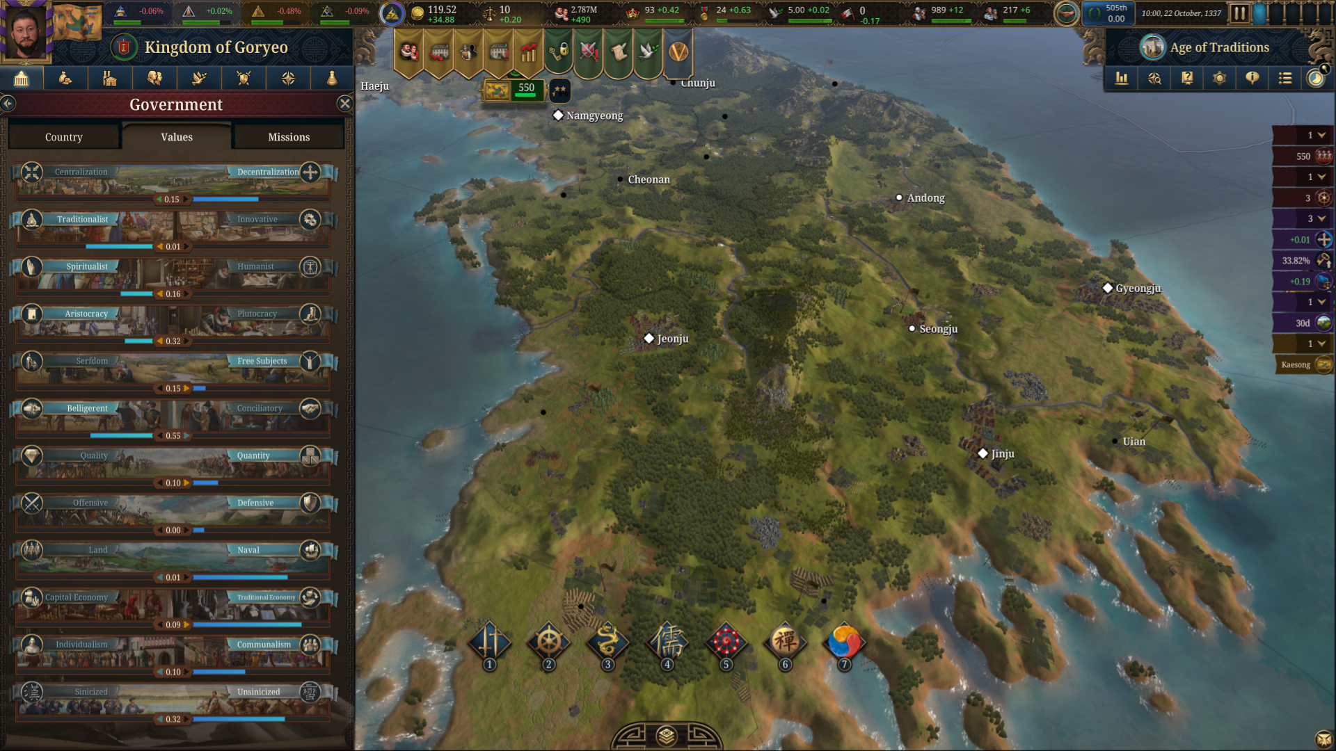
It looks like town/city models have a fair amount of cultural and development diversity, though that might be my eyes tricking me at this resolution.
The values screen looks great, and I'm looking forward to having some missions revealed at some point soon.
Really loving the way dense forests look on the Eastern portion of this image.
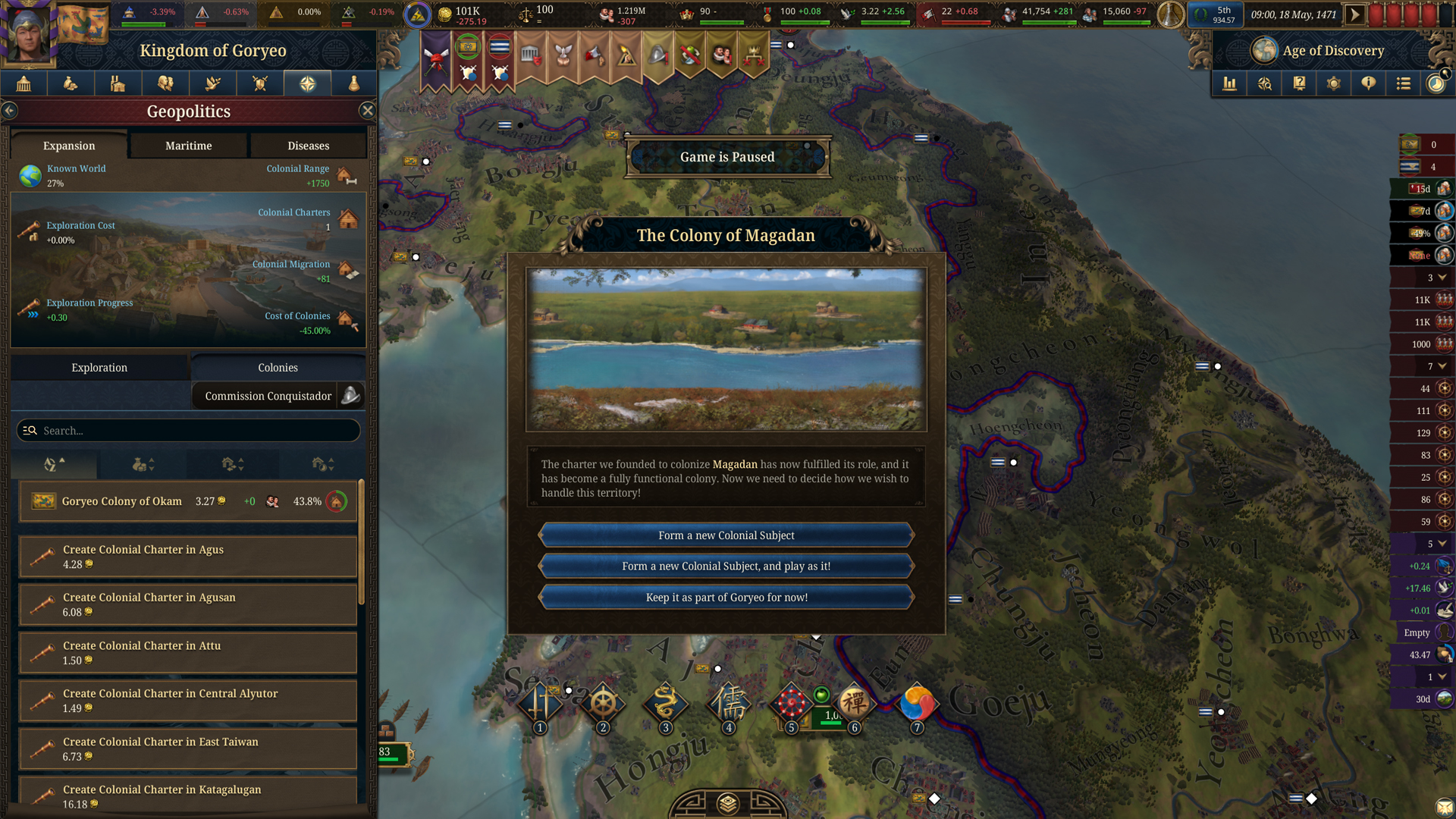
I see the "Commission Conquistador" button here, but was under the assumption that that mechanic was locked to Hispanic monarchies.
Has this changed? If not, I'm not sure that should be there.
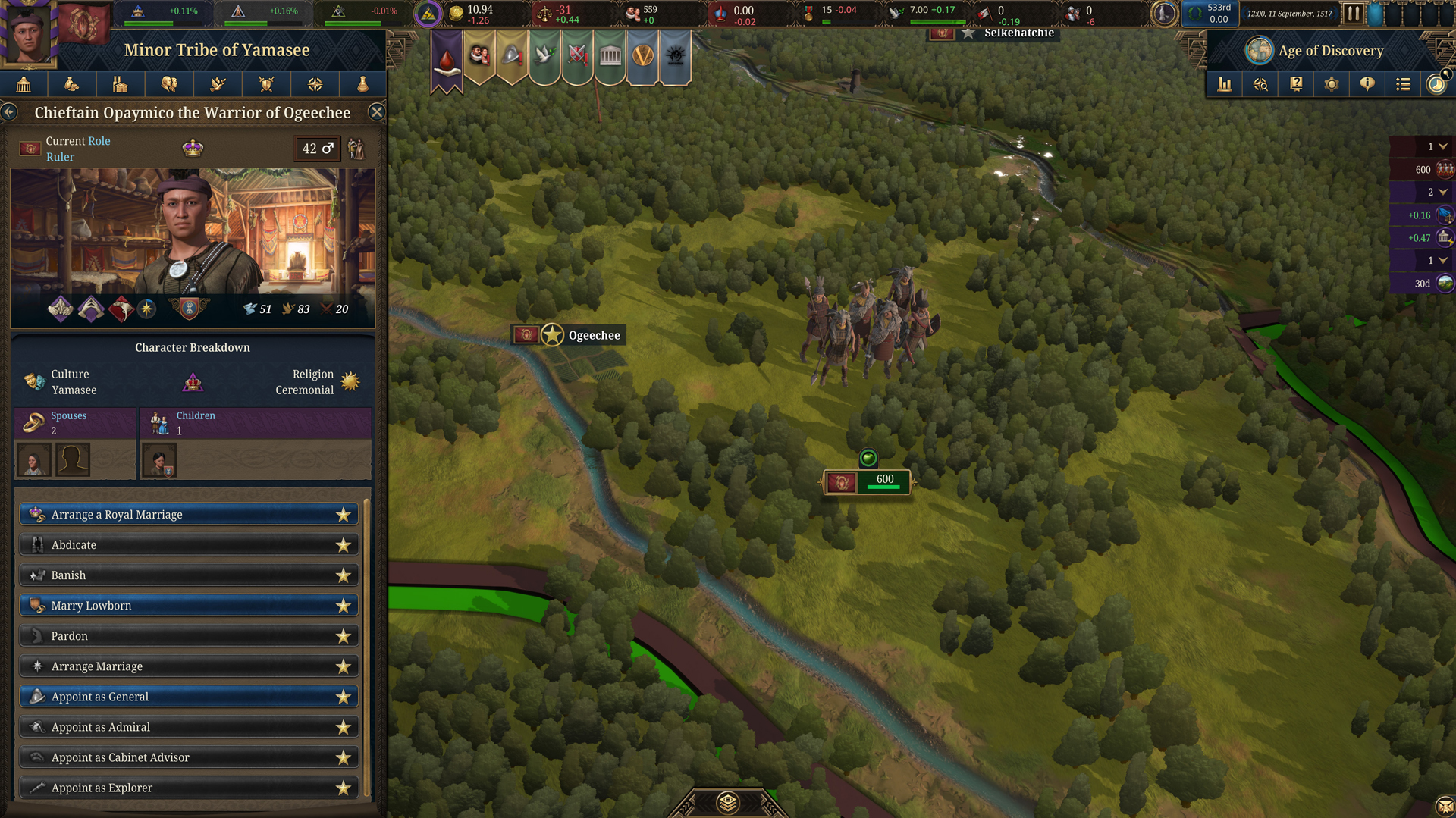
This very close up view looks really good to me, though the upper bank of the river looks a touch too thick. As an aside, I don't believe we'd seen the Yamasee before now, so that's a welcome reveal! I'm looking forward to the North America feedback!
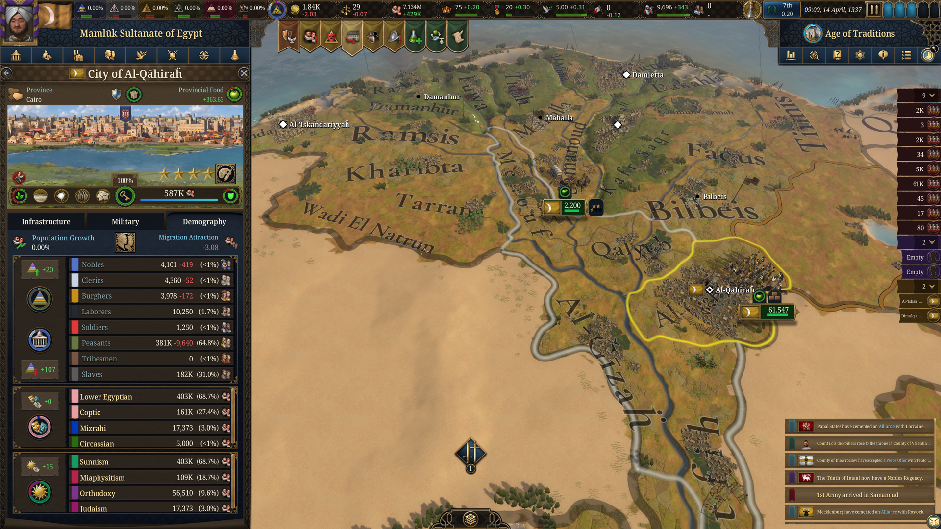
The Nile delta here is a bit of a disappointment. It's drab and could use a lot more greenery.
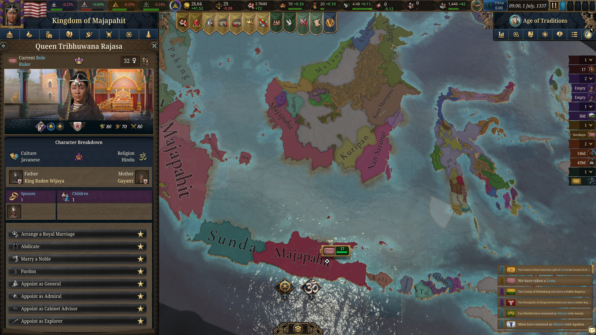
The uninhabited inner land on Borneo looks a pretty ugly to me, and the colours of the political mapmode also seem more washed out than other screenshots we've seen.
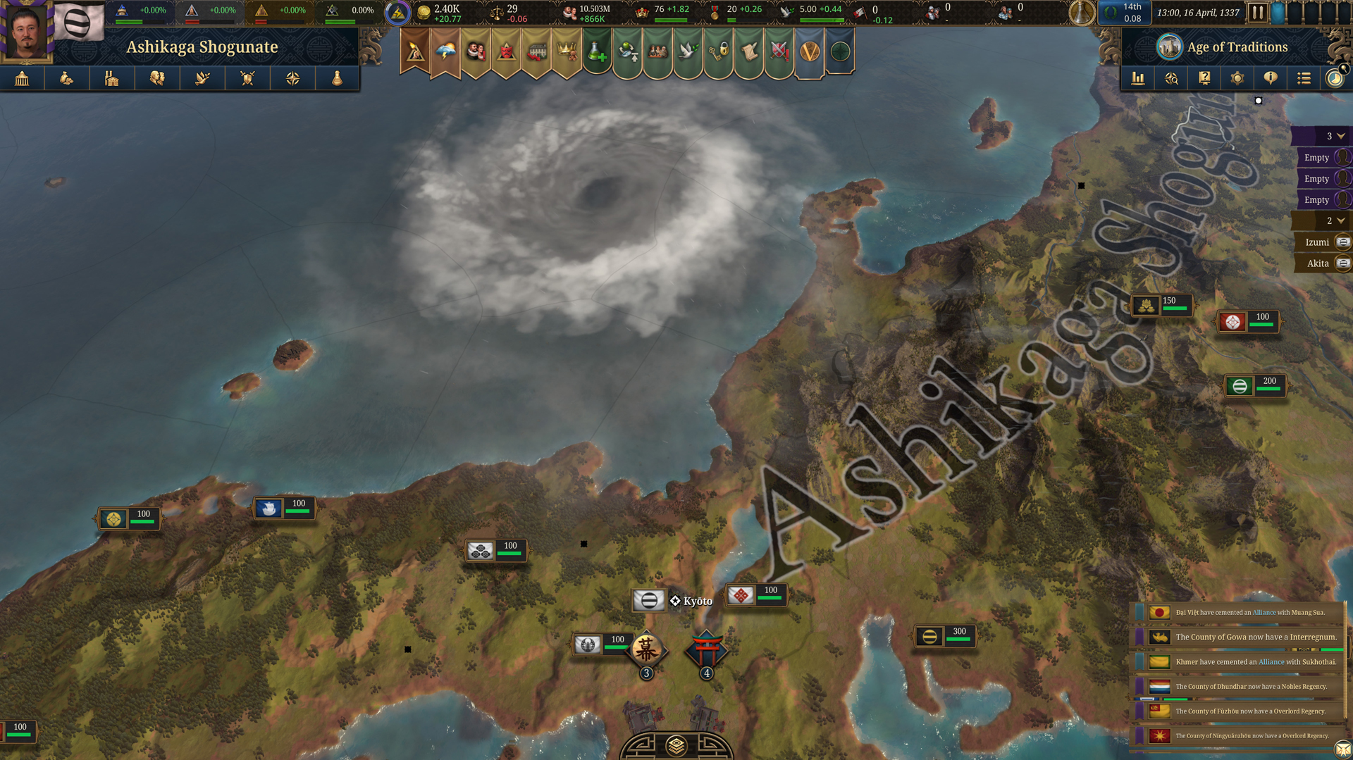
Also what is going on off of the shore of Gows?

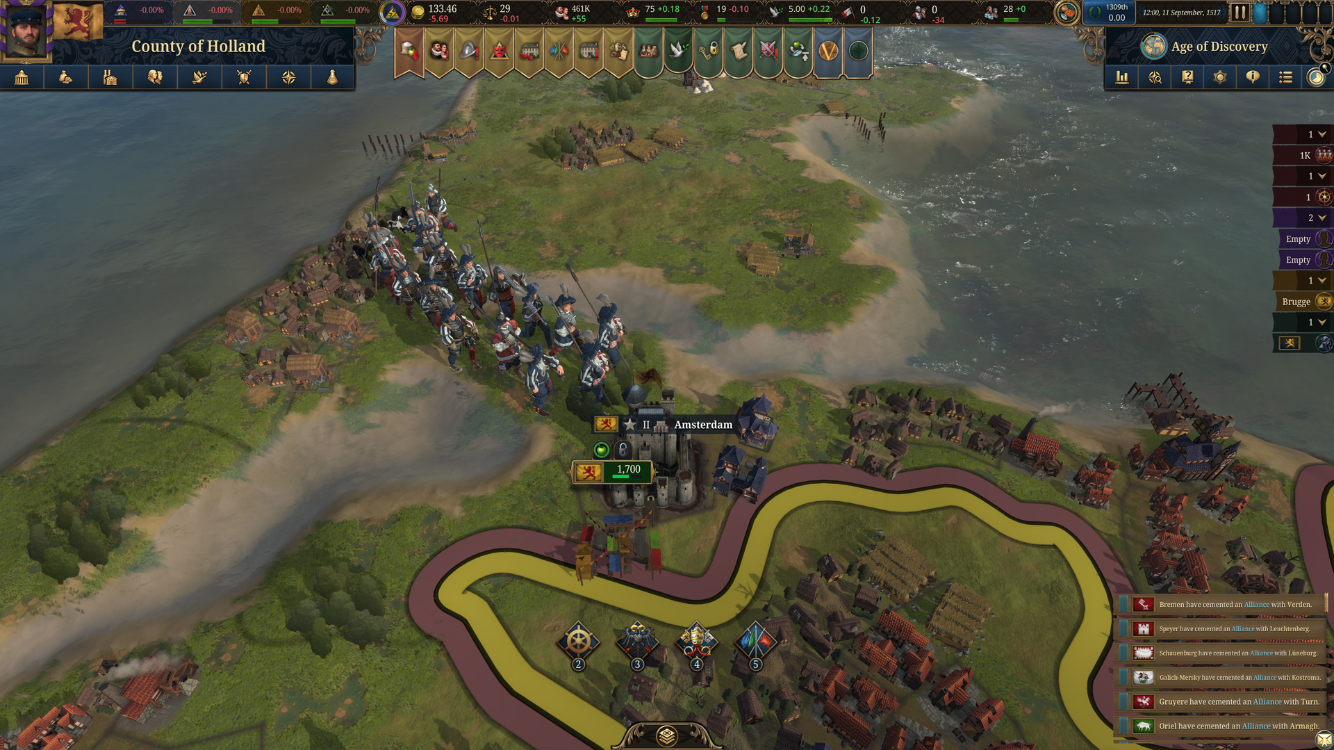
We've seen a few screenshots with these icons in the bottom of the screen. They seem a little large to me and are floating quite intrusively far up. I wonder what they're for? (Edit: They're control groups, and should definitely be somewhere else.)
I'm far less enthusiastic about the UX, but I'm curious to know what others think.
First thing that stands out to me here is the notification banners on the top of the screen. They seem intrusively large to me, but a welcome returning feature.
I'm hoping for a fair amount of UI customization here, as it seems like it might be cluttered. I'm particularly interested in how the top bar changes if more estates are introduced.
The cities here look good, but perhaps a little too large. I suspect this is a side-effect of high development, but slightly smaller models would not hurt in my eyes.
This is a really pretty, well saturated political map. It looks like the capitals of nearby nations are being indicated with diamonds.
The weather effect here is a great touch. I also like the opacity on the political mapmode.
I'm noticing the settlements here curving along the coasts, which is a lovely detail if intentional. Also note the army forming a column along the narrow landmass there. I suspect they're mid-animation moving between locations.
Greece is looking a little more arid than I'd expect around Larissa and the colours a little more washed out.
It looks like town/city models have a fair amount of cultural and development diversity, though that might be my eyes tricking me at this resolution.
The values screen looks great, and I'm looking forward to having some missions revealed at some point soon.
Really loving the way dense forests look on the Eastern portion of this image.
I see the "Commission Conquistador" button here, but was under the assumption that that mechanic was locked to Hispanic monarchies.
Has this changed? If not, I'm not sure that should be there.
This very close up view looks really good to me, though the upper bank of the river looks a touch too thick. As an aside, I don't believe we'd seen the Yamasee before now, so that's a welcome reveal! I'm looking forward to the North America feedback!
The Nile delta here is a bit of a disappointment. It's drab and could use a lot more greenery.
The uninhabited inner land on Borneo looks a pretty ugly to me, and the colours of the political mapmode also seem more washed out than other screenshots we've seen.
Also what is going on off of the shore of Gows?
We've seen a few screenshots with these icons in the bottom of the screen. They seem a little large to me and are floating quite intrusively far up. I wonder what they're for? (Edit: They're control groups, and should definitely be somewhere else.)
Last edited:
- 33

- 6
- 3

