• We have updated our Community Code of Conduct. Please read through the new rules for the forum that are an integral part of Paradox Interactive’s User Agreement.

Deutscher Kaiser

First Lieutenant
63 Badges
Mar 30, 2016
216
1.618
  • Crusader Kings II: Charlemagne
  • Europa Universalis IV: Res Publica
  • Europa Universalis IV: Wealth of Nations
  • Europa Universalis IV: Conquest of Paradise
  • Europa Universalis IV: Art of War
  • Europa Universalis IV
  • Crusader Kings II: Sword of Islam
  • Crusader Kings II: Sunset Invasion
  • Crusader Kings II: Sons of Abraham
  • Crusader Kings II: The Republic
  • Crusader Kings II: Rajas of India
  • Crusader Kings II: The Old Gods
  • Crusader Kings II
  • Hearts of Iron IV: Death or Dishonor
  • Stellaris: Megacorp
  • Europa Universalis IV: Dharma
  • Stellaris: Distant Stars
  • Surviving Mars: Digital Deluxe Edition
  • Europa Universalis IV: Rule Britannia
  • Stellaris: Apocalypse
  • Stellaris: Humanoids Species Pack
  • Hearts of Iron IV: Expansion Pass
  • Crusader Kings II: Jade Dragon
  • Europa Universalis IV: Cradle of Civilization
  • Stellaris: Synthetic Dawn
  • Stellaris: Nemesis
  • Crusader Kings II: Holy Fury
  • Europa Universalis IV: Golden Century
  • Imperator: Rome Deluxe Edition
  • Imperator: Rome
  • Surviving Mars: First Colony Edition
  • Stellaris: Ancient Relics
  • Stellaris: Lithoids
  • Stellaris: Federations
  • Imperator: Rome - Magna Graecia
  • Crusader Kings III
  • Europa Universalis 4: Emperor
  • Stellaris: Necroids
  • Stellaris
  • Crusader Kings II: Legacy of Rome
  • Europa Universalis IV: Call to arms event
  • Victoria 2
  • Victoria 2: A House Divided
  • Victoria 2: Heart of Darkness
  • Europa Universalis IV: El Dorado
  • Crusader Kings II: Way of Life
  • Europa Universalis IV: Common Sense
  • Crusader Kings II: Horse Lords
  • Europa Universalis IV: Cossacks
  • Crusader Kings II: Conclave
I have seen a lot of discussion about people preferring to stick to EU4's UI art-style over what we have seen so far for Caesar. While the UI has nostalgic value for me, I don't think it's among the best Pdx-UI's, stylewise I liked Victoria 2 a lot better. However, I am all for a cleaner and more transparent UI ( not like Vicky 2) that overall, newer Paradox games have done an admirable job with.

That being said, I very much agree that particularly Victoria 3 and Crusader Kings 3 failed to create as much period-flavour with their UI-design as their immediate predecessors. But I think Imperator did a wonderful job with mixing both - clarity and period flavour. And with 2.0, it also got much more intuitive and transparent. Sure, the Roman-marble aesthetic might have helped with combining both, but maybe Caesar could achieve the same by using a very light and restrained Renaissance-style, less heavy and baroque than EU4.

What do you think?
 
  • 5Like
  • 5
  • 5
Reactions:
I agree.

I would also like to add that the IR map representation and icons were great (port and fortress icons).
The icons were hard for me as a first time player to understand, maybe some colour coding could have helped there, but now I’m pretty secure with what all of them are.
 
Last edited:
  • 3
  • 2Like
Reactions:
for me, in imperator everything melts together it is not easy make any difference all the text and get the importan/desired info. maybe i havent played in enough to get used to it. also generally the overall coloring of imperator, im not a fan tbh
 
  • 8
Reactions:
I agree.

I would also like to add that the IR map representation and icons were great (port and fortress icons).
If only we had a city icon.

(I post it with a secret hope that someone tells me there's an option I missed somewhere, because I find it extremely strange you have no icons for cities and have to squint and loot for buildings or open list of territories)
 
Last edited:
  • 1
Reactions:
That being said, I very much agree that particularly Victoria 3 and Crusader Kings 3 failed to create as much period-flavour with their UI-design as their immediate predecessors. But I think Imperator did a wonderful job with mixing both - clarity and period flavour. And with 2.0, it also got much more intuitive and transparent. Sure, the Roman-marble aesthetic might have helped with combining both, but maybe Caesar could achieve the same by using a very light and restrained Renaissance-style, less heavy and baroque than EU4.

Imperator have a lot of problems. First - light style is heavy on eyes. Second, color code used is very bad for color-blind people. Third there is not enough visual distinction for different parts of the interface. Icon set could be better.

I'm not saying that I:R is not better than Victoria3 and CK3 (those are clearly "visuals-first" design) but I see EU4 superior to all three overall.
 
  • 3
  • 1
  • 1
Reactions:
EU4 is extremely hostile to colorblind people. I only realized you can see if the army is hostile by looking at the color of its plaque when I saw a colorblind mod changing it.

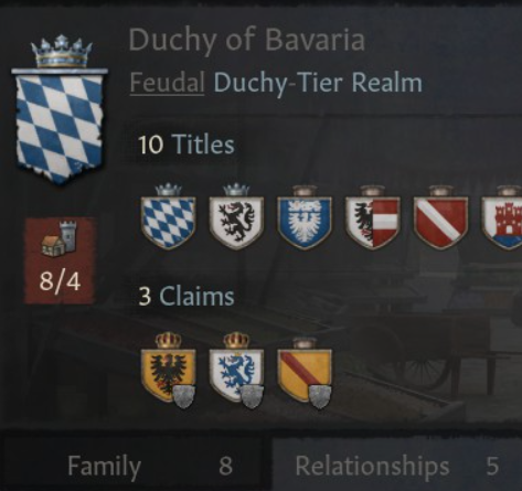
I'm not sure what's wrong with light style. Black font on white background feels natural to me and one of the better UIs in Paradox games. In general it's surprising how these text-heavy games make the same mistakes of using hard to read fonts or color combinations again and again. CK3 font is good but we can't have good things so half of the text in the game is grey on dark grey. And EU4 font is so hard on the eyes it's hard to find a streamer who doesn't use some font mod.

1711626397011.png
 
  • 4Like
  • 2
  • 1
Reactions: