• We have updated our Community Code of Conduct. Please read through the new rules for the forum that are an integral part of Paradox Interactive’s User Agreement.

Sulphurologist

Extravagant Map Man
43 Badges
Sep 23, 2018
497
6.527
  • Stellaris: Megacorp
  • Cities: Skylines - Mass Transit
  • Europa Universalis IV: Mandate of Heaven
  • Hearts of Iron IV: Death or Dishonor
  • Stellaris: Synthetic Dawn
  • Age of Wonders III
  • Hearts of Iron IV: Expansion Pass
  • Stellaris: Apocalypse
  • Europa Universalis IV: Rule Britannia
  • Europa Universalis IV: Dharma
  • Stellaris - Path to Destruction bundle
  • Europa Universalis IV: Golden Century
  • Imperator: Rome Deluxe Edition
  • Imperator: Rome
  • Prison Architect
  • Imperator: Rome Sign Up
  • Stellaris: Ancient Relics
  • Imperator: Rome - Magna Graecia
  • Crusader Kings III
  • Europa Universalis 4: Emperor
  • Europa Universalis IV: Common Sense
  • Europa Universalis IV
  • Europa Universalis IV: Conquest of Paradise
  • Victoria 2
  • Cities: Skylines
  • Europa Universalis IV: El Dorado
  • Stellaris: Leviathans Story Pack
  • Europa Universalis IV: Mare Nostrum
  • Stellaris
  • Hearts of Iron IV: Cadet
  • Europa Universalis IV: Rights of Man
  • Stellaris: Digital Anniversary Edition
  • Europa Universalis IV: Cradle of Civilization
  • Europa Universalis IV: Cossacks
  • Cities: Skylines - After Dark
  • Europa Universalis IV: Pre-order
  • Europa Universalis IV: Third Rome
  • Victoria 2: Heart of Darkness
  • Victoria 2: A House Divided
  • Europa Universalis IV: Res Publica
  • Europa Universalis IV: Wealth of Nations
  • Europa Universalis IV: Art of War
  • Crusader Kings II
I have seen several threads where a plethora of UI elements are discussed, but one I haven't really seen is one on the flag shape itself.

Personally, I feel it is a bit underwhelming at the moment where it feels a bit cartoony. Especially with the black line around it, and the simple shadows-highlights.
Of course, every post always designates 'All UI elements are very WIP', and this is obviously a huge 'IMO'.

So I was wondering, what are your thoughts on:
- overall shape: simple rectangle, shields, waving flag, vertical banners
- overall texture: metallic, real cloth feel, none....
- extras: mud & grime, shadows/highlights...

1739542311829.png
1739543463232.png

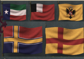
A selection of some other designs throughout Paradox's catalogue.

Banners 3.0MEIOU and TaxesBase EU4Victoria 3Imperator: RomeOlder Ck3 designCk3 crests
OIP.7lZHDu7s0sjow4b1M7mqUgHaDt
OIP.9xOHIYhwrZyrXxeyU62hWgHaFK
OIP.Z2NEGXRPs35isptPIivgIAAAAA
1739542664659.png
1739543228216.png
R.a28fe5ea6c76aa3e8e4677374cfeb613
zhgjf5r9iqh81.png

My personal preference goes out towards the MEIOU & Taxes / I:R / CK3 designs - for their sense of it being a 'real tangible object'
 
Last edited:
  • 47
  • 4Like
  • 2
  • 1Love
Reactions:
Yes flag graphics is one of the things I wanted to ask about. I had a few examples, the current flags really do look cartoonish and lack resolution.By the way, the black line around it appeared recently, it wasn’t there before.
wW3ITpT.jpeg
8uNABTs.jpg
 
  • 6Like
  • 1
Reactions:
The quality of the flag images seems good. In my opinion, to improve them, they need to be made more like in Victoria 3, but I can't say with full responsibility, we haven't seen live gameplay yet.
 
  • 8
  • 6
Reactions:
Now when you mention it flags do seem to be a bit on a darker side, as you are looking at them at dusk. I would prefer if they were brighter like in IR. I see what you mean by "real object" with IR and MEIOU, but I don't see it with ck3 .. crown kind of breaks realness of it.

I would vote Vic3 as the worst...
 
  • 4
  • 3
  • 1Like
Reactions:
I think it looks good in the places where it’s integrated with the UI and looks horrible when it’s floating in the air over some background. Primarily because the texturing makes it look very fake in that environment, though I’m not sure how much of that is the location in the UI or just the larger size of the flag.
 
  • 5Like
Reactions:
I believe they stated they will be flapping in an unfelt wind.

As they are tokens on the UI I feel they should be static.

Is the fish/apple trade icon going to be rotating? Do any of the other UI icons or tokens move?
 
  • 3Like
  • 1
Reactions:
Clarity for flags is important. If they're all gonna be shaded and waving, they might get rather muddled and hard to distinguish.

1739577680137.jpeg


With the small flags, the clarity becomes more important. The irregular shapes, lack of outlines and muted colors kind of make it harder to distinguish them. Especially the Lithuania flag here is kind of hard to see properly as it sort of gets lost in the background.

1739577783071.png


Compare to Eu4, where all the flags are bright, regularly shaped and outlined. They're also on a darker, clear background. This helps a lot to make even complex flag designs clear and recognizable.
 
  • 27Like
  • 4
  • 1
  • 1
Reactions:
Country Selection.jpg


My main complaint about the flag is its shape. It has a wavy, somewhat "ragged" appearance, which may look less aesthetic or just disgusting. I would like to suggest several ways to improve its appearance:


  • Classic Rectangular Shape
The simplest option is to make the flag a standard rectangle, like most national symbols. This would add more solidity and formality.


  • More Realistic Waves
The flag could be made to appear as if it is waving in the wind, but with smooth waves rather than sharp, irregular curves.


  • Adding a Border or Other Decorative Elements
For example, a thin gold border could make the flag more elegant and in line with a royal style.


  • Changing the Flag’s Mounting Style
If it currently appears to be attached to a silk fabric without a rigid base, its appearance could be adjusted to look like it is hanging from a horizontal bar or designed as a heraldic standard.
 
  • 17Like
  • 1
Reactions:
Honestly? The flags themsleves look great for the most part, but I don't know how to feel about the movement since we didn't see them moving yet, that said I ask for the option of having them static especially considering how many tags there are in game there are gonna be countries with VERY similar flags so having them being static and without shadow can be essential for understanding the country it belongs to. My only real gripe here is the black line around it, I would prefer for it to be removed or even better be replaced with a frame similar to the ones in Eu4 or Victoria 2
 
  • 6
  • 2Like
  • 1
Reactions:
Looks like this feedback could be heard because I see flags in the last HRE TMF post are far less 'distorted' by waving.
Compare the shapes:
Bohemia TF
HRE TMF
FlagsWave.jpeg
Flags.png

(Or maybe it is just about taking screenshots at different moments and nothing has changed :rolleyes:)
 
  • 3Like
  • 1
Reactions:
wrong link. Here
that thread is about the content of the flags, not the ingame reprensation as a flag/banner. That feels sufficiently distinct to me.

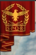
Anyway, I'd probably prefer coats of arms or hanging banners rather than flags. Just less ornate than e.g. the EU4 default. The MEIOU banners look nice, as well as the CK3 banners (sans crowns).
Flags are more modern and always feel fake without actual wind (and animating symbols is a no-go).
 
  • 4Like
  • 1
Reactions:
In my dreams I wish they had a mechanic to represent the shift from square and irregularly-shaped banners to modern rectangular flags, but that might be too much of a hustle. Although, CK3 does have unique banner shapes for different cultures owing to it's robust heraldry system, so I guess it's not entirely impossible to add such functionality in Project Caesar.

1920px-Chor%C4%85giew_kr%C3%B3lewska_kr%C3%B3la_Zygmunta_III_Wazy.svg.png
1920px-Royal_banner_of_the_Grand_Duchy_of_Lithuania.svg.png
2560px-1783_Ottoman_Flag.svg.png

1920px-Flag_of_the_Cossack_Hetmanat.svg.png
1920px-Mameluke_Flag.svg.png
2560px-Banner_of_M%C3%B6ngke_Tem%C3%BCr_%281257-1280%29.svg.png

Historically, there was lots of diversity in flag shapes during this time period but if a single compromise option MUST be picked, I'd certainly prefer square banners like in Imperator: Rome or the EU4 mod - they're the most versatile.
 
  • 7Like
Reactions:
We know they move so it is hard to give feedback. They look fine. Minimalistic but underatandable if they move.

1739884521425.png


But i can see it problematic. If I open this and all of these flags are moving, it is going to be a bit difficult to read them besides probably give me epilepsy episode :p

Bu yes very hard to give feddback until seen on movement.

They are simplistic, kind of like Vicky's, with no ornaments around it, but that is understandable if they move. I personally prefer they do not move and have a fancy ornament around it to be honest. I don't understand what is gained from moving flags other than hurting performance.
 
  • 5
Reactions:
I personally prefer they do not move and have a fancy ornament around it to be honest. I don't understand what is gained from moving flags other than hurting performance.
I think as you had pointed out that it can hurt readability also. Imagine all the icons moving.

<Aside: Insert some snarky "pdx preference towards 3d art assets where 2d assets would work better" comment>

Edit: correct mistakes
 
Last edited:
  • 1Haha
Reactions: