• We have updated our Community Code of Conduct. Please read through the new rules for the forum that are an integral part of Paradox Interactive’s User Agreement.

DrFranknfurter

Colonel
26 Badges
May 8, 2017
885
2.819
  • Age of Wonders III
  • Stellaris: Nemesis
  • Stellaris: Necroids
  • Stellaris: Federations
  • Stellaris: Lithoids
  • Stellaris: Ancient Relics
  • Prison Architect
  • Stellaris: Megacorp
  • BATTLETECH: Flashpoint
  • Shadowrun: Dragonfall
  • Stellaris: Distant Stars
  • Stellaris: Apocalypse
  • Stellaris: Humanoids Species Pack
  • Surviving Mars
  • BATTLETECH
  • Stellaris - Path to Destruction bundle
  • Stellaris: Leviathans Story Pack
  • Stellaris: Digital Anniversary Edition
  • Stellaris
  • Pillars of Eternity
  • Cities: Skylines
  • Europa Universalis IV
  • Crusader Kings II
  • Stellaris: Synthetic Dawn
  • Sword of the Stars II
  • Sword of the Stars
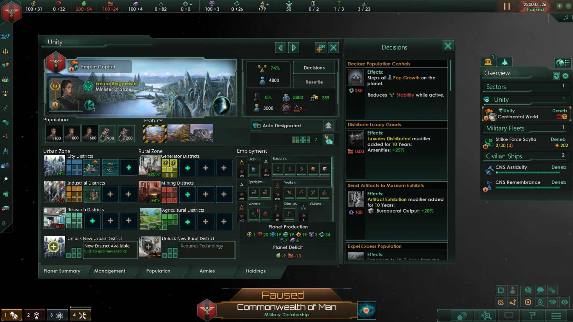
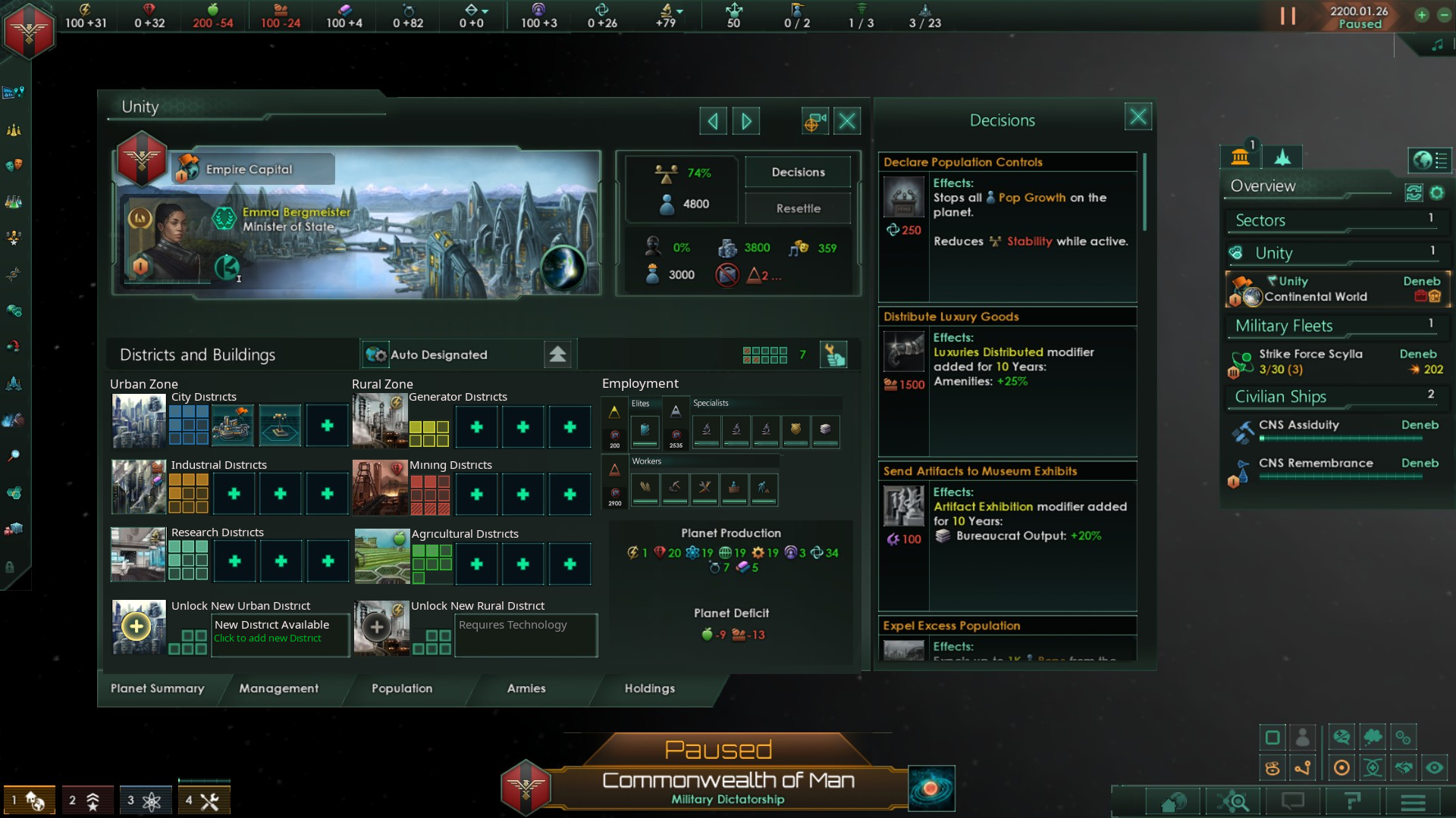
After some frustration with zones I wanted to see if I could improve the Planet Summary UI. Here's a very quick mock-up:
4.0 Planet UI mock-up.png


Changes:
1. Restored Districts UI to allow finer control of Job ratios
2. Added Employment to show which Jobs are being worked
I've tried to keep the sizes roughly the same and not add anything too dramatic (although that was tempting, I would change a lot more if I could).

Let me know what you'd change about the UI.
...and what you think about this mock-up
 
  • 9Like
  • 6Love
  • 5
  • 1
Reactions:
Another mock-up adding some pop group information and planetary features in the available space:
4.0 Planet UI mock-up 2.png

It's a bit small, but there's not a lot of room to work with.
I'd trim the "Districts and Buildings" to make the added bits bigger if I could... and I can... so I will:

4.0 Planet UI mock-up 3.png

This mock-up adds:
1. The 5 largest pop groups on the summary screen.
(any indication that people live on the planet would make me happy).

2. Top 3 planetary features, hopefully the ones at the top of the feature list are important enough to show
(any indication that a planet has actual features would make me happy).
 
  • 9Like
  • 3
  • 2
Reactions:
It looks a bit cramped. Can the whole window be made larger? It could work then.
 
  • 3Like
Reactions:
I'd suggest removing the 4th rural district slot since you only need 3, taking out the top one next to the government zone, and then using that space to show total available districts and the first item in the build queue.

I don't think the Employment section will work as is since you can end up with addition strata that won't fit like civilians, criminals, presapients, etc.
 
  • 1Like
Reactions:
I’ve been thinking about this myself today. I landed on the same idea as you, which is that it might work better if districts were inside zones.

This gives the flexibility of the new system, but with the added bonus of retaining the granular control from previous versions of the game when it comes to where your jobs go.

It should be possible to swap out one of your urban zones for a different one, albeit at the cost that scales to the number of districts. In this way you can still specialise a planet without the annoying clicks of having to tear down all your districts and then rebuilt them.
 
  • 4Like
  • 1
Reactions:
One thing is for sure. The new planet summary UI needs to be full screen.
There's no way they can fit everything in the amount of space they currently have.
 
  • 4Like
  • 1
Reactions:
It looks a bit cramped. Can the whole window be made larger? It could work then.
One thing is for sure. The new planet summary UI needs to be full screen.
There's no way they can fit everything in the amount of space they currently have.
It is a bit cramped, the downside of putting more information in a small window.

In the Dev stream they talked about maintaining support for smaller resolutions (1600x900) so I tried to just use the space we already have with icons roughly the same size as 4.0 and 3.14, so I worked with some of my screenshots rather than resizing the window to be any bigger.

Obviously you can fit a lot more if you make the Planet Summary view full-screen, or the window a little bigger, or reduce the size of each element until it looks nice.

I was just trying to show that it's easy to fit a lot more than currently is being shown. In the slightly adjusted mock-up below I've put 3 Features, 5 Pop icons, 16 Job icons, 8 Districts/Zones each with 3 build slots, planet income and expenditures... without even reducing the size of the city background art.

I'd suggest removing the 4th rural district slot since you only need 3, taking out the top one next to the government zone, and then using that space to show total available districts and the first item in the build queue.
Yes, that would work. But I wanted a design that is future-proof. Room for more new districts (base game and for modders). Even if those aren't actually used at the moment.

Also I like the idea of splitting the planet UI into Urban zone districts that are very flexible and Rural zone districts that are all limited in number by local resources. So I'd put any new district limited by deposits like a Betharian/Darkmatter/Zoo/Park district on the Rural side.

I don't think the Employment section will work as is since you can end up with addition strata that won't fit like civilians, criminals, presapients, etc.
Employment is just an idea to help show if a job is actually being worked or not.

It's rather important information for new players (and old) to help understand why building more researcher jobs can sometimes do nothing (not enough workers to promote) and sometimes cause a sudden deficit (new researchers are no longer producing CG/food/energy). Lots of easy mistakes that seeing the jobs, even just as a little workforce % bar under each would help prevent.

If you're worried about jobs not being able to fit in there you can make more room by moving planet production down a little - here's what it could look like with the most generalist of capitals with 16 different job types, too many to fit on a single line and all the relevant strata including criminals:

4.0 Planet UI mock-up 4.png

Mock-up version 4 - with all the job icons.
 
  • 1
  • 1Like
Reactions:
1. You could add a vertical scroll bar functionality, to allow for modders to add more district types.

2. The boxes for district count could be smaller, or the UI could just switch to XX/XX from the start. Although It may be difficult to determine tile blockers this way - just add a pop up tooltip that would show the detail.

I like this. It has potential.
 
  • 1
Reactions:
1. You could add a vertical scroll bar functionality, to allow for modders to add more district types.
Good point.

Scroll bars would be useful for modders to make changes without needing to edit the UI.
I've added a little scroll bar to the employment element on the right in the next mock-ups as an example of how it could look if there are more elements than fit on the screen. Although I think it's important the design shows as much information as possible without requiring scrolling.

(Also the outliner and jobs tab broke my scroll wheel... or maybe dropping this new mouse is what broke the middle mouse button... but either way scrolling long lists to find what could easily be shown is annoying and often unnecessary).

2. The boxes for district count could be smaller, or the UI could just switch to XX/XX from the start. Although It may be difficult to determine tile blockers this way - just add a pop up tooltip that would show the detail.


I like this. It has potential.

It's important to be able to show big district numbers, blockers and built districts. Numbers showing all 3 (X/Y/Z) could be confusing and lots of icons could take a lot of space... so here's a little experimental idea:
There are a lot of ways the information could be presented without taking up as much room.

The district boxes could be:
1. Smaller
2. Arranged differently
3. Replaced with text
4. Scaled to represent different district numbers e.g. box = 1 district, Big box = 5 districts, Big shiny box = 10 districts

I've opted in this example for the latter, making district icons slightly (50%) bigger and fancy to show 22/26 energy districts built.
Instead of smaller it's 9 pixels taller, but better than 110 pixels taller to show 3x as many districts built.

I'm not certain it looks right, so it's just a little experiment.
Let me know what you think.

4.0 Planet UI mock-up 5 and boxes.png

Mock-up 5:
4.0 Planet UI mock-up 5.png

1. Added Scroll bar to the Employment window as an example for how it could look if you add far more than can fit.
2. Added +% output summary information to district icons
Shows important negatives that need fixing (-50% from the new starting factory, or it could be from a deficit situation or devastation etc)
Lets you quickly compare output modifiers when tabbing through planets
 
  • 2
Reactions:
I wonder how many people play on lower resolutions because having to make a UI with windows this tiny is extremely restricting.
Enough to make a difference to the dev team.
 
I wonder how many people play on lower resolutions because having to make a UI with windows this tiny is extremely restricting.
Enough to make a difference to the dev team.
I just switched to 1280x720 to test and it's nice that it is still fully functional, as for numbers:

Steam has 20k active players each month.
Steam Hardware says 52.34% of people play on 1920x1080. It's the resolution I use, but also use 1.2x UI Scaling to make windows closer to the intended size.
4.66% use resolutions below that... (and 2.34% also use "Other" adding a large error margin to any estimates).

So I'd guess around 900-1500 people at any time are currently playing with smaller resolutions. Around 40-400 people will be using the lowest supported resolution (Steam doesn't even have the Stellaris minimum resolution as an option in the hardware survey table so this is a bit of a guess the exact numbers).

Whatever the reason for the specific UI window size (and support for small old computers is a good reason), changes could be made without expensive work on the engine, even if it would be nice if players could dynamically move and resize everything to fit better on larger monitors (windows, elements, fonts).

The mock-up shows the Planet Summary window could fit a more complete Summary of the planet without, even at 1280x720 without using any additional space.
 
  • 2
Reactions:
Man, you're onto something here. Good work!

I was also close to suggesting something similar. The new planet management system could really use some research and industrial districts. And the whole "rural/urban" divide makes tons of sense too, but I don't know if discussing this system would detract from the UI discussion.
 
  • 1Like
Reactions:
Great job with the redesigns! So far the UI is the most pressing problem with the open beta. At least it is for me personally.

Enough to make a difference to the dev team.

The impression from the open beta stream is that 720p policy is not really about the numbers, but about the principle. And if so, that policy needs to change.

Stellaris is a very complex game, and the UI is a window that lets you interact with that complexity. That's why it is so important. A good UI helps you to get information easily, and in turn, lets you make necessary calculations easily. One look and you understand what resources you need, who produces them, what you need to make them produce more.

Open beta planetary management UI clearly is not up to the task. Not blaming the designer, they received a really hard task of shoving nine years of complexity into year 2016 UI, and did their best. But from a player point of view the UI is just not satisfying. It is a small, overcrowded, claustrophobic window with five small tabs and huge amount of numbers that float around and fluctuate on the window's right side with no context. Such UI makes it harder to gauge information and plan your next move.

The most annoying thing by far is that in current beta it is harder to predict how much raw resources you are about to get from a decision. For example, in current (3.14) it is very easy to see how much resources each job produces. So, if you need +10 more energy on a planet, you build +1 energy district and get +2 technician jobs, each producing +5 energy (+10 in total). Very simple, very fast, very informative. In open beta you see something like "approx. job production 1779" and you have to decipher what that means or how that relates to planetary output of +51 raw energy output. Or how much exactly you would get from +200 jobs more (by counting jobs, raw output and extrapolating from there). It is like having to manually convert dollars into euro and back all the time. The goal of Stellaris 4.0 is to reduce late game computer lag, not outsource lag to players' brains.

Look at Vic 3, it is also a very complex grand strategy. Its province management is even more complex than Stellaris' planet management. And although Vic 3 also has its problems, the UI has never been one of them. It is very easy and convenient to gather information because well-functioning polished UI was a top priority from the get go. The example with energy production would be easy to solve with Vic 3 UI, it would just show you how many jobs you would create and how much raw energy you would get from that. If Stellaris tries to emulate Vic 3, it needs to emulate UI policy too.

There should be a solution that works both for players who exclusively play in 720p (small minority) and the rest of the playerbase. Not just design the game for 720p and make everyone else accomodate that. Imagine if modern industrial port engineers put interests of sailships first, and everyone else second. Just because someone may eventually transport something into port by yacht.

Get rid of the 720p restriction for those who do not need it. Upgraded UI is a necessity to future, more complex Stellaris.
 
Last edited:
  • 2
Reactions:
There should be separate districts for Alloys and Consumer Goods, no need to combine them in one District.

And what the need for Buildings? Districts themselves provide jobs, so Buildings are excessive.
 
  • 4
Reactions:
Man, you're onto something here. Good work!

I was also close to suggesting something similar. The new planet management system could really use some research and industrial districts. And the whole "rural/urban" divide makes tons of sense too, but I don't know if discussing this system would detract from the UI discussion.
Thank you!

I think any comment about the planet summary screen has to touch on the role of districts, population and all the other intertwined changes in 4.0 so I think it's all relevant. There's a lot of small and rather large details that need hammering out before temporary changes in the beta become set in stone.

Regarding Rural/Urban:
If planet development was split between Rural and Urban (working the land and working in cities) one benefit is that it would be easy to also divide civilian populations accordingly, allowing for both a Rural and Urban civilian population with different outputs and needs. I imagine the civilian population of an ecumenopolis would be quite different from the civilian population of an agricultural gaia world. If something like that existed you could watch the rural population gradually decrease as you transform a planet into an ecumenopolis (rural civilians could generate some food to cover their upkeep, urban generate some trade to cover their logistical upkeep).

Allowing for flexibility in future changes is important to me. 4.0 adding a civilian population adds hooks for future mechanics that I find interesting.

4.0 Planet UI mock-up 6.png

Mock-up 6
Tiny change:
1. Adds pop happiness bar and slavery indicators to pop group icons
(I like to know if my people are happy or miserable)
 
  • 1
  • 1Like
Reactions:
1742387187932.png

For Devs: Do we really need the planet production to show all 3 research productions at same time? Can't you combine that into one number like you did on topbar resource overview, and if you want to see the specific numbers then you just hover it over, there are very few circumstances where a planet produces one type of research far more then the other two. This should overall reduce the clutter in "Planet Production".
 
  • 4
Reactions:
The devs should use the above ui design mock ups as an inspiration in the beta, with the grouping of districts under either the urban or rural zones.
 
View attachment 1268205
For Devs: Do we really need the planet production to show all 3 research productions at same time? Can't you combine that into one number like you did on topbar resource overview, and if you want to see the specific numbers then you just hover it over, there are very few circumstances where a planet produces one type of research far more then the other two. This should overall reduce the clutter in "Planet Production".
Yes we do need them, but I would go one step further and suggest that the entire planet output widget should become a pop up tooltip on mouse over some element.
 
  • 1
Reactions:
I actually really, really love this.
Tho tbh i think swapping the housing/jobs/amenities info to be under the art (where the population and fearures are) might be better, so that thay population info can be nearer to where the jobs population stuff is.