Greetings!
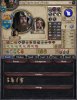
Today I’d like to show off the new Character View, which we affectionately refer to as the ‘Redux’ version. The old Character View, despite having been redone several times already, was still plagued by not having enough space for the various elements (traits, in particular) and having random buttons floating all over the interface (Leading Troops Toggle, Artifacts, Barber Shop, etc). Our primary goal has been to free up space and facilitate the addition of new buttons, and here’s the result:

This is how the Character View for your own character will look. As you can see, a lot of things have been reshuffled to create more space. We’ve kept in mind that certain habits are hard to break, so some of the more commonly used things are still in their original place, e.g. the ‘Arrange Marriage’ button, and the information you need at a glance is in the same general area as it used to be, e.g. the Levy Size number. We’ve replaced the text with icons, and all icons now also have tooltips - this means that, unlike before, we actually explain the concepts of the various lists you see, such as what the difference between a Trait and a Modifier is.
Some elements have been removed, such as the ‘Dynasty Tree’ button, as clicking the Dynasty Shield itself fulfilled the exact same function.
The old ‘Combat modifiers’ icon (the two crossed swords) have been replaced by a new icon (orange with a sword and chess piece) in order to make it more clear that you can hover it to see useful information. We’ve also added a similar button that shows the total effects of any Artifacts a character has (yellow with a goblet and helmet). This icon is also visible in character lists, making it useful for tracking down characters which hold artifacts on their persona.
We’ve also exposed the Personal Combat Skill value of characters in the list of skills. More on this in a future DD, but rest assured that it’ll have an enhanced impact on your gameplay experience!
To preserve some sense of mystery I’ve censored some of the buttons pertaining to expansion features using pictures of confused ducks, I’ll go into more detail on what the buttons entail in later DD’s.
This is how it looks when viewing another character:

As you can see, it’s similar to the other view although with more censored buttons. The main difference, which may take some time to adjust to, is the new location of the Plot button - though it is now in a way more convenient location overall.
We’ve tried to shuffle as much information as possible to the right of the view, in order to make it easier to get the information you need at a glance - Active diplomacy (such as wars), levy numbers and stats are all lined up and easy to view.
While we don’t expect everyone to instantly embrace the new layout, we did it out of necessity and managed to use the space we had available in a very effective way - and after having spent months using it internally, I don’t believe there’s a single one of us in the Dev Team that could go back to the old layout.")
Today I’d like to show off the new Character View, which we affectionately refer to as the ‘Redux’ version. The old Character View, despite having been redone several times already, was still plagued by not having enough space for the various elements (traits, in particular) and having random buttons floating all over the interface (Leading Troops Toggle, Artifacts, Barber Shop, etc). Our primary goal has been to free up space and facilitate the addition of new buttons, and here’s the result:
This is how the Character View for your own character will look. As you can see, a lot of things have been reshuffled to create more space. We’ve kept in mind that certain habits are hard to break, so some of the more commonly used things are still in their original place, e.g. the ‘Arrange Marriage’ button, and the information you need at a glance is in the same general area as it used to be, e.g. the Levy Size number. We’ve replaced the text with icons, and all icons now also have tooltips - this means that, unlike before, we actually explain the concepts of the various lists you see, such as what the difference between a Trait and a Modifier is.
Some elements have been removed, such as the ‘Dynasty Tree’ button, as clicking the Dynasty Shield itself fulfilled the exact same function.
The old ‘Combat modifiers’ icon (the two crossed swords) have been replaced by a new icon (orange with a sword and chess piece) in order to make it more clear that you can hover it to see useful information. We’ve also added a similar button that shows the total effects of any Artifacts a character has (yellow with a goblet and helmet). This icon is also visible in character lists, making it useful for tracking down characters which hold artifacts on their persona.
We’ve also exposed the Personal Combat Skill value of characters in the list of skills. More on this in a future DD, but rest assured that it’ll have an enhanced impact on your gameplay experience!
To preserve some sense of mystery I’ve censored some of the buttons pertaining to expansion features using pictures of confused ducks, I’ll go into more detail on what the buttons entail in later DD’s.
This is how it looks when viewing another character:
As you can see, it’s similar to the other view although with more censored buttons. The main difference, which may take some time to adjust to, is the new location of the Plot button - though it is now in a way more convenient location overall.
We’ve tried to shuffle as much information as possible to the right of the view, in order to make it easier to get the information you need at a glance - Active diplomacy (such as wars), levy numbers and stats are all lined up and easy to view.
While we don’t expect everyone to instantly embrace the new layout, we did it out of necessity and managed to use the space we had available in a very effective way - and after having spent months using it internally, I don’t believe there’s a single one of us in the Dev Team that could go back to the old layout.