Greetings everyone!
Today I’m here to talk a bit about the map. Building on top of our early map related DD#2 (if you have yet to read it, you can do so here), I’ll expand that discussion by outlining additional features, new information, and how you interact with the map itself!
Terrain
Let’s start with the terrain, which has a significant impact on several parts of the game. Different terrain types allow for different buildings to be constructed. For example, farmland allows for superior economy buildings, while mountainous terrain unlocks rather impressive defensive structures. They also have an effect on development, making development change faster or slower over time. Expect it to be a massive undertaking of developing the Sahara, while developing the fertile fields of India will be a much easier task.
As for combat, one of the most noticeable effects is that of combat width. When you are fielding a much larger army than your opponent, you will favour a high combat width, so you’ll want to seek to engage the enemy in plains or drylands. On the other hand, fighting in rough terrain like mountains or wetlands will restrict the number of units that can simultaneously engage the enemy, allowing small armies with powerful Men-at-Arms to truly excel. Terrain also affects army movement speed, along with the usual defensive bonus you would expect in rough terrain types, which is gained in the form of increased Advantage at the start of a battle.
The terrain types we have available are the following:
Farmlands - Has access to many different and powerful buildings, allowing you to easily customize your holding the way you want to. Paired with high development speed, farmland provinces are highly desirable to hold in your domain.
Floodplains - Another desirable terrain type used in certain areas, such as along the Nile. Similar in power to farmlands, but with some minor differences.
Plains - One of the most common terrain types, plains exist almost everywhere and provide a wide range of building options.
Drylands - A variant of plains with slightly different buildings available.
Desert - While deserts doesn’t offer a whole lot in terms of taxes, supply limit or development, it does have access to levies and a unique building chain increasing your number of available Knights.
Oasis - These exist only in certain areas. The terrain has access to similar buildings as desert, but without the penalties in supply limit or development.
Steppe - Mostly used by tribals on the wide steppe, this is where Horse Archers reign supreme. The steppe starts with low development, and has a significant penalty in development growth.
Forest - Has lower combat width and supply limit, but offers great buildings for improving archers and skirmishers.
Taiga - A variant found in the very northern parts of the map, with slightly lower combat width and supply limit than forest.
Jungle - Mainly found in India and offers even less combat width and supply limit. It does, however, have access to a unique building chain for improving your Knights and heavy cavalry.
Hills - Hills offers a small Advantage bonus in combat, and has access to both fortifications and decent tax buildings.
Mountains - Has access to great fortifications and defensive buildings, making it a long and risky business to siege down holdings.
Desert Mountains - Similar to mountains, but for desert areas (obviously), with lower supply limit, development growth, as well as a bonus that allows defending armies to take less casualties when retreating.
Wetlands - While wetlands still allow for some decent buildings, it’s a terrain type you don’t want to fight battles in if you can avoid it. Especially if there’s a risk of being on the losing side...


Context Sensitive Selection
We want it to be easy to gain information directly from the map. Whenever you change map modes, or have something “selected”, we update the map accordingly and allow you to often interact with the map itself. Clicking on the map on any given realm, will open that ruler’s character view. This in turn allows you to see rulers he is at war with, his allies, or direct vassals. All of this is shown directly on the map and is selectable, though you do not have to rely on finding it on the map; we still show relations and everything in the interface as well.

This applies to everything we show on the map. Regardless of your map mode, you can always click to select the “entity” you are looking at. If you have the faith map mode active, you can click on a faith to open the interface for it, as well as seeing where its holy sites are located.
Realm Map Mode
Your bread and butter map mode is what we simply call the Realm map mode.
When zoomed in you’ll encounter what we call the detail level, and will see the map for what it is. Terrain of individual baronies, rivers, and holding graphics are all clearly visible.
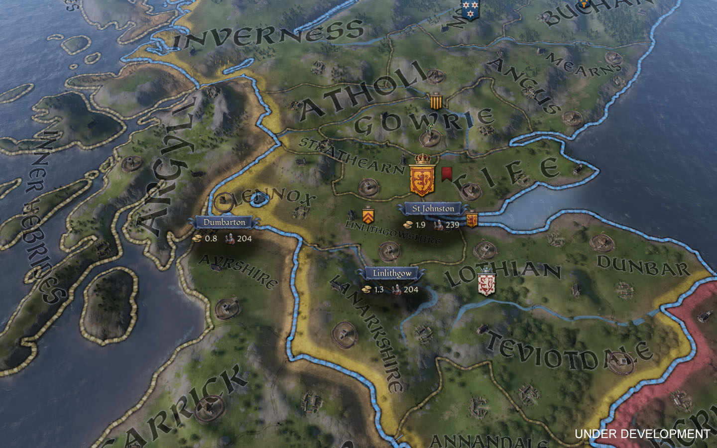
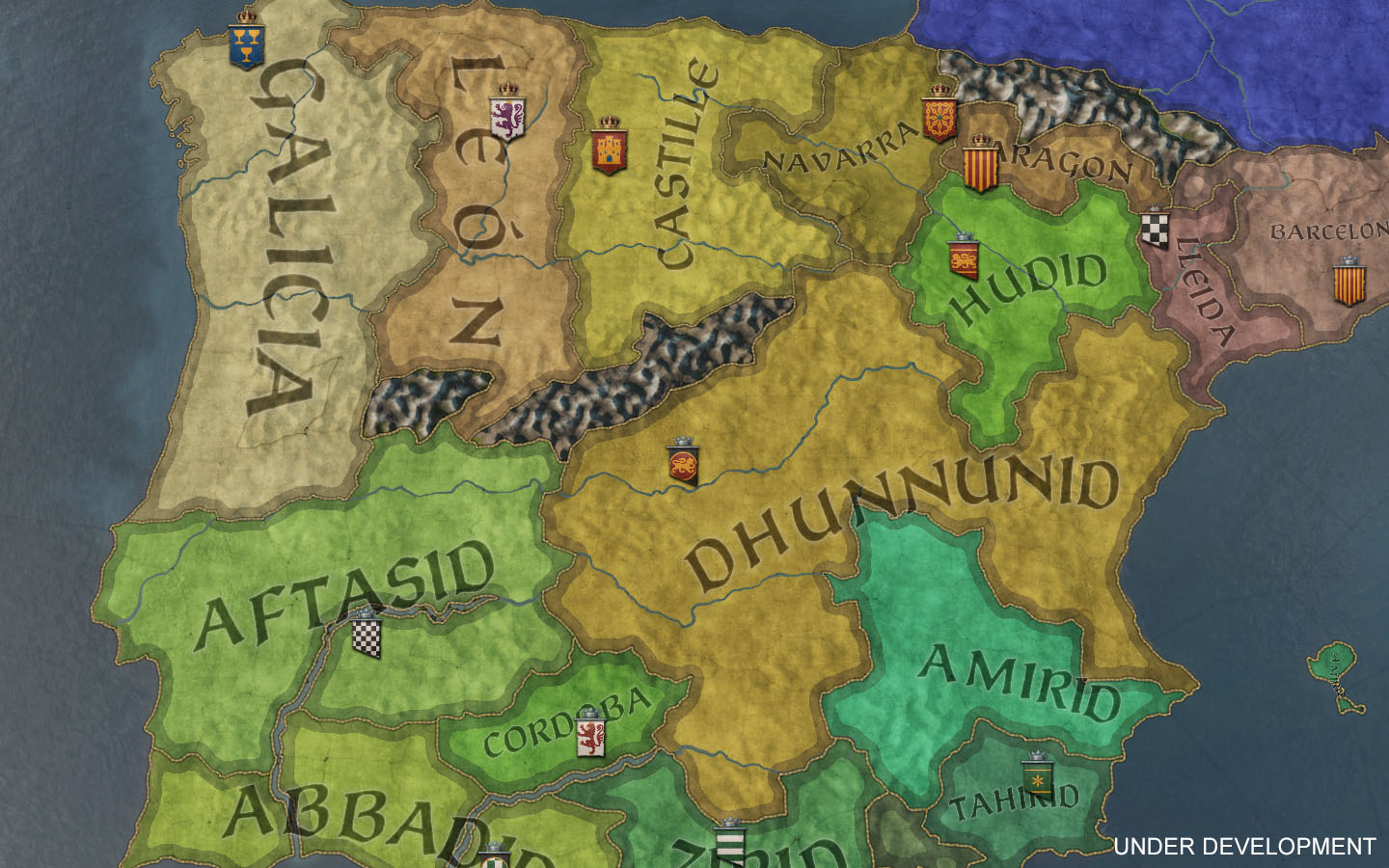
Zoom out a bit and you’ll transition into the Realms layer, your typical political map mode. Realms are clearly highlighted with their colour, allowing you to easily see all independent realms at a glance, while still showing the coat of arms of your direct vassals, to allow for easy realm management.
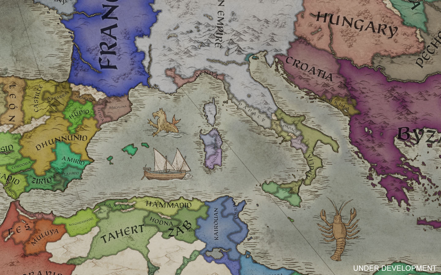
Zoom out further and you’ll enter the paper map. This is the place to go for a rather fancy overview of the world (or excellent screenshots)! Only independent realms are shown, without any vassal breakdowns. For now, I’ll just tease you with a partial picture, as we’ll show the entire thing in a later DD. And yes, we got the mandatory sea monsters!
Other Map Modes
Our other map modes remain consistent in the information they show as you zoom in and out, and do not have the level dependency of Realms. If you have the faith map mode open, you are gonna want to see faiths regardless of your zoom level. You’ll still get the spectacular paper map when you zoom further out, but the information shown on the map will remain the same.
De Jure - As you’d expect, we have dedicated map modes for showing the De Jure areas of duchies, kingdoms, and empires.
Faiths - Allows you to easily see what faiths are spread out around the world.
Cultures - For that nifty culture overview.
Houses - Since it’s a game about characters and dynasties, we want it to be easy to see which house is governing the different realms.
Counties - Highlights individual counties in their respective colour.
Terrain - Shows all terrain types in different colours, for that quick and easy overview of the dominant terrain in any given area. Very useful if you have several Men-at-Arms options available with different terrain bonuses.
Governments - The map mode for viewing what kind of government rulers have.
Development - Gives you an overview of what the development level is across the map.

That’s it for today! I’ll be back next week with another map related entry. Where I plan to simply show you, well, everything regarding the scope of the map and how different parts of the world looks!
Today I’m here to talk a bit about the map. Building on top of our early map related DD#2 (if you have yet to read it, you can do so here), I’ll expand that discussion by outlining additional features, new information, and how you interact with the map itself!
Terrain
Let’s start with the terrain, which has a significant impact on several parts of the game. Different terrain types allow for different buildings to be constructed. For example, farmland allows for superior economy buildings, while mountainous terrain unlocks rather impressive defensive structures. They also have an effect on development, making development change faster or slower over time. Expect it to be a massive undertaking of developing the Sahara, while developing the fertile fields of India will be a much easier task.
As for combat, one of the most noticeable effects is that of combat width. When you are fielding a much larger army than your opponent, you will favour a high combat width, so you’ll want to seek to engage the enemy in plains or drylands. On the other hand, fighting in rough terrain like mountains or wetlands will restrict the number of units that can simultaneously engage the enemy, allowing small armies with powerful Men-at-Arms to truly excel. Terrain also affects army movement speed, along with the usual defensive bonus you would expect in rough terrain types, which is gained in the form of increased Advantage at the start of a battle.
The terrain types we have available are the following:
Farmlands - Has access to many different and powerful buildings, allowing you to easily customize your holding the way you want to. Paired with high development speed, farmland provinces are highly desirable to hold in your domain.
Floodplains - Another desirable terrain type used in certain areas, such as along the Nile. Similar in power to farmlands, but with some minor differences.
Plains - One of the most common terrain types, plains exist almost everywhere and provide a wide range of building options.
Drylands - A variant of plains with slightly different buildings available.
Desert - While deserts doesn’t offer a whole lot in terms of taxes, supply limit or development, it does have access to levies and a unique building chain increasing your number of available Knights.
Oasis - These exist only in certain areas. The terrain has access to similar buildings as desert, but without the penalties in supply limit or development.
Steppe - Mostly used by tribals on the wide steppe, this is where Horse Archers reign supreme. The steppe starts with low development, and has a significant penalty in development growth.
Forest - Has lower combat width and supply limit, but offers great buildings for improving archers and skirmishers.
Taiga - A variant found in the very northern parts of the map, with slightly lower combat width and supply limit than forest.
Jungle - Mainly found in India and offers even less combat width and supply limit. It does, however, have access to a unique building chain for improving your Knights and heavy cavalry.
Hills - Hills offers a small Advantage bonus in combat, and has access to both fortifications and decent tax buildings.
Mountains - Has access to great fortifications and defensive buildings, making it a long and risky business to siege down holdings.
Desert Mountains - Similar to mountains, but for desert areas (obviously), with lower supply limit, development growth, as well as a bonus that allows defending armies to take less casualties when retreating.
Wetlands - While wetlands still allow for some decent buildings, it’s a terrain type you don’t want to fight battles in if you can avoid it. Especially if there’s a risk of being on the losing side...


Context Sensitive Selection
We want it to be easy to gain information directly from the map. Whenever you change map modes, or have something “selected”, we update the map accordingly and allow you to often interact with the map itself. Clicking on the map on any given realm, will open that ruler’s character view. This in turn allows you to see rulers he is at war with, his allies, or direct vassals. All of this is shown directly on the map and is selectable, though you do not have to rely on finding it on the map; we still show relations and everything in the interface as well.

This applies to everything we show on the map. Regardless of your map mode, you can always click to select the “entity” you are looking at. If you have the faith map mode active, you can click on a faith to open the interface for it, as well as seeing where its holy sites are located.
Realm Map Mode
Your bread and butter map mode is what we simply call the Realm map mode.
When zoomed in you’ll encounter what we call the detail level, and will see the map for what it is. Terrain of individual baronies, rivers, and holding graphics are all clearly visible.

Zoom out a bit and you’ll transition into the Realms layer, your typical political map mode. Realms are clearly highlighted with their colour, allowing you to easily see all independent realms at a glance, while still showing the coat of arms of your direct vassals, to allow for easy realm management.

Zoom out further and you’ll enter the paper map. This is the place to go for a rather fancy overview of the world (or excellent screenshots)! Only independent realms are shown, without any vassal breakdowns. For now, I’ll just tease you with a partial picture, as we’ll show the entire thing in a later DD. And yes, we got the mandatory sea monsters!

Other Map Modes
Our other map modes remain consistent in the information they show as you zoom in and out, and do not have the level dependency of Realms. If you have the faith map mode open, you are gonna want to see faiths regardless of your zoom level. You’ll still get the spectacular paper map when you zoom further out, but the information shown on the map will remain the same.
De Jure - As you’d expect, we have dedicated map modes for showing the De Jure areas of duchies, kingdoms, and empires.
Faiths - Allows you to easily see what faiths are spread out around the world.
Cultures - For that nifty culture overview.
Houses - Since it’s a game about characters and dynasties, we want it to be easy to see which house is governing the different realms.
Counties - Highlights individual counties in their respective colour.
Terrain - Shows all terrain types in different colours, for that quick and easy overview of the dominant terrain in any given area. Very useful if you have several Men-at-Arms options available with different terrain bonuses.
Governments - The map mode for viewing what kind of government rulers have.
Development - Gives you an overview of what the development level is across the map.

That’s it for today! I’ll be back next week with another map related entry. Where I plan to simply show you, well, everything regarding the scope of the map and how different parts of the world looks!


