Today we have another Dev Diary from the fine folks over at Lab42 Games, the studio porting Crusader Kings III to Consoles. We hope this helps tide you over until tomorrow when Royal Court comes to Consoles!
Hello there, Console Crusaders! I’m Michelle, the UI artist on the team adapting Crusader Kings III for consoles and I wanted to share some insight into how we built the UI art for the new Royal Court DLC.
About 80% of my time on every new DLC is spent making art mock-ups. These are specifically necessary for our code team since they implement all the UI into the game via code. We make sure that they receive screens that are to scale with the game, so that there can be no confusion as to how a new window needs to look.
I always start from the design mock-ups made by our UI Designer, checking how many new menus and windows get introduced and how many are similar to already existing mock-ups. With the limited memory we have when developing on consoles, we need to be smart about our decisions when it comes to introducing new graphics.
For this DLC the Royal Court menu was one of the biggest menus to tackle. After getting a Design mock-up, the first thing is trying to find existing menus that looked alike. The Ruler Designer seemed to have some overlapping elements, so that menu was used as a base, and after that the Royal Court menu is built on top of it. As this is an original PC game and Paradox have created an amazing art direction for it, we try and reuse as many graphics from the PC game into our version, but sometimes we need to make alterations. For example: the graphic for the display of the Royal Court and the Court Grandeur level was made using the original graphic and cutting it up in parts to display it in a way that made more sense to our version.

Figure 1: Banner_Header, PC version
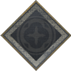

Figure 2: Banner_Header + Grandeur Level Icon, console version
To make sure all art made for console corresponds with all other previously made mock-ups, we made an art guide. It’s a necessary document to outline font sizes and styles, button graphics, which graphics to use when setting up a window or popup, etc. I usually add things to this guide every now and then, especially when working on the new DLCs.
An example of newly added info would be the additional font colors used for the artifact quality. For readability, we chose new, brighter colors than the PC game, just as we did with the other font colors in the beginning. They were added to the Art Guide with their corresponding RGB values, hex codes, and decimal values, so the coders would have no problem implementing the correct ones.
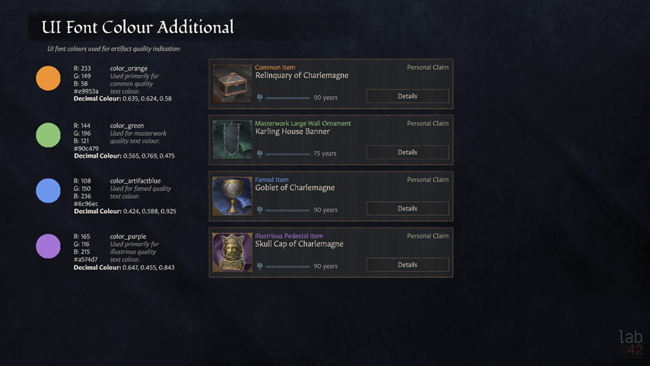
Figure 3: Art Guide for Artifact Quality Font Colors
Another example of additional Art Guide info was the number formatting. Since there is a lot of information displayed, we really wanted to make sure that the important figures were clear to everyone. Therefore, most of the numbers are displayed in a bold white color, to indicate essential data. They also appear green when they are meant to signify a positive outcome and red to suggest the opposite.
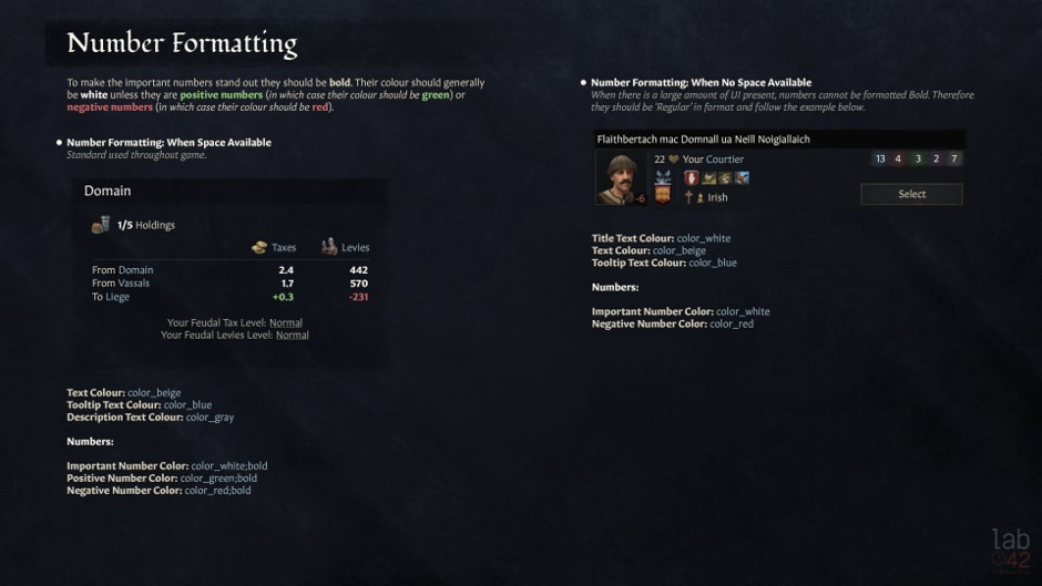
Figure 4: Art Guide for Number Formatting
The main UI issue we have when adapting a game that always displays a lot of info for console, is readability. That’s why we always make sure the text displayed is readable, keeping localisation in mind.
Now, another thing that is important is checking the graphics for certain icons. We needed to have two new icons for the Royal Court and the Inventory in the Character Radial, and since the radial doesn’t exist in the PC game, I had to paint up new icons that fit the style of the other ones in that menu. There were some flat icons for the inventory and the royal court, so they were used as inspiration.

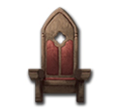
Image 5 and 6: Icons for the Inventory and Royal Court (PC Version)
Since the Royal Court icon had slightly more detail, I painted that one first, making sure to stay true to the original version, but painting it much bigger, with some more depth, making the shadows deeper and the highlights lighter.
The icon for the inventory was a much bigger challenge since there was only a flat icon, without any light information. It was a matter of finding correct references and getting to the level of detail of the other Character Inventory icons.
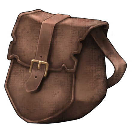
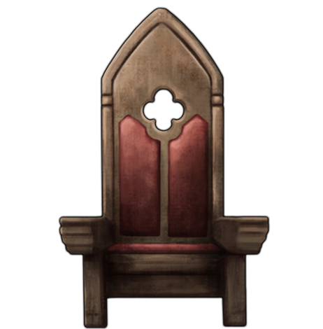
Image 7 and 8: Icons for the Inventory and Royal Court (Console Version)
After that I add them into the character radial mock-up screen, to make sure they fit with the rest of the icons and to give our coders a visual aid when they implement these new features.
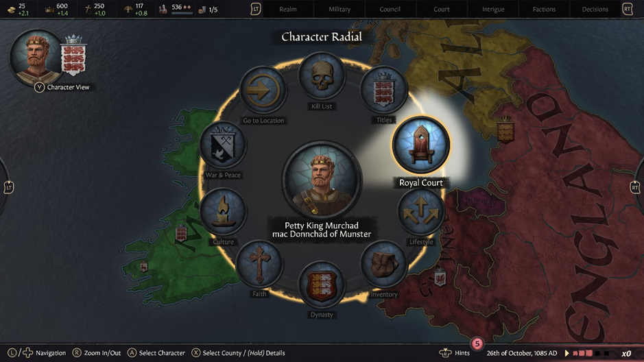
Figure 9: Mock-up Character Radial with Inventory and Royal Court icon (Console Version)
So, after adapting the graphics where needed, consulting the Art Guide, and looking at other mock-ups to keep the style consistent, the new mock-ups for the Royal Court were able to be made.
Taking the Court Grandeur Amenities screen as an example, it is mostly a matter of cross referencing the design mock-up and the PC version of the menu to get to a finished version that resembles both but uses the graphics to its full potential and makes sure all the info is clear and readable.
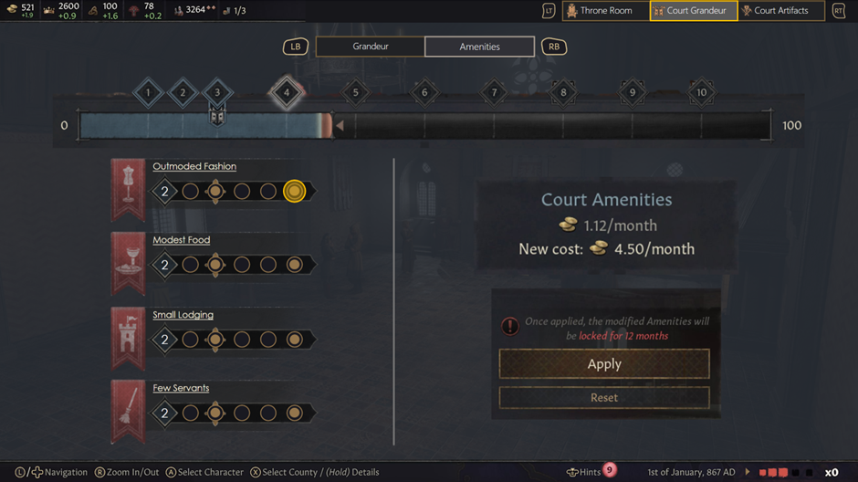
Figure 10: Design Mock-up for the Court Grandeur - Amenities
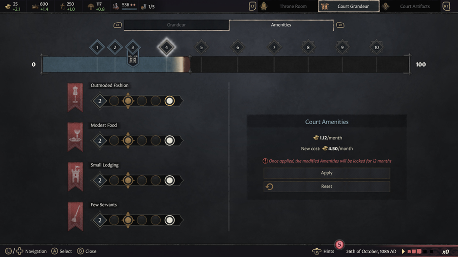
Figure 11: Art Mock-up for the Court Grandeur - Amenities
The Court Grandeur Amenities screen is an example of a UI mock-up screen that has a lot of new graphics and for the coders to find these graphics, I also add UI breakdown sheets to the mockups I make. These show the correct text formatting for titles and other text. It is also a clear guide to the names of the different graphics used and helps coders searching for the correct ones. I will usually also repeat some general guidelines, for example button formatting, for clarity.
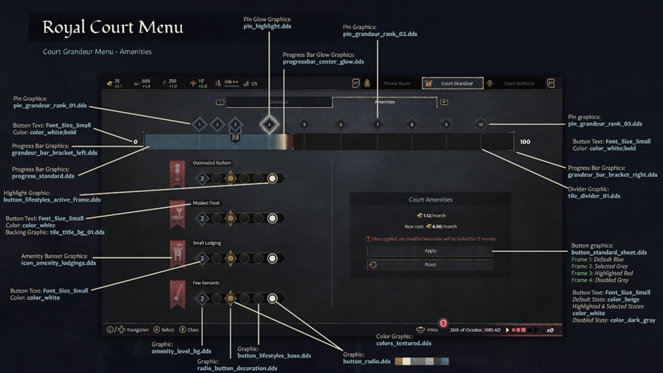
Figure 12: UI breakdown sheet for the Court Grandeur - Amenities
After making sure the mock-ups are equipped with the correct breakdown sheets, I send these off for sign off and hand over the reins to our code team.
Usually after the art mock-ups are done, I start work on the achievement icons. The icons from the base game are perfectly readable for PC but because both the PS5 and Xbox use different formatting for the achievements, we needed a more detailed version. To illustrate my workflow, I’ll explain the process for the Bod Chen Po Xbox Achievement.
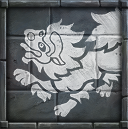
Figure 13: Bod Chen Po Achievement (PC Version)
All the Royal Court achievement icons have the same background so first, I make sure I have a clean background reference from the PC version. That will serve as the reference for the 512x512 PS5 icon. Then I need to make another version for Xbox, since they use a 1920x1080 format.
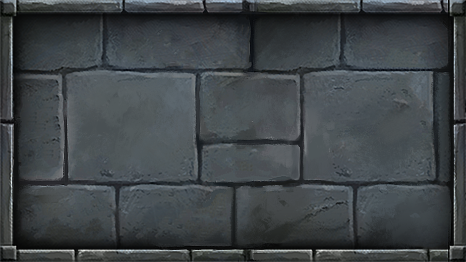
Figure 14: Background reference for Xbox Achievement
After I have this background reference, I paint in the rocky texture, following the original version but adding extra knicks, darkening the creases and adding highlights.
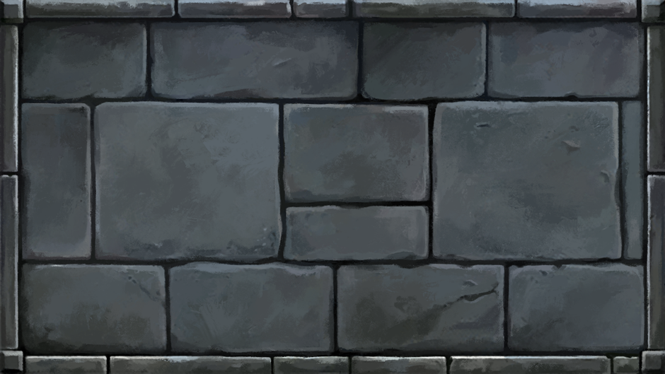
Figure 15: Newly painted background for Xbox Achievement
After painting a detailed background, I add some variation in lightness to the stones and the vignette effect that was present in the original art.
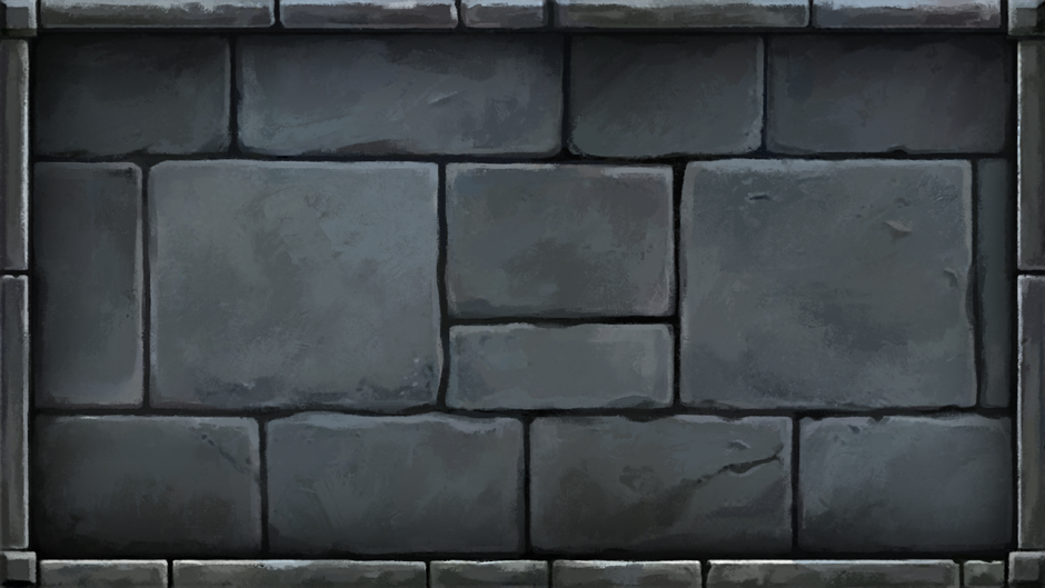
Figure 16: Added variation and vignette
Now I can create the specific icon for the Bod Chen Po Achievement. I start with painting a high resolution version of the icon, including adding the back half of the illustration that was obscured due to the icon being square.
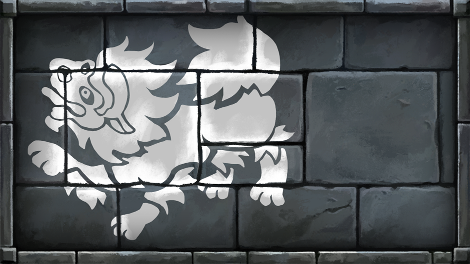
Figure 17: High resolution version of icon for Bod Chen Po Achievement
Then comes the last step in the icon creation process: texturing. Using the original icon as a reference, I add wear and tear, as well as the scratches that were present in the original version.
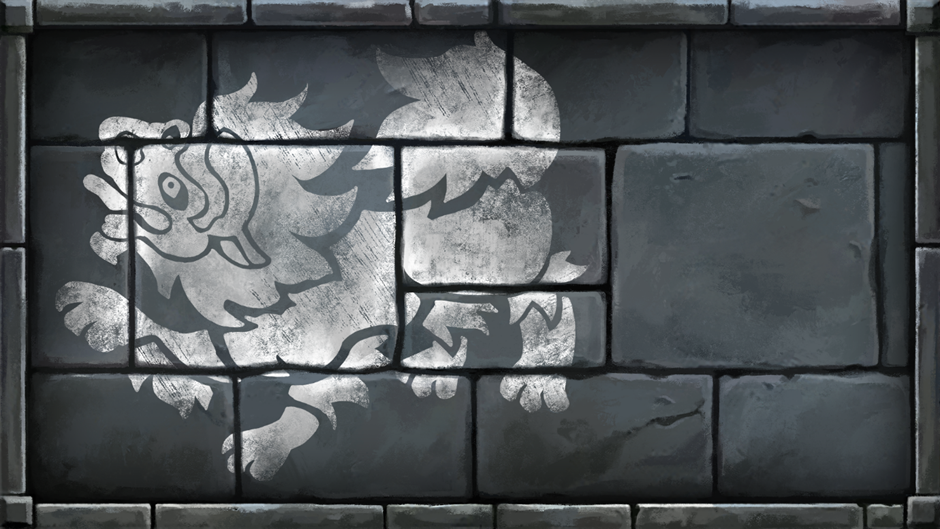
Figure 18: Final version of icon for Bod Chen Po Achievement
Et voilà – that concludes the process used to show your Xbox achievements in their full glory.
I hope this gave you some insight into how the UI art is made for the console version. Thanks again for all your patience waiting for the Royal Court, we have been working very hard to give you the best version possible!
Hello there, Console Crusaders! I’m Michelle, the UI artist on the team adapting Crusader Kings III for consoles and I wanted to share some insight into how we built the UI art for the new Royal Court DLC.
About 80% of my time on every new DLC is spent making art mock-ups. These are specifically necessary for our code team since they implement all the UI into the game via code. We make sure that they receive screens that are to scale with the game, so that there can be no confusion as to how a new window needs to look.
I always start from the design mock-ups made by our UI Designer, checking how many new menus and windows get introduced and how many are similar to already existing mock-ups. With the limited memory we have when developing on consoles, we need to be smart about our decisions when it comes to introducing new graphics.
For this DLC the Royal Court menu was one of the biggest menus to tackle. After getting a Design mock-up, the first thing is trying to find existing menus that looked alike. The Ruler Designer seemed to have some overlapping elements, so that menu was used as a base, and after that the Royal Court menu is built on top of it. As this is an original PC game and Paradox have created an amazing art direction for it, we try and reuse as many graphics from the PC game into our version, but sometimes we need to make alterations. For example: the graphic for the display of the Royal Court and the Court Grandeur level was made using the original graphic and cutting it up in parts to display it in a way that made more sense to our version.

Figure 1: Banner_Header, PC version


Figure 2: Banner_Header + Grandeur Level Icon, console version
To make sure all art made for console corresponds with all other previously made mock-ups, we made an art guide. It’s a necessary document to outline font sizes and styles, button graphics, which graphics to use when setting up a window or popup, etc. I usually add things to this guide every now and then, especially when working on the new DLCs.
An example of newly added info would be the additional font colors used for the artifact quality. For readability, we chose new, brighter colors than the PC game, just as we did with the other font colors in the beginning. They were added to the Art Guide with their corresponding RGB values, hex codes, and decimal values, so the coders would have no problem implementing the correct ones.

Figure 3: Art Guide for Artifact Quality Font Colors
Another example of additional Art Guide info was the number formatting. Since there is a lot of information displayed, we really wanted to make sure that the important figures were clear to everyone. Therefore, most of the numbers are displayed in a bold white color, to indicate essential data. They also appear green when they are meant to signify a positive outcome and red to suggest the opposite.

Figure 4: Art Guide for Number Formatting
The main UI issue we have when adapting a game that always displays a lot of info for console, is readability. That’s why we always make sure the text displayed is readable, keeping localisation in mind.
Now, another thing that is important is checking the graphics for certain icons. We needed to have two new icons for the Royal Court and the Inventory in the Character Radial, and since the radial doesn’t exist in the PC game, I had to paint up new icons that fit the style of the other ones in that menu. There were some flat icons for the inventory and the royal court, so they were used as inspiration.


Image 5 and 6: Icons for the Inventory and Royal Court (PC Version)
Since the Royal Court icon had slightly more detail, I painted that one first, making sure to stay true to the original version, but painting it much bigger, with some more depth, making the shadows deeper and the highlights lighter.
The icon for the inventory was a much bigger challenge since there was only a flat icon, without any light information. It was a matter of finding correct references and getting to the level of detail of the other Character Inventory icons.


Image 7 and 8: Icons for the Inventory and Royal Court (Console Version)
After that I add them into the character radial mock-up screen, to make sure they fit with the rest of the icons and to give our coders a visual aid when they implement these new features.

Figure 9: Mock-up Character Radial with Inventory and Royal Court icon (Console Version)
So, after adapting the graphics where needed, consulting the Art Guide, and looking at other mock-ups to keep the style consistent, the new mock-ups for the Royal Court were able to be made.
Taking the Court Grandeur Amenities screen as an example, it is mostly a matter of cross referencing the design mock-up and the PC version of the menu to get to a finished version that resembles both but uses the graphics to its full potential and makes sure all the info is clear and readable.

Figure 10: Design Mock-up for the Court Grandeur - Amenities

Figure 11: Art Mock-up for the Court Grandeur - Amenities
The Court Grandeur Amenities screen is an example of a UI mock-up screen that has a lot of new graphics and for the coders to find these graphics, I also add UI breakdown sheets to the mockups I make. These show the correct text formatting for titles and other text. It is also a clear guide to the names of the different graphics used and helps coders searching for the correct ones. I will usually also repeat some general guidelines, for example button formatting, for clarity.

Figure 12: UI breakdown sheet for the Court Grandeur - Amenities
After making sure the mock-ups are equipped with the correct breakdown sheets, I send these off for sign off and hand over the reins to our code team.
Usually after the art mock-ups are done, I start work on the achievement icons. The icons from the base game are perfectly readable for PC but because both the PS5 and Xbox use different formatting for the achievements, we needed a more detailed version. To illustrate my workflow, I’ll explain the process for the Bod Chen Po Xbox Achievement.

Figure 13: Bod Chen Po Achievement (PC Version)
All the Royal Court achievement icons have the same background so first, I make sure I have a clean background reference from the PC version. That will serve as the reference for the 512x512 PS5 icon. Then I need to make another version for Xbox, since they use a 1920x1080 format.

Figure 14: Background reference for Xbox Achievement
After I have this background reference, I paint in the rocky texture, following the original version but adding extra knicks, darkening the creases and adding highlights.

Figure 15: Newly painted background for Xbox Achievement
After painting a detailed background, I add some variation in lightness to the stones and the vignette effect that was present in the original art.

Figure 16: Added variation and vignette
Now I can create the specific icon for the Bod Chen Po Achievement. I start with painting a high resolution version of the icon, including adding the back half of the illustration that was obscured due to the icon being square.

Figure 17: High resolution version of icon for Bod Chen Po Achievement
Then comes the last step in the icon creation process: texturing. Using the original icon as a reference, I add wear and tear, as well as the scratches that were present in the original version.

Figure 18: Final version of icon for Bod Chen Po Achievement
Et voilà – that concludes the process used to show your Xbox achievements in their full glory.
I hope this gave you some insight into how the UI art is made for the console version. Thanks again for all your patience waiting for the Royal Court, we have been working very hard to give you the best version possible!


