• We have updated our Community Code of Conduct. Please read through the new rules for the forum that are an integral part of Paradox Interactive’s User Agreement.

Stellaris Dev Diary #154 - UX Design in Stellaris

Hello all, this is Hildor Anduv, the UX Designer on Stellaris. I’ve been with the team since December, and have really enjoyed working on such a great game. With my first Dev Diary I’m going to be sharing how I have been approaching UX Design on Stellaris.

Disclaimer: We're not quite ready to announce our plans just yet (we're saving that for the big stage, PDXCon), so this is going to be more process oriented without delving into specifics about any new feature. If that's not your thing, you can safely give it a miss, but if you're interested in the nuts and bolts of how games are designed and made, let us lift the curtain a bit.

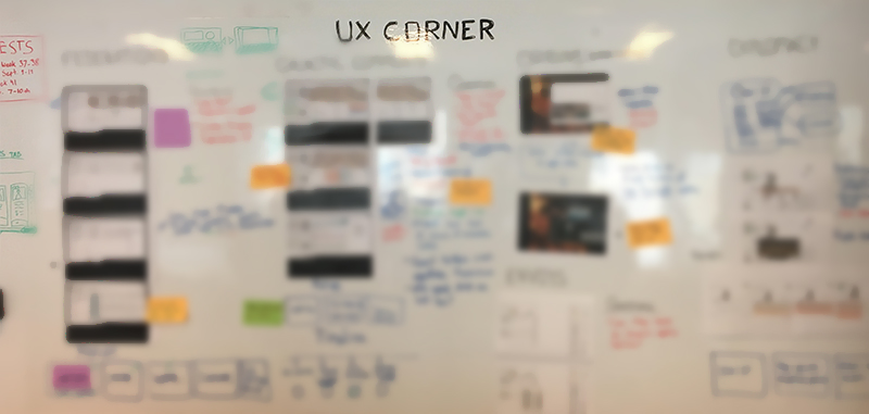
Whiteboarding: The UX Corner
Whiteboards are a great place for getting your ideas out quickly. When whiteboarding I try to get team members from multiple disciplines and rough out ideas, together. It’s a great way to discover gameplay and player needs, as well as find any potential development pitfalls early on.

We wanted to create a permanent space for this, and thus the UX Corner was born. Here we come together and iterate on ideas in real-time as a group. Having the permanent space has helped facilitate conversion and increased cross-discipline communication within the team,.


ijod8Lid9WhNsBPs1t7irsX6Oj2eStn5GmfQrAEOYW6DejLrt5yeDzY58pR-y6JQIRkYDx8i6gfnXtx9bLJvETvV87DwKzP9kH-SfaWvsKcvRls1zffzlpAQdZGAZneSeGyeF_co


Wireframing & Prototyping.
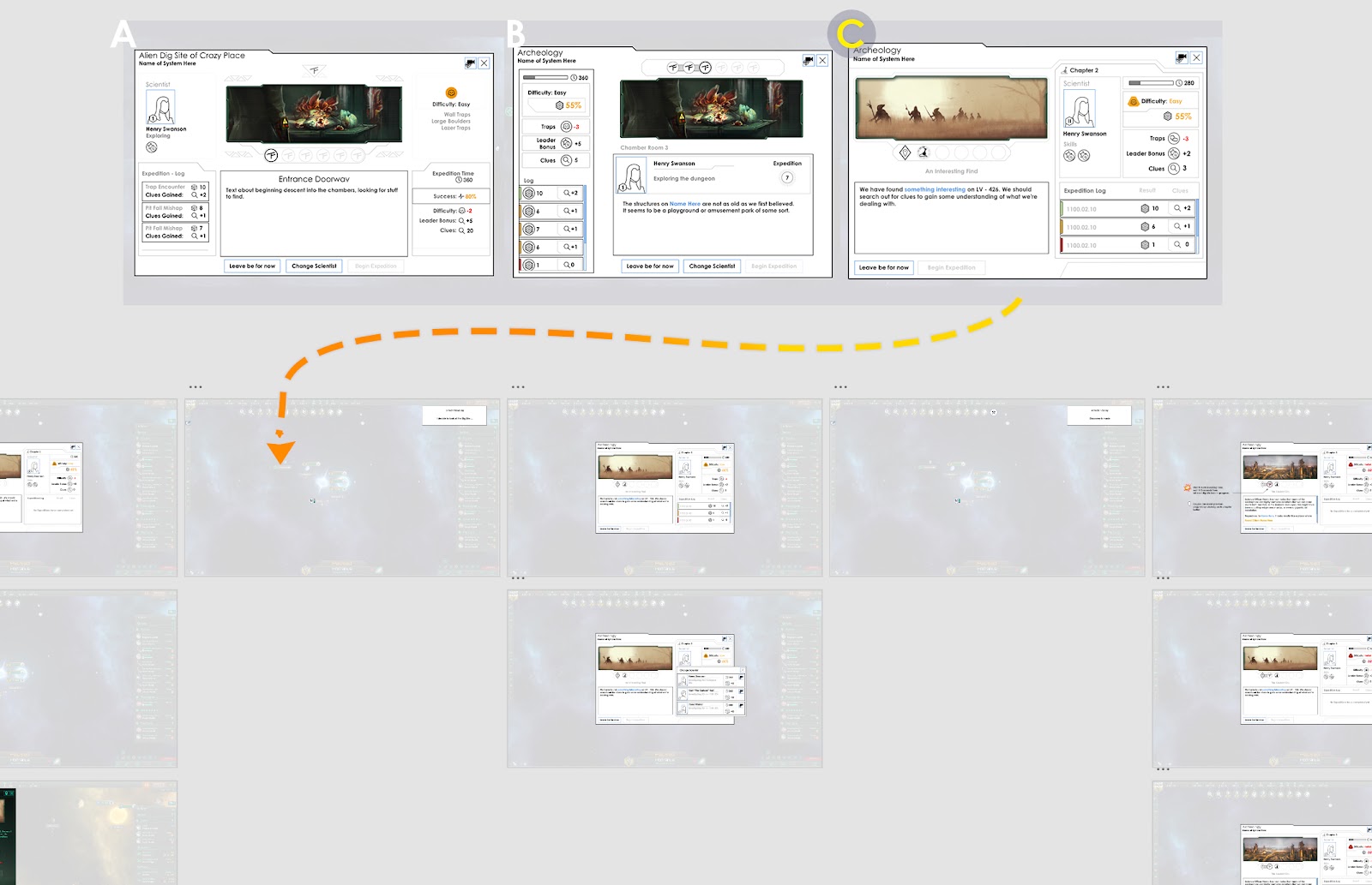
From the whiteboard sketches, I then move onto creating more detailed wireframes, the skeletal mockup of a UI design. Keeping your wireframes simple lets you iterate quickly, but more importantly allows you to nail down what content should be displayed, and how best to lay it out visually for the player.

I typically try to nail down one key screen, and from there I build out a User flow of the entire experience.

When Designing the Archeology UI for Ancient Relics, I had some key pillars I wanted to nail.

  • The stories are linked, and I can revisit past chapters for context. (Also experience the great artwork again!)
  • When I come back here, I have a sense of the progress my scientist has made.
  • The challenge of the site feels ‘game-y’.

Once I nailed an overall layout for the Archaeology UI, I then broke it out into a User Flow to capture the full breadth of a player’s journey while excavating a site.


HXhqPAfmMvuAI8JXM6Zuu0FlVFKfbu4lVxH7nJwOBJ_FRGbEz1YGR-8OdqJHh1q6rNNq6EYb4DcMhrtyTOTxCqraq7f_dRRdMnBFZxxcdHnDakrXXe-dIxU-BKPzK7CsO12AxtT5


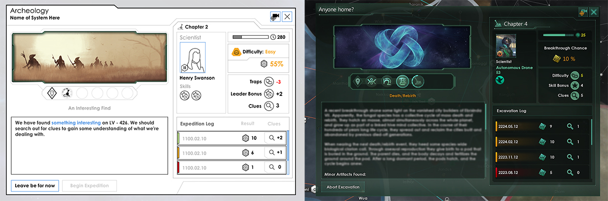
With the User flow complete I then link it up and create an interactive Prototype. The prototype allows team members to experience what we are trying to create before we set out to develop it. It’s a great low cost way to identify issues in the flow, and fix them here before investing in development.


IomaaXyi4recbbyNf_jM2z1tGRjrD0OkkWiG08OfKh4lSaN3qVh4I7Y1oS3F4-WtCcBbCULNa9FIMxd49JddaKcRzABnQWzfXoCInqzipkHan_HioASIhQ4djhmRvTlQQ-sG0TKM


After we agree on the UX design, we then get to finally create it in game. As you can see below, the design mostly held through to release. The text window was increased to accommodate larger story text, and ‘difficulty’ was changed to ‘breakthrough chance’ to help better understand the ‘die roll mechanic’.


ullUaf8HKlwVIzUWNbKN-J3_m7AAyzmTal-6C_AnRhBaVNB4rEQx8NbYItxI9ivkRi9n8yhxMdYyTDM1bgdel1ocmo97efIGZZZFxAIOBjgy4ObtkyNK20jUUdS2CXIzq-zUnEhZ


User Testing
So, even though the design has now gone through many gates, we must test our designs with players and iterate based on player feedback. Luckily Paradox has a great User Research department, and so we were able to run playtests and get vital feedback which we could respond to before launch.

----------

Well, I hope this was an informative window into how UX Design is done here on Stellaris.

Also, I read the forums and look out for your feedback as well. You all have been very helpful, so thank you for that!
 
  • 1
Reactions:
Interesting, thanks for sharing a bit of the thought process that goes into designing UX for Stellaris.

I think some may be used to dev diaries being solely discussions and timelines about reworks, fixes, new content, etc etc.. Lot's of people working on different areas of the game, I think it's cool we get to hear about stuff that usually isn't talked about.

My suggestion and request for the UI of the game: user customizable keybindings (I would like to assign F1 to the science tab for example)
 
With regards to testing for colour-blindness
I would be happy to help in this regard. I live in the United States. Stellaris has some pretty serious colour-blindness issues and I'd very much love to be involved in working with you and your team on them. PM me if you'd like. (And I signed an NDA with Paradox many years ago and would be happy to update one.)
 
Could you explain how this impacts the performance of Stellaris?

As I'm currently not playing Stellaris because of the poor late game performance, I don't see any value in a DD that does not discuss how performance will be improved.
 
I'll echo that the species page needs a full overhaul, it's pretty rough even before you get to Zeno difficulties.

Here's my chance to put in my usual request for message settings. We know that game has pop-ups for various events because they are shown to you the first time through. So pretty please give us the ability to decide if we want to see pop-ups. The notifications handle most everything well, but things like "ship or station under attack" and "your armies/navy has arrived at the system you sent them to and is now sitting without any orders" are rough. As of course is when planet modifiers run out.
 
Feedback, on the other hand, is always very much appreciated on this front and absolutely welcomed should you have any.

Hey,
Any plan to redraw the strategic ressources indicator, because it's always strange to have it red because of the lack of one of the ressources but not the others. Also it leads to too many click on it to know in which states are these ressources. Same history for research point even if it's a bit less important.
 
With regards to testing for colour-blindness and/or limited mobility, this is something that we'd absolutely love to do! This becomes tricky to accomplish, however, with restrictions that we cannot ask participants to give out information about any of these specifications due to GDPR regulations.
There are programs that simulate colour-blindness allowing a person with the normal vision to see how the image would appear to people with different types of colour-blindness.

Regarding mobility, do you do any objective interface evaluations? Such as measuring number of clicks, mouse distance traveled, area to process etc... to accomplish a fixed task. Improving those metrics will help people with limited mobility and it will also make things better for everyone. I find that many interfaces work fine in a simple case but in a real mid/late game they become very clunky and inefficient. Various gameplay mechanisms (such as sector/planet automation) attempt to work around interface shortcomings, but are you looking into improving the interfaces themselves?
 
Thanks for the blog, it's always interesting to see the behind the scenes thinking and processes.


One random suggestion that I would like to throw out, could it be made more obvious when a planet has potential rare resource deposits? I feel I need to do a lot of clicking to see where I can build my cheap refineries!

I dnt usually ^ This, but... ^THIS! its what, 3 levels of menu deep to see deposits? that's madness.
 
With regards to testing for colour-blindness and/or limited mobility, this is something that we'd absolutely love to do! This becomes tricky to accomplish, however, with restrictions that we cannot ask participants to give out information about any of these specifications due to GDPR regulations.

We'd have to investigate further on how this sort of testing can be conducted, but would likely involve outsourcing this - and ultimately not being as involved in the process - to an external agency based where this is not a limitation or restriction to the process.

Feedback, on the other hand, is always very much appreciated on this front and absolutely welcomed should you have any.
From a limited mobility perspective here are a few problems and some solutions on how they can be fixed, other ways are of course possible too:

1. Stars are really hard to click compared to provinces in the other games, I can often have like 30 seconds trying to access a system and if this is a multiplayer match during a war, then this might lead to lost ships and systems, so some sort of voronoi province like system would allow you not only to have a larger area to click but see where the area ends.

2. The left hand menu can either lock closed or not lock at all, it is much easier to click it for me when it is opened, but if I accidentally go a few pixels out when trying to push the buttons before coming back to the area where the buttons just were the bar has now closed, making me redo the whole procedure of opening it up and trying to press the right buttons again, perhaps several times. Being able to lock it in either open or closed versions would be a way of solving it.

3. Both outlier objects and number shortcuts can help you find things, usually this comes to a very zoomed in view of a system and/or a menu though, going back often necessitates finding other buttons this can be a problem especially during stressed situations when needing to move a fleet to a system. A simple solution would be alternating between galaxy-, system-view and relevant menus, where every click would bring you to one of the three centered on what you're selecting, but not leaving you in a rabbit hole of menus that will take time to get out of.

4.The previous one dealt with the functions of the outlier and the control groups/number shortcuts, however marking the unknown is not a function of it though for navigation it probably should be, scrolling the view is not as easy for everyone and while some is acceptable for my level, cutting down on it is a good thing. Being able to mark areas of interest regardless if you have discovered it or even even if there is nothing there to return to the view quickly would be a good tool to avoid feeling lost most of the time.

Hoepfully this feedback helps and is in the right place.
 
if the game doesn't recognize that I was holding shift.

I've never had this problem with the game, and I use shift-click extensively - maybe it's your keyboard? I know sometimes I get some crumb or something underneath a key of my keyboard and then that key doesn't always register (because the key doesn't always physically depress enough to trigger), cleaning it out now and then may help your issue.
 
I've never had this problem with the game, and I use shift-click extensively - maybe it's your keyboard? I know sometimes I get some crumb or something underneath a key of my keyboard and then that key doesn't always register (because the key doesn't always physically depress enough to trigger), cleaning it out now and then may help your issue.

It may be my keyboard, or more likely it may be my operating system. I'm not saying that it's the game's fault that shift-clicking doesn't work for me with an acceptable degree of consistency (I also have this problem in other games), just that having another option for queuing fleet commands would help me immensely.

Also, I agree with a lot of the other UX feedback in this thread, particularly message settings, outliner and other rebindable keys.
 
We'd have to investigate further on how this sort of testing can be conducted, but would likely involve outsourcing this - and ultimately not being as involved in the process - to an external agency based where this is not a limitation or restriction to the process.

Feedback, on the other hand, is always very much appreciated on this front and absolutely welcomed should you have any.

Thank you.
 
When you rework the species tab, please include the slave market and make it usable and searchable. I would love to buy some xenos for my mines, but that window doesn't make it easy.
 
Stellaris has a great UI, though there is always something that can be improved. I created the designs for the updated Planet View, for example. I'm on the look out for community feedback on features, though. You all help give direction on what to improve, and how.
Something that could be improved is the functionality where you use a keyboard modifier to increase the quantity of a resource on the market, empire trade, jobs and fleet manager screens.

These need to be consolidated and unified, in my opinion. There are four different methods in each place that this functionality appears.
  • Fleet manager doesn't have a keyboard modifier at all, and needs one
  • Market doesn't have a keyboard modifier, but instead offers five possible transactions.
  • Empire trade and jobs both use different shortcuts for essentially the same functionality, iirc.
 
Well, I appreciate the chance to spoil the fun by reading some details from a screen ;]

SPOILER WARNING

btw is this event currently in the game?


Attachments

  • Bez tytułu.jpg
    Bez tytułu.jpg
    154,6 KB · Views: 122
Well, I appreciate the chance to spoil the fun by reading some details from a screen ;]

SPOILER WARNING

btw is this event currently in the game?
In order of [???], best of my interpretations
  • "mass" seems to be right
  • "hatch" en masse, "almost" simultaneously "across" the whole planet
  • "linked" seems to be right
  • spread out and "reclaim" the cities built and abandoned by the previous "died-off generation"
  • nearing the "next" death/rebirth event
  • no clue for a bunch
  • the "body" "decays", and "fertilizes" the ground around the "pod/pool" (not sure)
  • the pods "hatch" and the cycle begins anew.
 
May I ask what software are you using to make an interactable prototype? Me want.

Another big question: will we ever get custom hotkeys? In any of Paradox games? Is there a technical reason they aren't implemented yet?

I use Sketch and Adobe XD. Sketch right now has basic functionality, but with XD you can set up transition animations as well as test your designs with a controller.