
written by Pavel Golovii and David Strömblad Lindh
Hello! My name is Pavel Golovii, I am a concept artist from the art team that has worked on the Stellaris Aquatics Species Pack. I am going to highlight the process of developing ship designs from a concept artist perspective. I will talk about the initial ideation process, inspiration, visual language and defining the look of individual ship classes.

Brief
The work of a concept artist is to suggest a clear visual interpretation of game aspects often based on initially vague ideas and definitions. At this very first stage our goal was to probe for the style for the aquatic ships, invent a sort of a visual language that we then could use to create the entire aquatic ship set that would also fit the existing Stellaris universe. Our art director, Simon Gunnarson, articulated main pivot points for the concept art team. The ships' style had to convey the aquatic and sentient origin of the species that built them and yet artists should avoid too literal interpretations (e.g. converting sea animals into a spaceship). While striving toward non-traditional organic forms we also had to clearly show they are artificially created. These statements served us as navigation beacons leaving a very broad fairway for our art experiments.Inspiration
Starting a new concept work can be both exciting and intimidating. As a first step I try to get more information on the topic as it helps to feel myself on solid ground and start off. I had some starting advantage because long before participating in the project the underwater world theme was already part of my interests and passion. Being a seasoned diver and amateur underwater photographer gave me a lot of personal emotional experience and fueled my work. A lot of inspiration I gained from modern architects like Zaha Hadid and Santiago Calatrava. Their works are a great example of organic form interpreted as constructive elements. And of course nature itself is an inexhaustible source of ideas.
Radiolaria drawings by Ernst Haeckel(left) became an inspiration for many ships’ elements, including the titan's bow gun. Modern architecture and design gives great examples of organic form interpretation(right).
Finding style
Starting from big design entities I try to find what proportions, shapes and patterns would distinguish the ships of aquatic species. Will they be thin and streamlined or bulky and rounded? What associations does that particular form bring up to the viewer? We already have Molluscoid species in the game and they are somewhat related to the aquatic theme. So it was critical that new designs are read as different and do not utilize the same shape language.
Early ship style exploration sketches by Pavel Golovii.

Style exploration sketches by Mattias Larsson.
Once there is an understanding that large shapes and proportions are settled and work well for the theme, smaller elements need to be explored next. This is like enriching the visual vocabulary that will later be used to ‘write the whole story’ - designs of all the ship classes. Many details like windows, engines, and greebles are going to be shared across ship classes. This helps to propagate style and contributes to better scale perception. A detail that is perceived as a viewport should be approximately of the same size both on a battleship and a corvette. Thus another important step is to test how these elements work for different ship sizes.
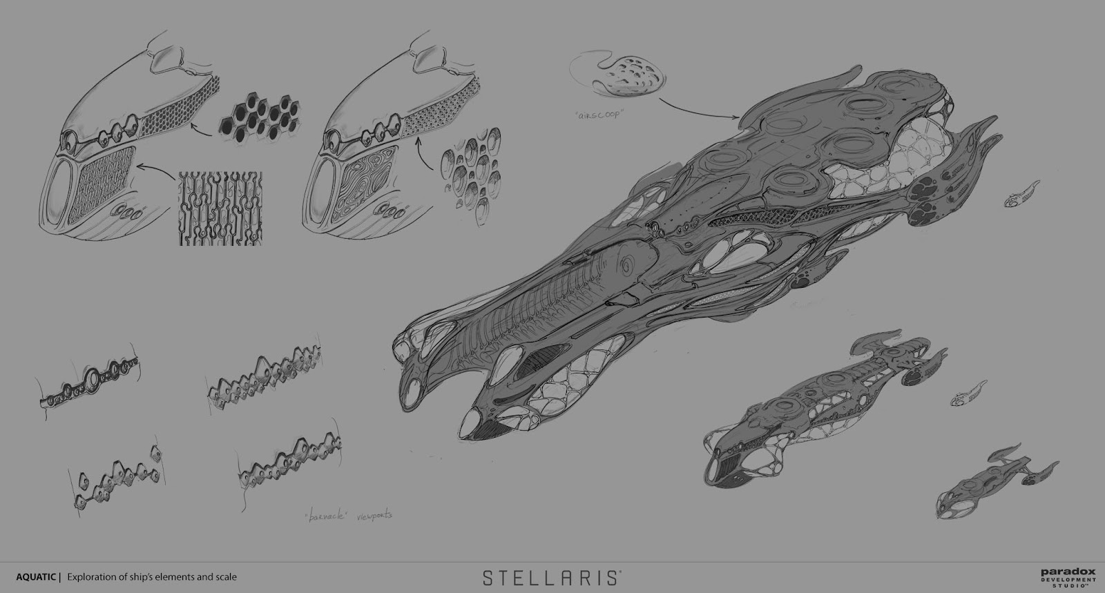
This sketch sheet by Pavel Golovii shows exploration of various elements like viewports and also an attempt to get the feeling of scale for small, medium and large ships.
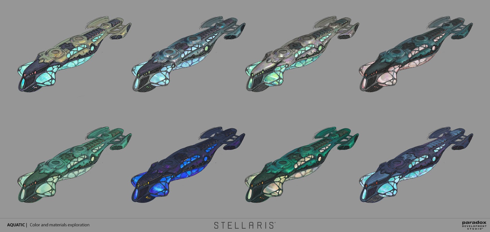
Material and color exploration sketches by Pavel Golovii.
And last but not least comes color and material explorations. At this stage I try to figure out the set of materials that is going to be used for the ships. What the primary and secondary plating may look like? How large is the area a specific material is going to cover? What texture is going to be used for that plating and how it looks when adjacent to another material? These kinds of questions I need to give an answer to in my sketches. Here concept artists work in close collaboration with 3D artists. As the look of the materials is quite dependent on the game engine it is good to test the possibilities and limitations both from artistic and technical points.
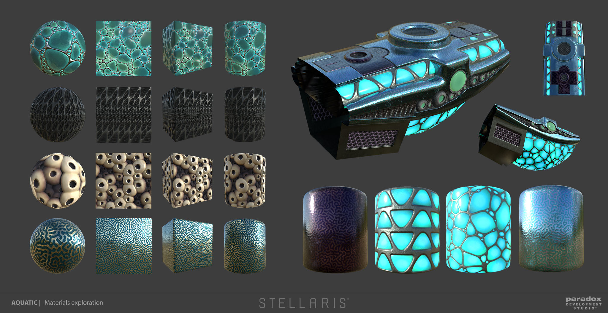
Material explorations done by 3D artists Anton Hultdin(left) and Tim Wiberg(right).
All the artistic findings during the style development stage are finally wrapped up by the art director into a style guide that becomes primary but not the only reference for the next step.
Designs of ships classes
Once the visual language is defined it is time to ‘write the story’ using that language - build design for each ship class. This is where each class should get its unique look within a given style and where more rules and restrictions apply. Ships consist of several interchangeable modules and each module has its own set of gun mounts. Modules should have seamless joints to each other and gun mounts have their specific fixed size - all that needs to be taken into account now.
Cruiser concept by Pavel Golovii. This is a work in progress showing all module designs. Orange lines represent seams between modules. The corvette drawings(left) are there to keep control over scale perception.
As each ship class has its unique characteristics, it is important to show that in their appearance. Agile corvette differs from heavy titan not only by size, but also proportions, silhouette and unique details. Proportions and silhouettes are something that a viewer reads first, especially when a ship is observed from a distance, which is a common case for Stellaris. So it is important to put distinction at this level. Some elements may help to further differentiate a ship from other classes and tell more about its purpose.
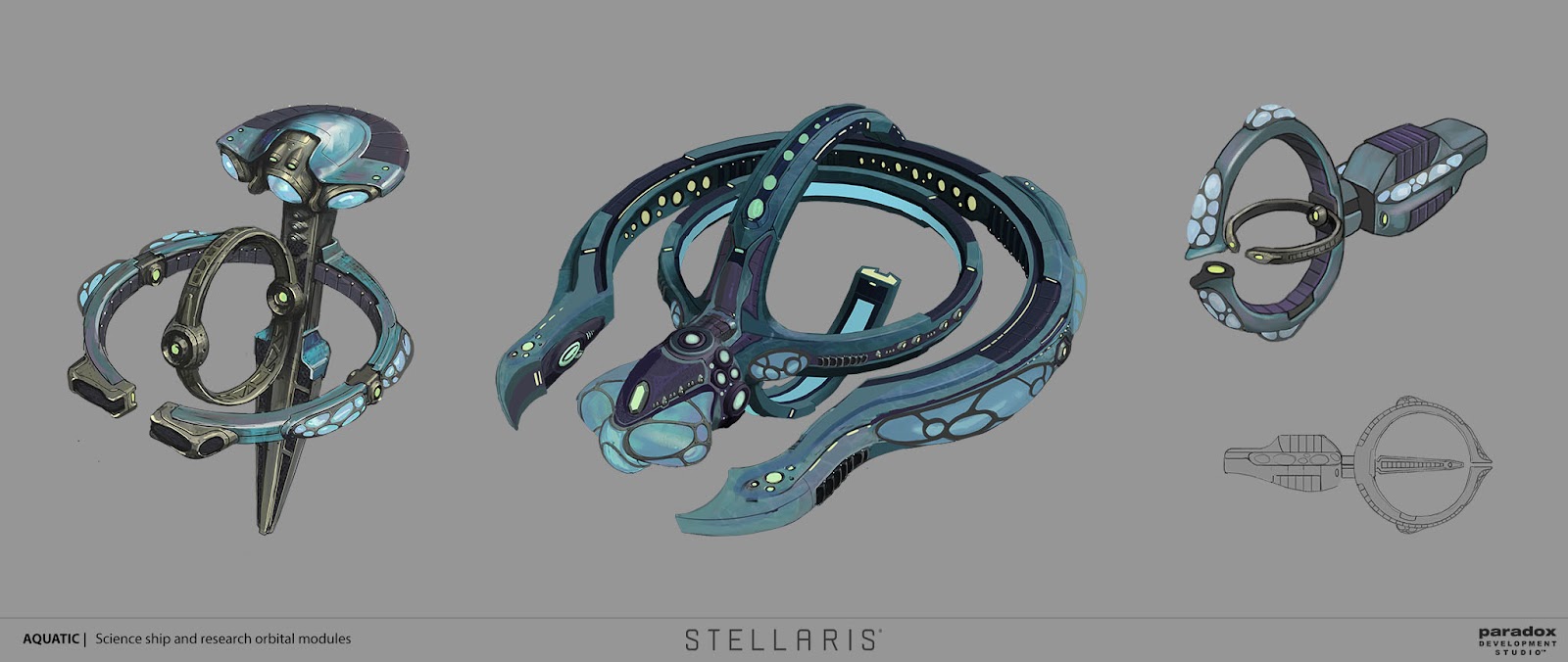
Rotating circular element initially designed by Mattias Larsson for the science ship(center) became a distinguishing feature of other science related structures like the research station(left, by Pavel Golovii) and starbase’s science module(right, by Anna Windseth).
Given the theme, in the design of many elements marine life motifs were used. The hard part of the job is to do that in a subtle, balanced way that would bring a viewer a certain association but would not feel too on the nose. It is good to make a titan ship reminiscent of a big whale shark, but it should not look like a shark and it must keep the sense that ship was manufactured rather than has organic origin. Ideally a viewer should read that on some subconscious level, without explicitly naming the association.

Initial sketches of the titan ship class used whale shark and manta ray motifs. In the process the titan got a different look for the front gun but the ‘manta’ motif was used for the construction ship design(the leftmost image). Sketches by Pavel Golovii.
Work of a concept artist is not only about how things may look, but quite often it is also to answer ‘how it may work’. The aquatic colossus class design is quite ambitious with tentacles as its most prominent feature. A lot of effort has been put into figuring out the mechanics of the tentacles, how they bend and draw out. To prove the mechanics a 3D model was created and animated. Also colossus is supposed to have quite intricate special effects so sketches of them were included in the concept sheet to serve as a starting reference for our VFX artist.
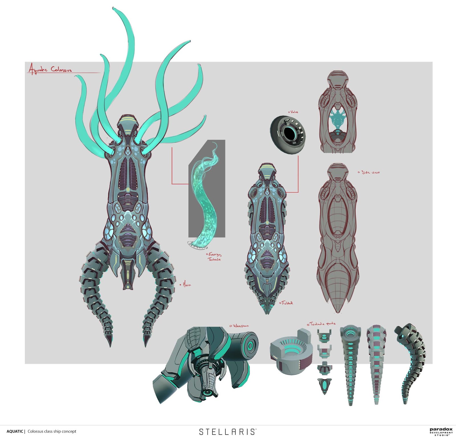
The colossus class ship designed by Mattias Larsson. The concept sheet contains sketches of VFX and a detailed breakdown of the tentacle construction(lower right corner).

Proof of tentacle mechanics in 3D software. Done by Mattias Larsson together with Hanna Johansson.

Proof of tentacle mechanics in 3D software. Done by Mattias Larsson together with Hanna Johansson.
Not only ships
Arguably, ships are key actors of the Stellaris game, sharing that title with characters. But the inhabited part of the game’s universe is full of static man-made objects - space stations, that also play an important role. Design-wise they can be regarded as ship’s direct descendants as they inherit a lot from their look and share the same style. Yet development of stations has its peculiarities. These are static objects orbiting a planet or a star and that must be reflected in their proportions and shape that tends to be more weighted toward its center and is not pointed to any direction. Also, some of the station types have a layout that changes and gets more complicated by the addition of modules with various functionality.

Star base design made by Anna Windseth. These drawings show the station's structure and how it evolves from an outpost to a formidable citadel. Radial symmetry helps to underline the static nature of this object.

Mining station concept by Pavel Golovii. The silhouette of this station is supposed to bring association with a factory and hint on its industrial appliance.
Is there life after the concept is done?
Once the concept is done and approved by the art director it is then passed on to 3D artists for modelling, texturing and material setup. This could be an artist in an outsourcing company. In that case a concept artist can not communicate directly with a 3D artist and the concept sheet should be as detailed as possible to minimize the chance of misinterpretation and extra feedback. It is a bit different when the ship is planned for production inside Paradox studio. That gives a concept artist a chance to collaborate with a 3D artist directly by providing instant feedback and additional information that he may be asked for. That also means a concept artist can be more loose in rendering and detailing his artwork.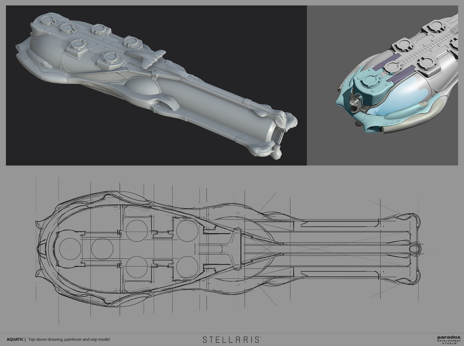
Additional top-down drawing and paintover of the stern area requested from a concept artist for the titan ship. The model is made by Abraham Gomez.
There is a lot more that can be covered about the ship design process but this goes beyond the format of the diary article. I hope the reading was of some interest and most importantly I hope you will enjoy the ship designs in the upcoming Aquatic species pack! Below are some more concepts for you to help pass the time until the pack is released.
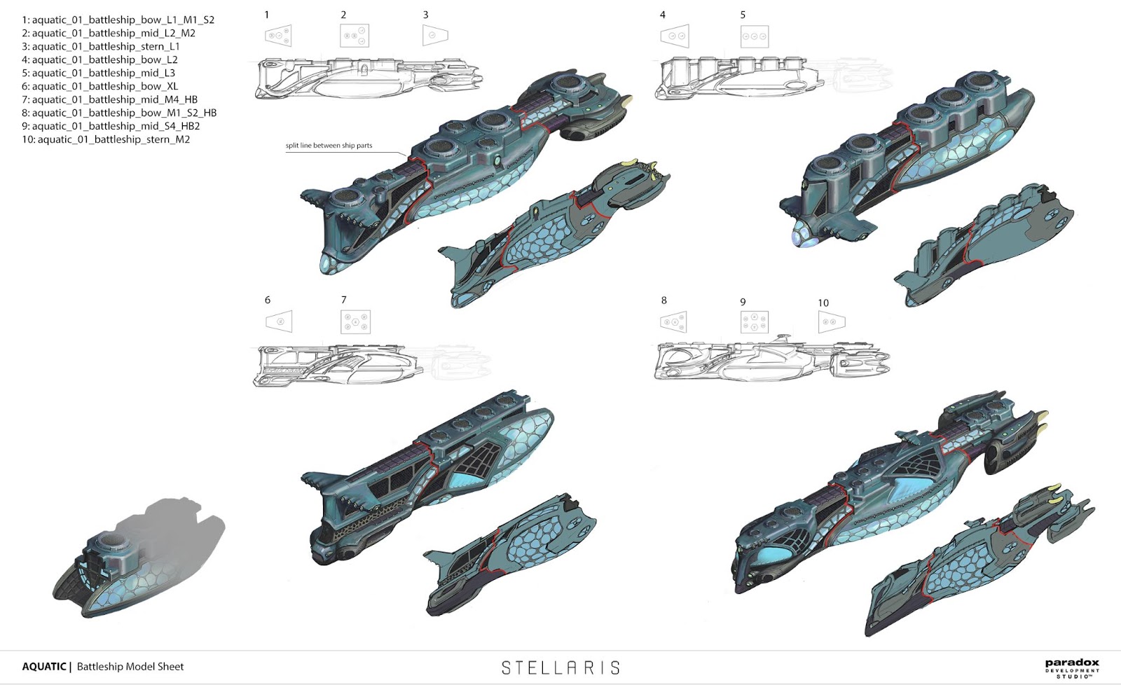
Battleship concept by Pavel Golovii.
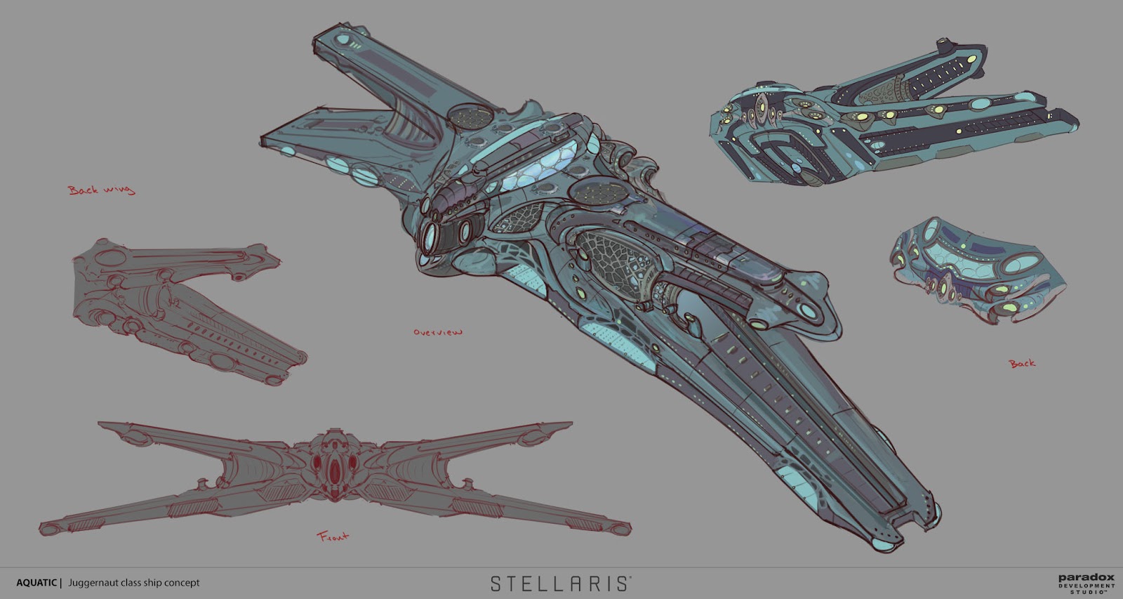
Juggernaut concept by Mattias Larsson.

Cruiser concept by Pavel Golovii.
Modelling the Aquatic Dragon
My name is David Strömblad Lindh and recently joined the 3D art team for Stellaris after completing my internship at Paradox Development Studio.My task was initially to re-skin the texture set for our already existing dragon. Instead our art producer came up with the brilliant idea to create a small team to work with the dragon, a kind of strike force, consisting of multiple disciplines within art and game design. Putting people with different skills together to work closely in an early stage, created closer communication and reduced the gap between the roles.
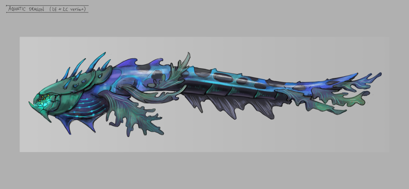
My work started parallel with the concept artist being a part of a mini pre production. Pushing what we think our engine can handle, testing out ideas in game to see what limitations we have with the shading and lightning. Then roughly block out ideas in 3D with the mindset that anything can be scraped to avoid spending any significant time on any part. What works on a flat 2D concept might not work in full 3D.
To come up with an idea of how the dragon should look like we started with what we already know from the Aquatic artstyle and combining it with the lore of the dragon. We wanted to create a godlike dragon that comes from another galaxy. It has to be a central part of the system it lives in.


(1) Highpoly sculpt with topology ready for more details. (2) Sculpt with medium sized details added. (3) Lowpoly model with baked information from highpoly with added details. (4) Final textured model with placeholder for VFX.
It’s important to get a feeling for how the final product will look and that's why it's important to get a model into the game as soon as possible. Even if it’s only a first draft of a lowpoly model with badly baked textures you will get a feeling of how the lightning in the game will affect the model. From that point it’s easy to iterate on the model continuously exporting and reviewing the changes in the game. That way you avoid spending a lot of time on a model and then in the end realize the model doesn't work.


When working from home it’s more important than ever to break your own vacuum and communicate with the rest of the team. The same way I worked close to the concept artist I want to continue working close to the VFX artist and animator that will continue the work after me. So I don't create something that will make their job harder but instead prepare the model to make their job easier.
This kind of work is what makes working as a 3D artist on Stellaris interesting. I’m not only producing ship after ship but is also being challenged with tasks outside my comfort zone.
----
See you all next week, when we will talk some more about the art process for the aquatic portraits.


