• We have updated our Community Code of Conduct. Please read through the new rules for the forum that are an integral part of Paradox Interactive’s User Agreement.

Victoria 3 - Dev Diary #74 - UX Improvements

16_9.jpg


Hello, my name is Henrik, and I am one of the UX Designers on Victoria 3. For 1.2 I have been fully focused on improving the user experience of the game. Before we go into the details of what has been worked on for this update, I want to give a special thanks to the community, all the modders, and anyone who posted feedback here on the forum, Discord, Reddit, Youtube, or any of our other communication channels. Your feedback, ideas, and discussions have all been instrumental in helping the team prioritize our time and efforts for this update.

Trade Routes​

One of the first things we started with immediately after 1.1.2 was improving the usability of the Trade Routes panel. In addition to the current view of grouping Trade Routes by Goods, you can now get a sortable list of all Trade Routes in the Market, or get a view where they are grouped by Country. All of these lists can also be filtered to exclude any Routes not owned by you. The Country grouping is especially useful when setting up Embargos or Trade Agreements.

DD74_1.png


DD74_2.png

Message Settings​

Our new Message Settings window lets you decide how you want a specific Notification to be displayed, and if you want the game to automatically pause when it gets triggered. In future updates, we are planning on expanding this to cover more functionality, like the Current Situation panel, Alerts etc.

DD74_3.png

Parallel to adding Message Settings, we also made a pass on making sure that the Notifications we post to the player are informative and have a reasonable default setting for how to present them. Among the tweaks we have done are:

  • Make the “Interest Activated/Deactivated” Notification into a “You can now conduct Diplomacy with X” Notification that only triggers if the activated/deactivated Interest is the first/last one that overlaps with any of your Interests
  • Moving the Price Report to the Market Panel (turned off by default, can be turned on in the Message Settings panel)
  • Splitting up Trade Routes Notifications into significant and less significant versions (Significant is turned on by default, less significant is not)
  • Only show “Mobilization” and “Declare Neutrality” Notifications if you are committed to the Diplomatic Play in question
  • Only show resource related Notifications if they happen in your Market (previously Strategic Regions in which you have an Interest in)

All of these changes should, according to our benchmarks, reduce the number of Notifications by roughly 50% for most Countries. In addition to this, we have also tweaked the animations for the Notification feed, so the overall user experience of the entire system should be much improved.

Rebindable Keys​

Our shortcut system has been replaced by a new system that can leverage rebindable keys. When adding this new system also made a pass and added a few more shortcuts, as well as hooked in a few existing ones in more places.

DD74_4.png

Pop Needs​

Another fully reworked panel is the Population overview, which now gives you more information about who your Pops are, how many they are, how much money they make, what they spend it on, and how much that goes to increasing/decreasing their Standard of Living (the last one not included in the screenshot, but visible without scrolling when the Taxes and Needs sections are collapsed).

DD74_5.png

In addition to creating this new panel, we have exposed more information in the Pop Lists used throughout the game, and improved a few of the Pop Need tooltips. They should now surface more of the relevant information higher up in the information hierarchy. We also exposed the top five Goods a Pop spends money on in this list, inspired by the Visible Pop Needs mod by Apprehensive-Tank213

DD74_6.png

Economy​

Martin has already discussed some of the changes regarding Construction in DD #71, and in addition to these changes we have improved the user experience of the gameplay loop by providing better contextual information in several places. For example, we have added Infrastructure, Available Labor, and Qualifications to the Map List that is shown when expanding Buildings. In the screenshot below you can also see that we have restructured the layout of the Map Interaction panel to make it possible to navigate directly to another panel, which in the case of the Construction Interaction is the Building details panel for the specific Building. This layout also allows for more reasonable tooltip positioning, making it easier to navigate into a nested tooltip without accidentally opening another tooltip when moving the cursor towards the tooltip you wanted to dig into the details of.

DD74_7.png

The most recent improvement that made it into the game is the Reset Production Methods Map Interaction, a PDT project by our Lead Designer Mikael and myself. It should make it much more efficient to streamline the production in your Country, which is especially useful if you have just acquired a few new States. This is currently somewhat of a work in progress, and we are hoping to expand this to work on Buildings and Building Types in the future.

DD74_8.png

One of the most popular mods for the game is currently Visual Methods by FUN, a mod that we liked so much that we decided to make our own, slightly tweaked, version of.

DD74_9.png

The Investment Pool is now being more prominently displayed in the Buildings panel.

DD74_10.png

The tooltips for Market Access have also been improved to give more detail as to why a State is not fully connected to the National Market.

DD74_11.png

Radicals and Loyalists​

We have improved the presentation of why your Pops turn Radical or Loyal, who they are and which Interest Groups they belong to. Information regarding this has been exposed in several tooltips and panels, like the Interest Group panel.

DD74_12.png


DD74_13.png

Convoys​

Your current Convoy balance has been added to the Top Bar, making it much easier to keep track of and access when needed. This item will be hidden for landlocked Countries and unlocked as soon as you gain access to a coastline.

DD74_14.png

Map Modes​

We have added three new Map Modes (Literacy, Population and Infamy), and given the transition between two Map Modes a configurable fade in/out to make it smoother. One of the first mods I personally subscribed to at release was Practical Heatmaps by Ronin Szaky, and an ever-so-slightly tweaked version made its way into the base game in 1.2.

DD74_15.gif

Diplomacy​

For Diplomacy, we have improved how we show AI Acceptance and signal more clearly if offering or using an Obligation would convince them to accept.

DD74_16.png

We have also exposed all types of Diplomatic Plays on the Country details panel, not only the ones you can currently start, making it easier to figure out what is blocking you from starting a particular Play.

DD74_17.png

Military​

When it comes to the Military system, the focus for the UX improvements in 1.2 has revolved around making it clearer how the Battle systems work. We approached this by exposing more data related to Battles, as well as, improving some of the tooltips presenting breakdowns of the calculations involved. Some effort has also been made to decrease the amount of visual noise from multiple Front Markers.

DD74_18.png

Work in Progress tooltip for the breakdown of the initial number of troops each General was able to bring to the Battle.

DD74_19.png

We have also surfaced the information regarding which HQ a Commander considers their Home HQ and made some improvements to the information presented in the Naval Invasion user flow.

DD74_20.png


DD74_21.png

Outliner​

The Outliner has gotten some polish, with pinnable Goods and non-Military Characters being the biggest additions. Interest Groups are now showing their Approval value, and States show their Available Labor and Qualifications.

DD74_22.png


DD74_23.png


DD74_24.png

Tech Tree improvements​

The Tech Tree Improvements discussed in DD #70 also made it for 1.2.

Closing words​

In addition to all of these changes listed above, we have also made over 100 smaller UX tweaks and bug fixes, which you will either have to wait for the full patch notes to explore, or experience for yourself during the Open Beta. Once again, thanks for all the feedback, it really helps us make the game as great as it deserves to be!

Next week, Martin will be showing us diplomacy improvements coming in 1.2!
 
Last edited:
  • 125Like
  • 105Love
  • 7
  • 3
  • 1
Reactions:
1) That is correct! This is the tooltip for it:
View attachment 946064
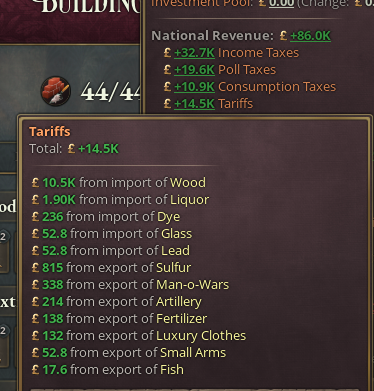
Great, thanks for the clarification! My only wonder is whether the most informational indicator is "trade revenue after tariffs" or simply "tariffs" (which is what I meant). The first indicator is just what the shopkeepers earn in the trade center (good for them), but the second is what the public budget is getting out of the trade, which maybe I care more as a strategic player.

Usually I spent a lot of time looking at this tooltip below (other people too?)... maybe it can be incorporated in this screen you are showing so it can be seen more directly.
Screen Shot 2023-02-09 at 23.05.15.png
 
Last edited:
  • 5
  • 2Like
  • 1
Reactions:
What is the fascination with buttons that appear to be not needed.

In this pictures we have added the + in square button a few places such as in the Construction Interaction panel that you presented. Currently it appears this button serves two purposes that can be moved from the button and just put onto the row to which the button was attached. These actions are add building to queue and as an anchor/target for the tooltip. Is there reason we couldn't just remove the "+" button in these cases saving some real-estate and just click the row of information?

The tooltip and button action works for the things on the top bar, I don't need an extra indicator the pound and +7.35K (note: this K should be lower case) to be able to open the budget screen or see the tooltip for it.

DD74_7.png

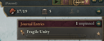
Same here with the Arrows, in this case if I click on fragile Unity it opens the panel about it, but I just cannot click the Journal Entries bar but need to click the arrow. Same with e construction information, please let me just hit the bar.
1675983477227.png

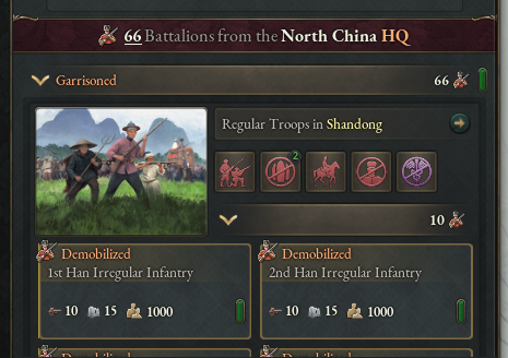
This can also be seen in the general/admiral panel when looking at the battalions/flotillas where clicking the picture and the bar that has arrow button could have been enable as the target area for click. Interesting thing here is that we can click the whole box for the individual battalions and it takes us to the Barracks in Shandong (and has a context menu to increase / downsize barracks).
1675984827185.png

The last type of button that I will mention is the "Go to Details screen" buttons in tooltips clicking on the area that you hover to get the tooltip should perform that action. Don't make me lock the tooltip (wasting time or adding another click), move to the button and then click.
 
  • 7
  • 4
  • 2Like
Reactions:
Great changes but I think this also needs addressing as per the new law changes. Playing Command Economy as a communist country becomes impossible. It goes like this:

Vanguardist forms a Communist Party. Vanguardist wants to make command economy. Command economy required autocracy. Autocracy disables parties. Therefore, Communist Party abolishes itself when it passes its own laws. A little absurd and game breaking IMO.

How to fix: allow parties to exist in an autocracy UNLESS autocracy is an absolute monarchy, chiefdom, or theocracy. An autocratic Council Republic will still have parties, but the ruling party cannot change. Or, alternatively, parties outside of government are disallowed and disabled under autocracy (but ruling party stays, as long as it is a Republican government). Since the ruling party is an ideological umbrella group of interest groups, these interests groups can come and go in government while the Party cannot.

This not only fixes the problem illustrated above, but gives more playthrough difference between an autocratic republic and an autocratic monarchy.
 
  • 4
  • 2
  • 1
Reactions:
What is the fascination with buttons that appear to be not needed.

In this pictures we have added the + in square button a few places such as in the Construction Interaction panel that you presented. Currently it appears this button serves two purposes that can be moved from the button and just put onto the row to which the button was attached. These actions are add building to queue and as an anchor/target for the tooltip. Is there reason we couldn't just remove the "+" button in these cases saving some real-estate and just click the row of information?

The tooltip and button action works for the things on the top bar, I don't need an extra indicator the pound and +7.35K (note: this K should be lower case) to be able to open the budget screen or see the tooltip for it.

DD74_7.png

Same here with the Arrows, in this case if I click on fragile Unity it opens the panel about it, but I just cannot click the Journal Entries bar but need to click the arrow. Same with e construction information, please let me just hit the bar.

This can also be seen in the general/admiral panel when looking at the battalions/flotillas where clicking the picture and the bar that has arrow button could have been enable as the target area for click. Interesting thing here is that we can click the whole box for the individual battalions and it takes us to the Barracks in Shandong (and has a context menu to increase / downsize barracks).

The last type of button that I will mention is the "Go to Details screen" buttons in tooltips clicking on the area that you hover to get the tooltip should perform that action. Don't make me lock the tooltip (wasting time or adding another click), move to the button and then click.
Agreed with all of this, especially the new construction bar; I wish we could just click on the icon to go to the type of construction we want to access, rather than having to click the unnecessary arrow and then sometimes have to click again to switch to the construction queue we want.

And re: the army menu, is there any reason why those boxes have to be so large with so much empty space? the amount of space above and below the information in that infantry box makes it so much more of a hassle to see the information that we need, its height could easily be halved while portraying the same information. That "waste of space" is a kinda common complaint I have about the UI, but the army screen is almost certainly the most annoying example for me.

Edit: For the person that respectfully disagreed with me, what's wrong with having functional buttons and efficient use of space?
 
  • 2
  • 2
  • 1Like
Reactions:
Loving the new redesign, but noticing an issue with the beta - None of the interest groups seem to back cooperative economy, so it can't be passed into law. Labor Unions, Communist, and Anarchist ideologies do not support it, so wonder if there is something I am missing, or if this was an oversight for this beta?
 
  • 4
Reactions:
Pop Needs

Another fully reworked panel is the Population overview, which now gives you more information about who your Pops are, how many they are, how much money they make, what they spend it on, and how much that goes to increasing/decreasing their Standard of Living (the last one not included in the screenshot, but visible without scrolling when the Taxes and Needs sections are collapsed).
So, I see better mapping of "this good is being bought this much". But I'm not seeing so much of "these goods are being bought to service this need". For example, we can see that pops are buying services, transportation, and automobiles, but not how that fits into their free movement needs. This I think still needs to be addressed, because it is effectively (if not actually?) impossible right now to work out "okay, I can reduce the price of good A by making more of good B to meet pop needs". I can see that pops are buying a lot of liquor, but the gap from "liquor is expensive" to "I don't actually need more liquor, since I can address the intoxicants need with other goods and allow my grocers to focus not on liquor" has yet to be bridged it seems.

and given the transition between two Map Modes a configurable fade in/out to make it smoother.
Oh thank god it's configurable because I did not personally like that gif you shared of the fade-in. But I am glad to see new maps, and many other changes!
 
  • 2
  • 2
Reactions:
Here's a question for the devs: When are you going to fix the utterly atrocious map problems there are in the Pacific Northwest so I can start playing the game finally?
 
  • 3Haha
  • 3
  • 1Like
  • 1
Reactions:
Would it be possible to create a menu where we can see all the possible trade routes I can make for just 1 specific country?

Example: I want to bring Portugal into my market, so I want to increase trade volume with Portugal specifically. Currently I have to go through every single good and look for Portugals name on the list, a highly tedious process. It would be better if I could see a list of what's most profitable between my country and Portugal. So I might see that the biggest profit between our markets will be fabric, followed by dyes, followed by Steel, and I'd accordingly make those trades.
 
  • 5
  • 1Like
  • 1
Reactions:
A small (but beautiful?) request for the Population tab. The Taxes dropdown is currently sorted by size:

DD74_5.png


I find this a little bit annoying since I have to actually read the labels, which is an extra mental step when comparing strata or considering tax changes.

I think it would be better to sort the taxes in alphabetical order. That way, any player with more than a few hours' experience would be able to get the info at a glance (reading the labels would not be necessary) and can easily compare strata. New players would be no worse off.

I completely understanding sorting by size for longer lists (such as the Population Needs list), where you want to make sure that people don't have to scroll for important items. But this is only a three-item list, so that's not an issue here.
 
  • 7
  • 1
Reactions:
This is a great list of changes, and I'll need to look at pops more in the beta (I never noticed those changes).

Great, thanks for the clarification! My only wonder is whether the most informational indicator is "trade revenue after tariffs" or simply "tariffs" (which is what I meant). The first indicator is just what the shopkeepers earn in the trade center (good for them), but the second is what the public budget is getting out of the trade, which maybe I care more as a strategic player.

Usually I spent a lot of time looking at this tooltip below (other people too?)... maybe it can be incorporated in this screen you are showing so it can be seen more directly.
View attachment 946073
They are currently talking about pop revenue. In my beta game the numbers went negative when I increased tariffs.
 
  • 1Like
  • 1
Reactions:
On both Mac and Windows(DX12), my keyboard pause isn't working, whether the original space or rebind to anything else. I don't see other people complain that, am I the weirdo here:eek:?
 
  • 1
Reactions:
Yeeeees. More ways to make it easier for Greater New York [All States Independent mod] to absolutely dominate the world! I do have a few suggestions, though:

(1) Make an incorporation map mode. Dark red for not incorporated, light red through light green for currently incorporating, and dark green for fully incorporated. No, it's not usually an issue, but as Greater New York I have over a hundred states scattered around the world, so it'd be nice to see at a glance where I need to hit the Incorporate Now button.
(2) When listing radicals and loyalists, please include the percentage that's radical/loyalist instead of just the absolute number. Some countries lean more towards one poptype or another, so percentages make it easier to see what needs work and what doesn't.
(3) If you're making a green/red map for which nations accept a diplomatic offer, why not make obligation-only acceptances yellow instead of green?
(4) Include the rank icon for "Select general for naval invasion". Surely I'm not the only one who uses Promote Officer to designate who's best in combat!
 
  • 1
  • 1Like
  • 1
Reactions:
What is the fascination with buttons that appear to be not needed.
The main reason is "Players more often than you think miss that some buttons are buttons". We saw this time and time again when doing user research, both from new players and experienced PDS veterans. The arrow navigation buttons solved most of those problems.

In addition to this, for the Construction Map Interaction the reason was two-fold:
1) We wanted to be able to both queue a construction and navigate to the details panel for that Building, not just queue
2) We wanted to make sure that it was easy to move your mouse cursor into the tooltip if you wanted to dig deeper into it, which a button for the entire list item made much harder to get right

For the Construction Widget in the Outliner, it was also two-fold
1) We wanted to be able to Pause/Unpause the queue from the Outliner, and to be able to navigate to the Construction panel
2) We wanted it to align neatly with the rest of the Outliner
However, after looking at the result of this, and listening to the feedback we got from internal testing and the Open Beta, this will be changed in the upcoming release.
 
  • 10
  • 1Like
Reactions:
They are currently talking about pop revenue. In my beta game the numbers went negative when I increased tariffs.
Yes, that's what it seems. My point was that the revenue pops get after tariffs is not that a useful indicator when we already have productivity displayed (which tells the same story). Instead, tariffs that "I" get as a government, would be more useful for decision-making.
 
  • 2Like
  • 1
  • 1
  • 1
Reactions:
The main reason is "Players more often than you think miss that some buttons are buttons". We saw this time and time again when doing user research, both from new players and experienced PDS veterans. The arrow navigation buttons solved most of those problems.
From my experience in UI/UX design, it's possible to catch at least some of it with a slight color change on hovering if the user has a reason to have the cursor nearby.
And Vic3 at least encourages hovering with the popups that often appear.

But it might be you also tested this and found it was not enough.
 
  • 1
  • 1
  • 1
Reactions:
This does remind me that qualifications are kind of broken in the game right now. There's really no reason why you can't build tons of factories and advanced production in the colonies, it may be the largest issue with the economic simulation besides not being able to build resource extraction in subject nations. On paper you'd think it should be really hard to build them in colonies because of a lack of staff. I also don't think incorporated vs unincorporated isn't a great solution because a german territory owned by france should be able to easily build lots of steel mills and chemical plants and staff them, while a core territory owned by Yemen should not. Regions like southern latin america or indonesia should be able to build industrial economies, but with significant effort; right now in the game you can just join a great power's market and industrialize immediately.
 
Last edited:
  • 2
  • 2
Reactions: