• We have updated our Community Code of Conduct. Please read through the new rules for the forum that are an integral part of Paradox Interactive’s User Agreement.

naelcdw

Sergeant
7 Badges
Oct 3, 2024
79
1.411
  • Crusader Kings II
  • Europa Universalis IV
  • Europa Universalis IV: Art of War
  • Europa Universalis IV: Common Sense
  • Hearts of Iron IV: Cadet
  • Hearts of Iron IV: Death or Dishonor
  • Hearts of Iron IV: Expansion Pass
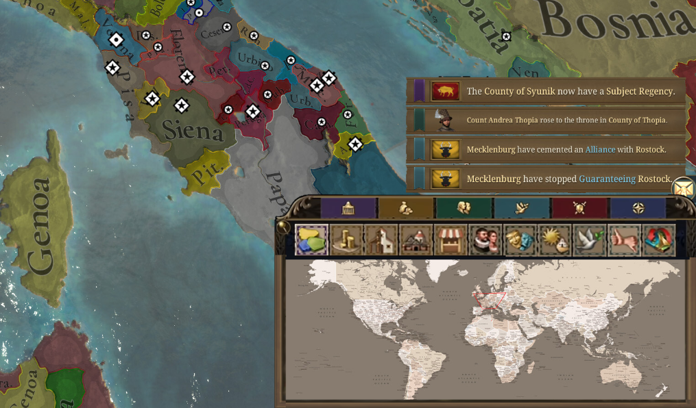
Paradox should consider adding a minimap to EU5. In EU4, it was one of my most frequently used features especially when managing a global empire. It allowed me to quickly and accurately move the camera anywhere in the world, making navigation far more efficient, and it's a shame that this feature is missing in EU5. It could still be implemented as a toggle for those who don’t use it as much, and the message logs could also be a toggle like in EU4. Plus I’d also recommend bringing back the mapmode icons above the minimap.

CurrentMinimap & mapmodesMinimap, mapmodes & messages
1748667625825.png
1748666831020.png
1748667579668.png
 
Last edited:
  • 135
  • 34Like
  • 7
  • 3Love
Reactions:
Indeed. Best thing about the minimap is that it gives content creators some irrelevant place to put their camera.
true but also, rn the game has something equally irrelevant in that corner; random message BS
 
  • 1Like
Reactions:
something that takes up 25% of the screen isn't much of a mini map (mockup is a bit over exaggerated :) ) . and yes hoi4 came out without it and while it took a while, they finally came to their senses and added it.
 
  • 5Like
  • 1Haha
  • 1
Reactions:
something that takes up 25% of the screen isn't much of a mini map (mockup is a bit over exaggerated :) ) . and yes hoi4 came out without it and while it took a while, they finally came to their senses and added it.
Had to zoom it in to to make it clear ;)

Also, since the mapmode icons are gone from the bottom middle, you could move the International Organizations icons there which fits in more imo.

Here's the fullscreen mockup:
mmmmmapp.png
 
  • 46Like
  • 10
  • 4Love
  • 1
Reactions:
Gonna throw in my support here as well. They're the easiest way of navigating globe spanning empires at the single click of your mouse.
 
  • 13Like
  • 2
  • 1
Reactions:


Absolutely, the Victoria 3 style mapmode-tools are abhorrent.


Absolutely. I don’t know if it could be implemented at this stage of the game’s development, but I think a mini-map is necessary to manage large empires.
 
  • 9
Reactions:
I completely agree! A mini-map is a very useful tool, and is even better when the fog of war shows what you actually know of the world. Kind of reminds me AoE. I like EUIV "heatmap" mini-map where you can see what is happening in the world at a glance.

Of course it could be a toggle for those who don't like it.
 
  • 8
  • 2Like
  • 1
Reactions:
Had to zoom it in to to make it clear ;)

Also, since the mapmode icons are gone from the bottom middle, you could move the International Organizations icons there which fits in more imo.

Here's the fullscreen mockup:
View attachment 1310085

I'm gonna add my proposition for unit visibility in here as well to give a clearer example of how everything can still be visible despite the boxes at the bottom, even with classic EU4 UI elements. Some things don't need changing just for the sake of it, sometimes they just work well as intended.

mmmmmapp.png
 
  • 12
  • 7Like
  • 1Love
Reactions:
I'm gonna add my proposition for unit visibility in here as well to give a clearer example of how everything can still be visible despite the boxes at the bottom, even with classic EU4 UI elements. Some things don't need changing just for the sake of it, sometimes they just work well as intended.

1748708078006.png
Just gonna say that we really need more screen layouts that don’t take up a third of the entire display. Right now, literally every single menu uses the same large layout, even when it’s unnecessary.

EU4 and I:R handled this much better and had different menus take up different amounts of space, which not only lessens the amount of empty space but also helps you instantly recognize which screen you're on just from the screen layout alone.
 
  • 17Like
  • 3
  • 1
Reactions:
It's not even the minimap for me but I prefer EU4's bottom right corner with the ledger and map modes to whatever Victoria 3 did with it. Please add in my cozy beautiful bottom right spreadsheets and map corner
 
  • 9Like
Reactions:
The UI as a whole is...not great, to say the least. There is still time to fix it but I highly doubt Johan wants to spend the remaining dev time before release redoing the whole UI instead of fine-tuning everything else.

It NEEDS a minimap, though.
 
  • 4
Reactions:
Had to zoom it in to to make it clear ;)

Also, since the mapmode icons are gone from the bottom middle, you could move the International Organizations icons there which fits in more imo.

Here's the fullscreen mockup:
View attachment 1310085
I'm gonna add my proposition for unit visibility in here as well to give a clearer example of how everything can still be visible despite the boxes at the bottom, even with classic EU4 UI elements. Some things don't need changing just for the sake of it, sometimes they just work well as intended.

View attachment 1310258
Where is the ruler portrait?
 
Gonna throw in my support here as well. They're the easiest way of navigating globe spanning empires at the single click of your mouse.
This is why It IS 100% NECESSARY to have a minimap.

With one click i can navigate several regions/ armies to fight a war in real time.

Without a minimap i have to scroooooooool.
 
  • 4Like
  • 2
  • 1
Reactions: