

Thanks for taking the time to reply in detail! Your interface designs are also all really good. As long as the information is presented so that I do not need to think in order to process it, everything is fine. I personally prefer icons but you showed that numbers can also be presented really nicely.Honestly, I don't intend this to be a long post, so if it does become a long post, I do apologise.
I've been playing video games since I've been old enough to walk, and I've been a programmer and a hobbyist game developer for a good three-quarters of my life, so while I don't have official industry recognised experience, I feel I'm pretty capable of offering my opinion.
Also, below I am going to provide a modification of my own, but bear in mind I'm not a UX designer, so I won't claim it will look professional at all.
It does, and it's fantastic that it does so.
In what way is this approach "unergonomic"? By definition, it is absolutely ergonomic.
I could not disagree with you more.
The very nature of written language is derived from symbolic cave paintings that signify a specific action, or portray a conceptual thought. The alphabet, is comprised of symbols, and it is through the combination of these symbols you can understand and translate what thoughts were until just a short while ago locked away in my mind. Numbers, too, are symbols, but unlike letters, which hold a "value" of a specific sound we can form physically, numbers hold a conceptual idea of quantity.
Here's the thing though. It's very rare that a letter holds multiple values, and when they do, it's not because the language has been designed, but because it has evolved from other systems that gave those values different meaning. Numbers are quite literally universal, the concept applies to you whether you speak English, Greek, Japanese or Klingon. The digit 1 will always hold the same meaning, and you can teach that meaning easily.
Can you recall any archaic method of portraying quantity by using the same symbols to represent different quantities that is no longer used for serious application, because it was deemed too cumbersome and stupid?
Here, I'll use it to tell you what year it is currently. MMXV. Of course, it's the tally-system courtesy of the Romans, and the year is 2015, but let's be more realistic.
You currently own in galactic credits, a ship worth MMMMMMMDCCCMVCMXCV - Tell me that you were able to immediately understand what number I was trying to get across to you within a single glance of looking at it, and without having to count every single M, every D and every C, and ensuring that you didn't screw it up somewhere.
The number was 7,804,995 - Which, if you were taught how to count at any point within your life, you can almost instantly discern the value without even needing to think about it, or count the number of 7's, or the number of 9's.
Because civilization only ever uses the base 5 tally system for systems such as tile imrpovements, where it's rare you'll go above a count of 20 (I've never, in my 15 years with the series seen such a thing personally) - Yet, you could have at least picked a better example of your method in use, because other than the tile improvement quick-look icons, everything else is quantified by the... Yes, proven interface concept that almost every game in existence has used, be it an icon of a bullet and a digit, an icon of coins and a digit, an icon of an apple and a digit... Civ uses an icon, and then a digit.

The reason, is that it is far quicker, and easier to assign a single meaning to a symbol and attribute an entire word to that symbol, than it is to have "GOLD" and then the number written down - It takes up less space, and conveys the exact same meaning.
No.
See, despite what other gamers in our wonderful hobby may say, gaming gets better with every month that passes. Gaming is the scientific method in action. Game developers will try new things with every new release, they'll test the waters, and if players hate it, they'll change it. If they believe they've found a new, fantastic way of conveying to the user, information, or game mechanics, they'll try it, and if it's shit, other game developers will see that the community thinks it's shit, and they won't adopt it. The things that stick, are the things that work, and for the past several decades, symbolic representation of a concept, be it a weapon in a kill feed, a warning icon in a flight sim, a representation of your populations current healthiness, or your current physics research progress, this one methodology is likely never going away, until we have some form of direct neural interfacing, or someone comes along and offers a better method of quantifying things...
Now... Here's my take on the UI - It's great, however, being an avid gamer for all my life, and a hobbyist developer, there is one thing that throws me off completely.
Symbol-Number misalignment. This is something that can be fixed extremely easily - Allowing more space between the symbol-number pairs, or by using something that is also a tried and true method in both game development, web design.. shit, even in the literary field... Separators.
There are issues with the UI, absolutely, but the issue you have tackled is a rather ridiculous issue, and should instead be focused on the poor placement and alignment.

Now, all I did, was divide the six icons into 30 by 30 containers, place a 1 pixel seperator between each block, and then arrange them within the (rather oddly sized) containing box, which measures at 196 width (actually 195, but standard practice is to have textures be multiples of 4 or 2, so...) I then rearranged them to set constraints to ensure that they were at least pleasing to look at, without overlap.
Notice how now, as ugly as it might seem (programmer art take on things, don't dis) it still portrays the meaning without having to learn how to distinguish between a billion + sizings, and now has an easy way to tell where the symbol-number pair starts and ends?
Edit: WIth all that said, I do have a design in my mind that I would prefer, it would take up less space, and probably be easier to actually read, but I've spent long enough here, and want to go make some breakfast.
Double Edit: I wasn't totally happy with my seperator correction, as it's still too... bad in my opinion. I'm not bashing the wonderful art or UI/UX team working on the game, I just think it could have been made with a bit more consistency(?) to the design.
To demonstrate what I mean, below I threw together an awful mockup. The colours aren't supposed to be final, they're supposed to be a visual representation of the bounding boxes to demonstrate the offset of elements in the UI.

The larger red rectangle is the main container, I've sized it to 200 x 54 (all sizes conform to the multiple of 2 or 4 rule)
The black rectangles are the information containers, these are 64 x 24 with a padding of 2 pixels on both width and height, and a separation of 2 pixels between other black information containers, once again, width and height.
Inside the black box, there is an 18 x 18 box, to match the 18 x 18 sprite size for the icons. These have a padding of 1 on the width and 3 on the height. To the right of the icon, with a 1 pixel separation is the yellow box which is 42 x 18.
Simple design, but I think a layout similar to this would be far superior to what is currently going on.
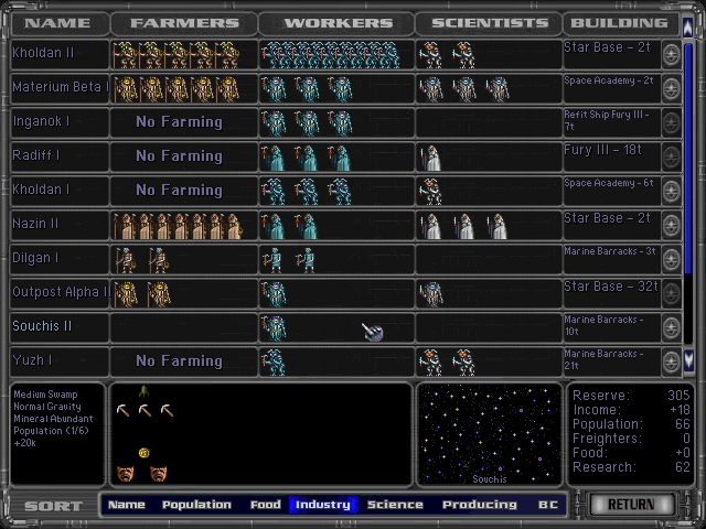
Nevertheless let me post one last interface image (not paint edited, I promise) as an example of how I think icons can work very effectively:
- 4