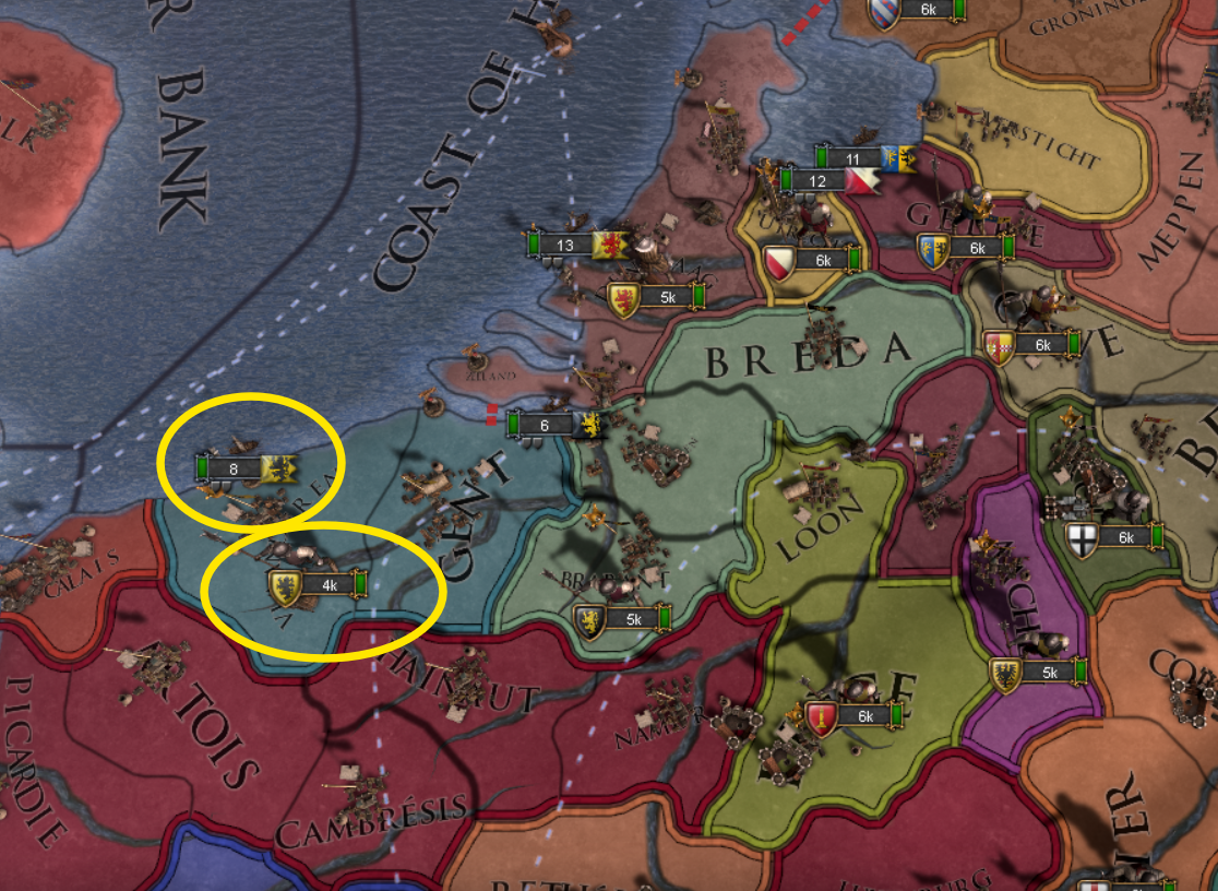
In EU4, armies and navies had visually distinct icons, which made them easier to distinguish at a glance (opposite symmetry, different shapes of CoA/flags).
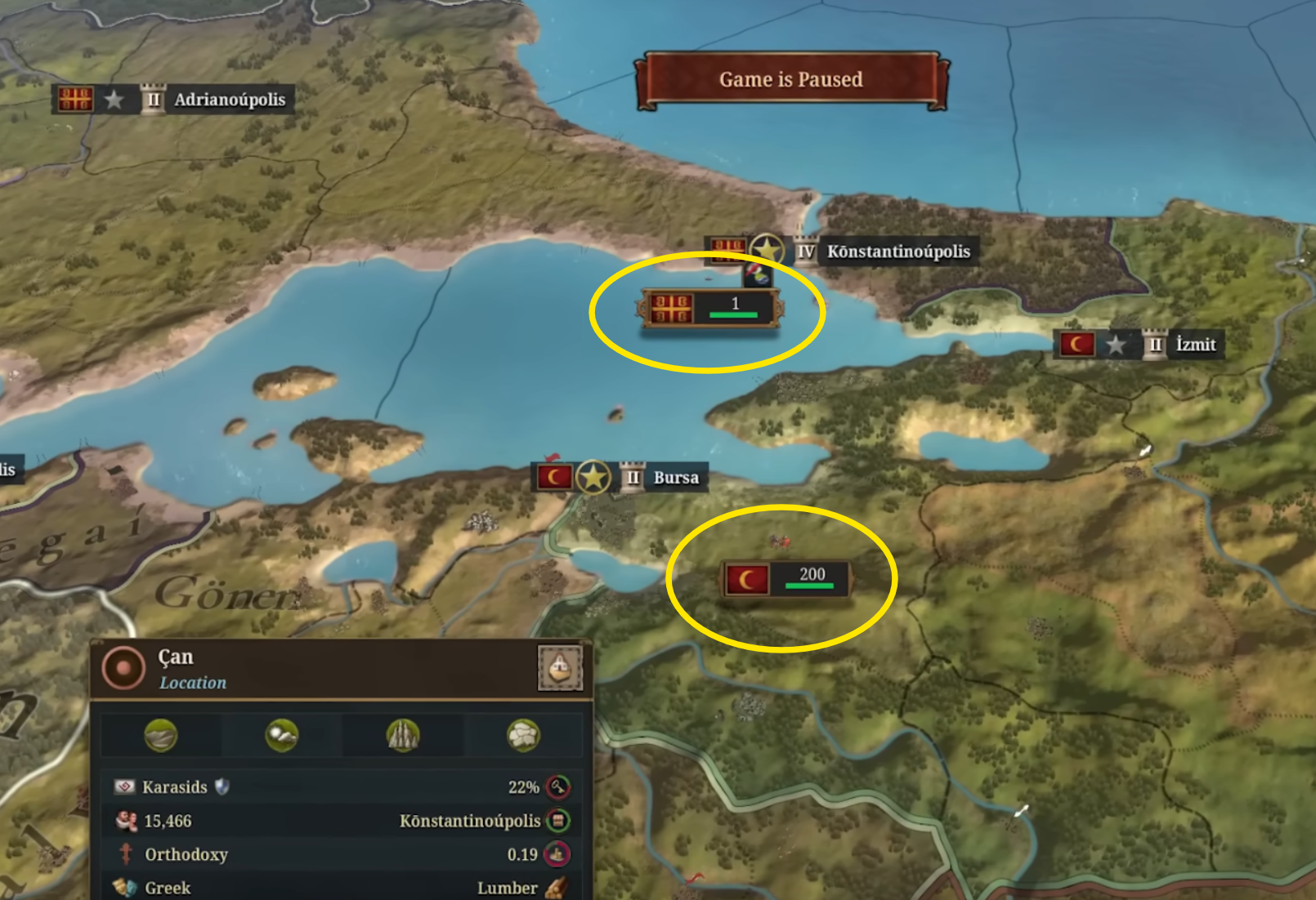
In EU5, they currently look much more similar.
This might be inconvenient at higher zoom levels if it stays this way.
-
In EU5, they currently look much more similar.
This might be inconvenient at higher zoom levels if it stays this way.
- I suggest placing the flag on the right side of the navy icon, at the very least. Similarly to EU4.
- Also, maybe consider using a dark blue box color for navies?

| 
|
- 18
- 10

