• We have updated our Community Code of Conduct. Please read through the new rules for the forum that are an integral part of Paradox Interactive’s User Agreement.

Twig1000

Sergeant
47 Badges
Mar 3, 2018
61
344
  • Crusader Kings II
  • Hearts of Iron IV Sign-up
  • Stellaris: Leviathans Story Pack
  • Europa Universalis IV: Third Rome
  • Hearts of Iron IV: Expansion Pass
  • Europa Universalis IV: Rights of Man
  • Stellaris: Digital Anniversary Edition
  • Hearts of Iron IV: Together for Victory
  • Stellaris - Path to Destruction bundle
  • Europa Universalis IV: Mandate of Heaven
  • Hearts of Iron IV: Death or Dishonor
  • Stellaris: Synthetic Dawn
  • Hearts of Iron IV: Expansion Pass
  • Hearts of Iron IV: Cadet
  • Europa Universalis IV: Dharma
  • Imperator: Rome Deluxe Edition
  • Imperator: Rome
  • Hearts of Iron IV: Expansion Pass
  • Prison Architect
  • Stellaris: Ancient Relics
  • Hearts of Iron IV: La Resistance
  • Imperator: Rome - Magna Graecia
  • Crusader Kings III
  • Battle for Bosporus
  • Hearts of Iron IV: No Step Back
  • Stellaris: Galaxy Edition
  • Stellaris: Galaxy Edition
  • Stellaris
  • Europa Universalis IV: Common Sense
  • Europa Universalis IV: Pre-order
  • Europa Universalis IV: El Dorado
  • Cities: Skylines
  • Victoria 2: Heart of Darkness
  • Hearts of Iron IV: Colonel
  • Victoria 2
  • Crusader Kings II: The Old Gods
  • Europa Universalis IV
  • Europa Universalis IV: Art of War
  • Europa Universalis IV: Wealth of Nations
  • Europa Universalis IV: Call to arms event
  • For the Motherland
  • Hearts of Iron III
  • Hearts of Iron III: Their Finest Hour
  • Hearts of Iron III Collection
  • Europa Universalis IV: Res Publica
  • Semper Fi
  • Victoria 2: A House Divided
I just want to preface this saying that this specifically refers to the icons shown in the menus (i.e construction) and not the map itself.

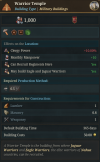
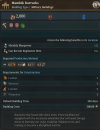
I want to make the case that the previous choice of using roman numerals for the different urbanisation levels of a location was probably the best and most logical decision. I for rural, II for towns and III for cities just made sense. I can understand, at an imediate glance, that these levels go up in an ascending scale. I can see the logic imediately as to what type of location I need to build a particular building.

The random shapes, however, doesn't make sense. A square and a pentagon doesn't really have as much logic to it as just numerals. It's not easy to understand at a glance which shape corresponds to what level of urbanisation, which I think is really important for players. I'm linking some images from the Delhi and Aztec flavours to show my point.
 

Attachments

  • Building Warrior Temple.png
    Building Warrior Temple.png
    554,3 KB · Views: 0
  • Mamluk Barracks.png
    Mamluk Barracks.png
    712,8 KB · Views: 0
  • 21
  • 7
  • 5Like
Reactions:
Both are bad options. Just make village = hut, a town = house, city = bigger or multiple houses. Or something similar. I don't see the reason to completely abstract it away. The symbol should indicate what it's referring to.
 
  • 54
  • 5Like
  • 1
Reactions:
Both are bad options. Just make village = hut, a town = house, city = bigger or multiple houses. Or something similar. I don't see the reason to completely abstract it away. The symbol should indicate what it's referring to.
Indeed, sometimes "rural" is indicated by lifestock in other games, but a single house (maybe with a farm) would be fine. A town would have multiple buildings, with a city adding at least a tower and higher buildings.
The Roman numerals were also bad indicators as these are probably not called "urbanization level I (rural)", "urbanization level II (town)" and "urbanization level III (city)" in the game.
The shapes look more like fortification levels, which is utterly confusing.
 
  • 5Like
  • 1
Reactions:
The Roman Numerals weren't the best, but they were functional - the numbers made sense, rural is a tier 1 settlement, town is tier 2, city is tier 3. I think you could make something better, but that definitely does work. The shapes are unintuitive and don't directly communicate the information, you have to know that they're the location tier symbols in advance, you can't tell that just by looking at them.
 
  • 8Like
  • 2
  • 1
Reactions:
It is so they match the settlement icons on the map. We couldn't use the roman numerals there because they can't be much more than simple shapes to avoid clutter. Our feedback from players was that two different sets of icons used in various different places was a far more confusing than having imperfect icons in some tooltips.

1753094162126.png
 
  • 15
  • 5Like
  • 1
Reactions:
It is so they match the settlement icons on the map. We couldn't use the roman numerals there because they can't be much more than simple shapes to avoid clutter. Our feedback from players was that two different sets of icons used in various different places was a far more confusing than having imperfect icons in some tooltips.

View attachment 1336843
I hate to be that guy, but these look way out of place compared to the map background. Maybe if you could angle them somewhat they wouldn't look like they were sprinkled on there randomly, but currently that's the feeling I get from them.
 
  • 8Like
  • 2
Reactions:
How do you mean angle them?
I think he means that the icons are 2d UI, on a high layer. while the map is 3d, whereas it would look better if they were "pasted" onto the map.

I.e., the map is on this plane: \
While the icons are on this plane: |

So the map-icon as \\ instead of \|.

This might be the type of thing that looks better in practice scrolling around and interacting with the map rather than a screenshot, though.
 
  • 3
  • 1
Reactions:
How do you mean angle them?
The camera looks at the Earth's surface at, say, a 45-degree angle, but the icons are perpendicular to the camera view, so they don't feel natural. I feel the same way.
 
  • 1
  • 1
Reactions:
How do you mean angle them?
Maybe not the right word for it, but make them in line with how it would look if I was looking down at an atlas from an angle. The markers currently are perpendicular to the map, which makes them feel unnatural. This might not be the best example, but making them look more similar to this would go a long way:
map-world-blue-globe-atlas-ecoregion-geology-earth-1616040.jpg
 
  • 1
  • 1Like
Reactions:
I think he means that the icons are 2d UI, on a high layer. while the map is 3d, whereas it would look better if they were "pasted" onto the map.

I.e., the map is on this plane: \
While the icons are on this plane: |

So the map-icon as \\ instead of \|.

This might be the type of thing that looks better in practice scrolling around and interacting with the map rather than a screenshot, though.

The camera looks at the Earth's surface at, say, a 45-degree angle, but the icons are perpendicular to the camera view, so they don't feel natural. I feel the same way.
Hard agree with both, @Desseabar gave the exact description of what I meant.
 
  • 2Like
Reactions:
It is so they match the settlement icons on the map. We couldn't use the roman numerals there because they can't be much more than simple shapes to avoid clutter. Our feedback from players was that two different sets of icons used in various different places was a far more confusing than having imperfect icons in some tooltips.

View attachment 1336843
I suppose it's something I'd learn, but I don't know what these symbols are supposed to mean on this map, either. If this is supposed to be rural/town/city, I really think you should try something else. Maybe you could do a shading thing per location instead? Like, dark green for rural, middle green for town, bright green for city, then you could put rural, town, and city icons (preferably more intuitive ones) on top so I could quickly tell at a glance "oh, these locations are rural, and if I scroll in I can see the icon that's the same as the one on this building, that must mean I can put this building in all these dark green locations!"

Edit: Now that I think about it, why not use different house sizes for tiers? 1 story for rural, 2 stories for town, 3 stories for city, preferably made of different materials to make each even more visually distinct.
 
It is so they match the settlement icons on the map. We couldn't use the roman numerals there because they can't be much more than simple shapes to avoid clutter. Our feedback from players was that two different sets of icons used in various different places was a far more confusing than having imperfect icons in some tooltips.

View attachment 1336843
I kinda like them but they aren't much distinguishable from each other so I suggest making their borders of different colours with silver for towns and bronze for rurals(like medals), then remove the golden star from the center unless it's the capital of the country, put a silver one in if it's the capital of a province(unless they are purely used for capitals of course), additionally having a little castle icon on top or below the symbol would be really useful for reporting the presence of a fort in the location
Also when visualizing a building it would be nice if the symbols could have the roman numbers ranging from 1 to 3 back in place of the star so to remind us to what settlement tier they belong, with all of these you'd have 3/4 visual pattern recognition systems in place
 
Last edited:
I hate to be that guy, but these look way out of place compared to the map background. Maybe if you could angle them somewhat they wouldn't look like they were sprinkled on there randomly, but currently that's the feeling I get from them.
No, they need to be clear to the player, if you angle them you reduce their clarity and they are not randomly positioned, they are located(or at least they should be) at the center of the location so you can tell to which one they belong right away
 
  • 1
Reactions: