

- 9
- 1

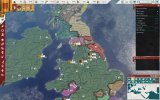
Speed indicator is too hard to see
- Thread starter JuanitoRUS
- Start date
-
We have updated our Community Code of Conduct. Please read through the new rules for the forum that are an integral part of Paradox Interactive’s User Agreement.
You are using an out of date browser. It may not display this or other websites correctly.
You should upgrade or use an alternative browser.
You should upgrade or use an alternative browser.
It probably should be shifted to a brighter red - like the highlight colour for the UI elements, rather than the background colour of the same.
Try this mod https://steamcommunity.com/sharedfiles/filedetails/?id=2450942335 while they work on the achievements compatible dark mode for the game:

It really is a wonder to me. With all of the massive improvements to the UI in Marius, and I love it to pieces!, the design team went with "dark brown on a background of slightly darker brown" for the speed indicator.
Really? How can more than one person have that problem?
It's INCREDIBLY obvious to me. Might as well say that you can't see the menu items on the left, vertical band.
It's INCREDIBLY obvious to me. Might as well say that you can't see the menu items on the left, vertical band.
- 3
- 2
This problem appears if you have eyesight less than 1.0. And this problem appears only in Imperator because the new interface was made by people with perfect eyesight for people with perfect eyesight. I don't have such a problem in HoI, Stellaris, EU4 for example, because their interface elements don't look like red squares of 2px size on a dark red background in MS Excel. My eyesight is 0.4 on the left eye and 0.7 on the right eye and I already absolutely don't see this speed indicator, and there are some people who have eyesight worse than me. It's always a bad design decision where you put dark elements above dark background because there is absolutely no contrast, it seems to me that it should be evident for any designer. Usually, games have elements corresponding 14px font and min 10px interface elements, white text on a dark background or vice versa, but not Imperator, there is 10px font in 1400x900 and 2px speed dark red indicator on the dark green background after 2.0 update.Really? How can more than one person have that problem?
It's INCREDIBLY obvious to me. Might as well say that you can't see the menu items on the left, vertical band.
I just want Paradox to hear me, a new interface has serious problems for people who have light/mild eye diseases. There were no such problems before 2.0. Not everyone can play in 10px MS Excel enviroment.
Last edited:
- 4
It's not at all obvious to me either. I have to look pretty hard to see what speed I'm playing on. I also have difficulty reading the text saying "Children", "Spouse", etc, on the character screen.
Yea this is another unreadable thing...It's not at all obvious to me either. I have to look pretty hard to see what speed I'm playing on. I also have difficulty reading the text saying "Children", "Spouse", etc, on the character screen.
Attachments
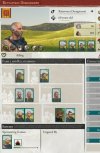
by now I know what it is, dont need to read...Yea this is another unreadable thing...
I just bought this game and came here looking for some one else complaining that the UI didn't show the game speed. So yeah it is not noticeable enough. Now that I know what I am meant to be looking at it is not a big deal, but certainly could be better.
Just FYI, this mod removes the grey background. Makes them much easier to see.
And you can get achivements (despite what the game says)
And you can get achivements (despite what the game says)
- 2