The new investment history tooltip is a great idea, but so far it's mostly conceptual. It's not very readable, and not very useful. Currently, it looks like this:
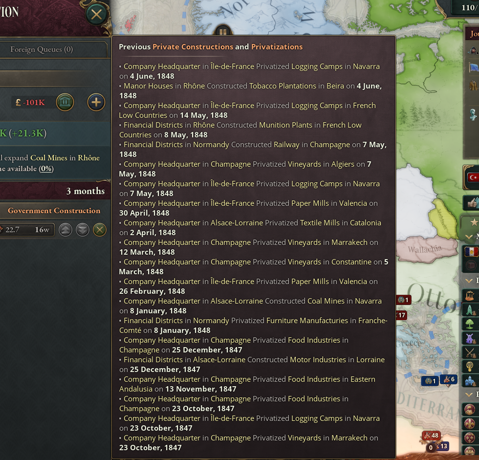
What are the issues here? Well first of all, it's a big wall of text. Readability is minimal, it has no icons, barely any color variety, no way to know who, what, or where. Also, it's maximum width is too small for some resolutions/UI scales, resulting in needlesly truncated text.
So the first thing we should do is increase the maximum width, to be compatible with more screen configurations.
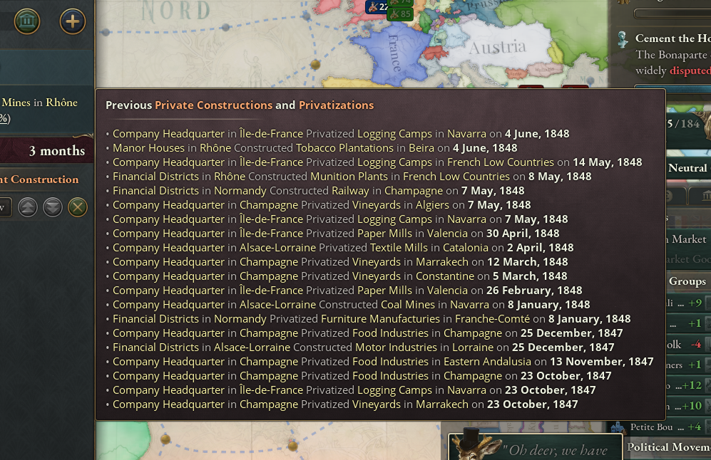
Much better! If this is not something you'd want to do because of other compatibility concerns, perhaps consider removing the dates to save space. It's by far the least relevant information here.
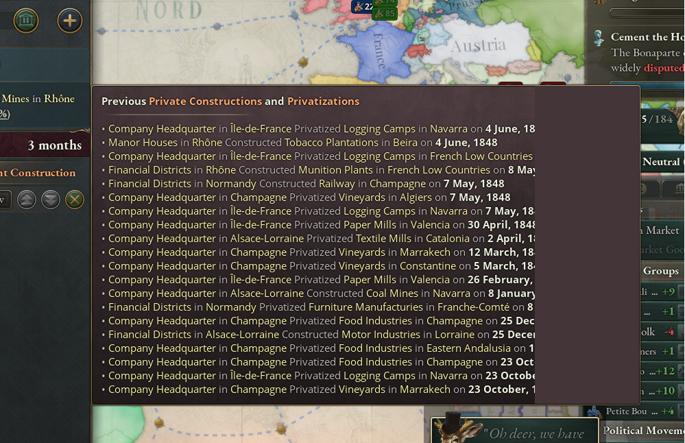
Nobody is going to miss it!
Now for the good bits. One of the most important aspects of this screen is not highlighted. I'm tlaking about wether or not something was built or bought. Currently that is just a word, the least visible word on the list! We can fix that with a quickly recognizable icon. Next is the buildings, they're a bunch of different names that can be hard to really wrap your head around at a quick glance. And finally, it'd be good to know where it happened. We do know of course, but state names aren't very useful by themselves. We can fix all that with something like this:
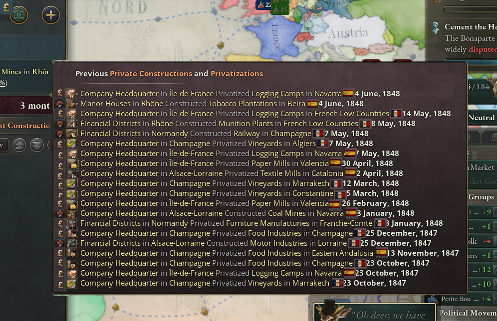
Flags could probably be better on the left of the state name, but for the purpose of this mockup being readable I put them there
Much better! Now we can tell at a glance that our French pool has been buying a hecking lot of things compared to actual construction, and also that it's been doing some shopping in Spain. We can also tell they've been focusing their efforts on Wine, Food and Wood, primarily.
I believe these changes would help bring this window in line with the rest of the UI. But wait, there's more! One last (but not least) thing: this window can be the gateway for the elusive Investment Logic. How? Simple, just hover over the what and let the game tell you the why.
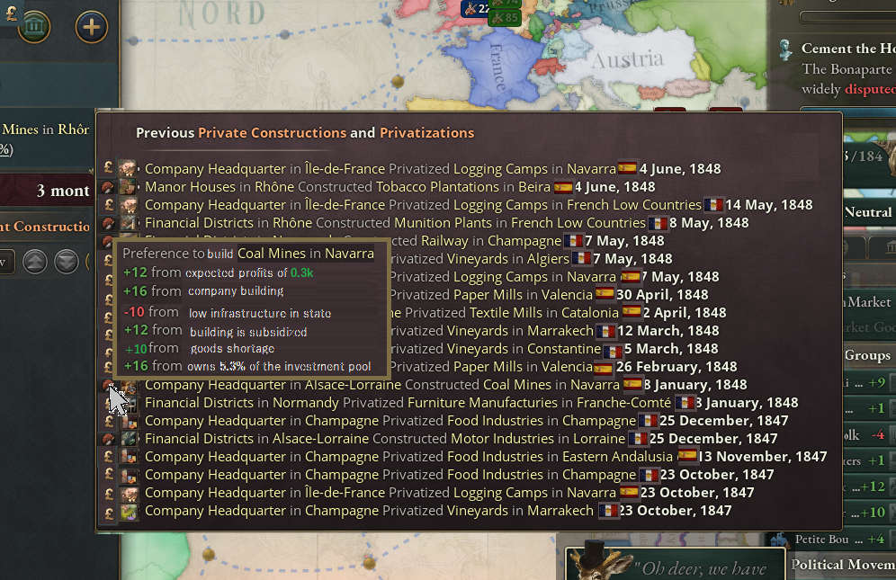
I don't know how it works but let's pretend this is correct
Ta-da! Simple, sensible, effective. Now the player has a window into the investment logic, with a logical path to get there, and can finally understand why the invisible hand of the market decided to build elsewhere.
I imagine you might have your own ideas cooking already but hey, I had time to kill and this thing has been on my mind for a bit. So I hope I put something on your minds at the very least. Cheers!

What are the issues here? Well first of all, it's a big wall of text. Readability is minimal, it has no icons, barely any color variety, no way to know who, what, or where. Also, it's maximum width is too small for some resolutions/UI scales, resulting in needlesly truncated text.
So the first thing we should do is increase the maximum width, to be compatible with more screen configurations.

Much better! If this is not something you'd want to do because of other compatibility concerns, perhaps consider removing the dates to save space. It's by far the least relevant information here.

Nobody is going to miss it!
Now for the good bits. One of the most important aspects of this screen is not highlighted. I'm tlaking about wether or not something was built or bought. Currently that is just a word, the least visible word on the list! We can fix that with a quickly recognizable icon. Next is the buildings, they're a bunch of different names that can be hard to really wrap your head around at a quick glance. And finally, it'd be good to know where it happened. We do know of course, but state names aren't very useful by themselves. We can fix all that with something like this:

Flags could probably be better on the left of the state name, but for the purpose of this mockup being readable I put them there
Much better! Now we can tell at a glance that our French pool has been buying a hecking lot of things compared to actual construction, and also that it's been doing some shopping in Spain. We can also tell they've been focusing their efforts on Wine, Food and Wood, primarily.
I believe these changes would help bring this window in line with the rest of the UI. But wait, there's more! One last (but not least) thing: this window can be the gateway for the elusive Investment Logic. How? Simple, just hover over the what and let the game tell you the why.

I don't know how it works but let's pretend this is correct
Ta-da! Simple, sensible, effective. Now the player has a window into the investment logic, with a logical path to get there, and can finally understand why the invisible hand of the market decided to build elsewhere.
I imagine you might have your own ideas cooking already but hey, I had time to kill and this thing has been on my mind for a bit. So I hope I put something on your minds at the very least. Cheers!
- 2
- 2


