A lot of complaining about the UI will probably come from people used to CK2 adjusting to CK3. I have had a very difficult time as a result of this, and while causing that for players is a problem itself, it's what I'm specifically not going to suggest here. I think several aspects of the UI are objective problems that should be fixed.
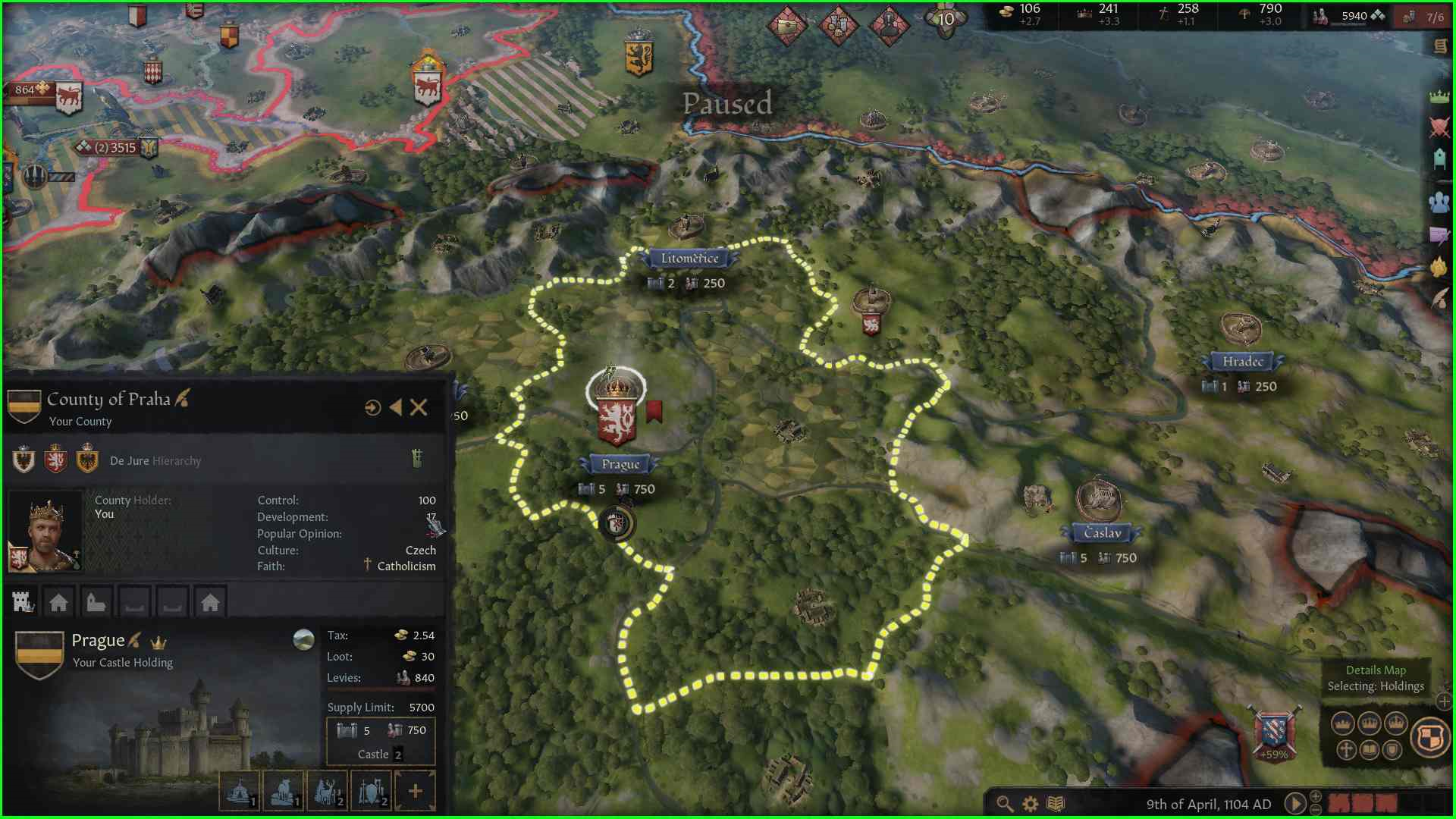
Trying to hover over one of the numbers of a county to view the details of it is too difficult because it's just two digits in a small font. A rectangle going around them and further to the left would help.
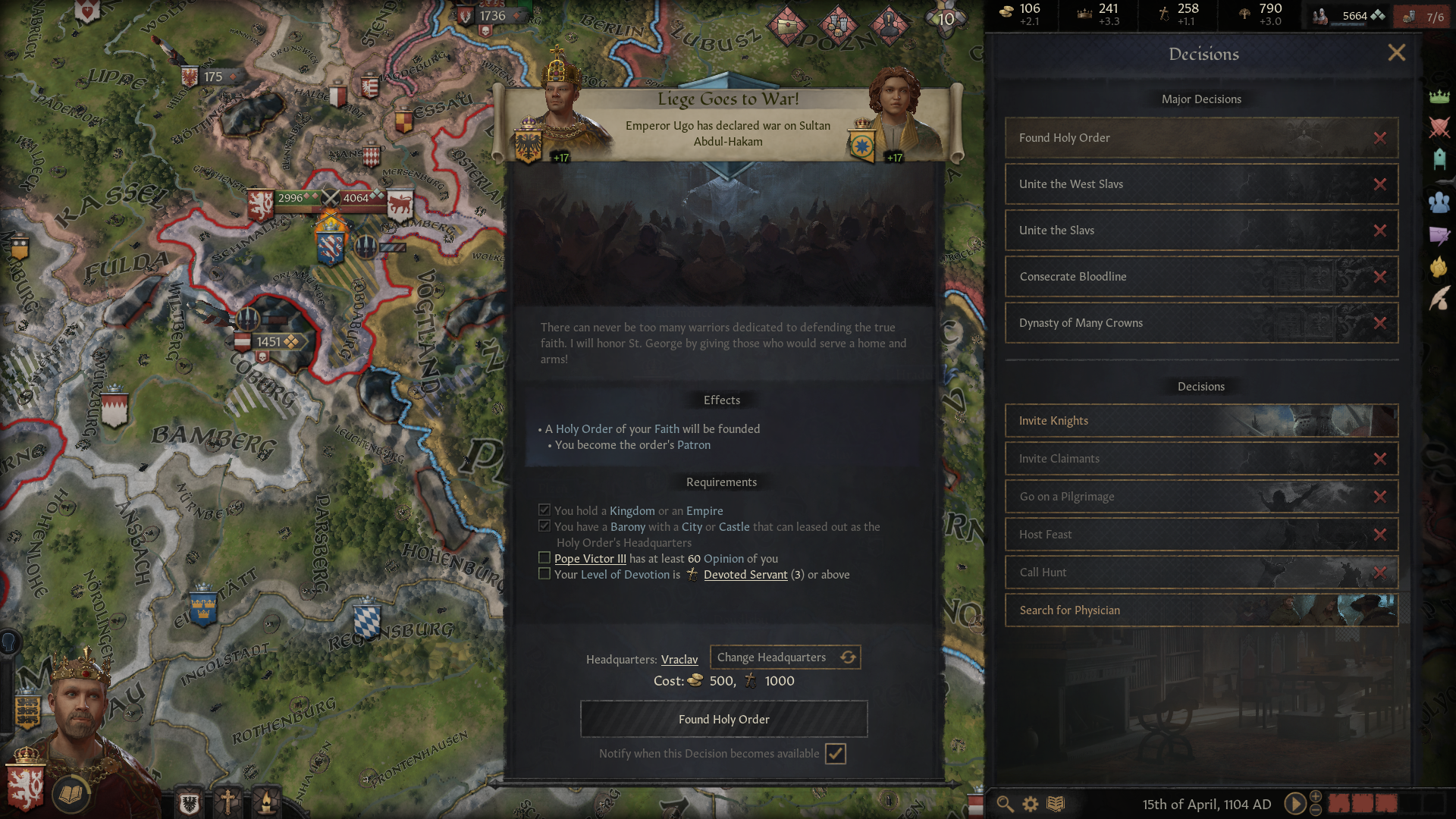
There's this banner that appears sometimes. It's kind of rare and the selection of things is quite random as a lot of them are insignificant. It stays there for like 10 seconds, blocking other parts of the screen. Notably, it can block the button to close menus which are taking up a lot of the screen. Basically stopping my ability to look at anything else for the duration of the banner, which I didn't even need because it just told me that I did the thing I pressed the button to do. These notifications could be moved somewhere else entirely like the notifications at the bottom right, they could not block other parts of the UI, their duration could be shortened significantly. There's many options to improve this.
As seen in the picture, I can't get rid of that decision because my liege went to war and I have to wait for ten seconds.
Speaking of the notifications at the bottom right, trying to dismiss them by right clicking is annoying because they'll take time to move so you can't keep right clicking the same spot or you'd click on the map. I suggest a button to clear all of them at once.
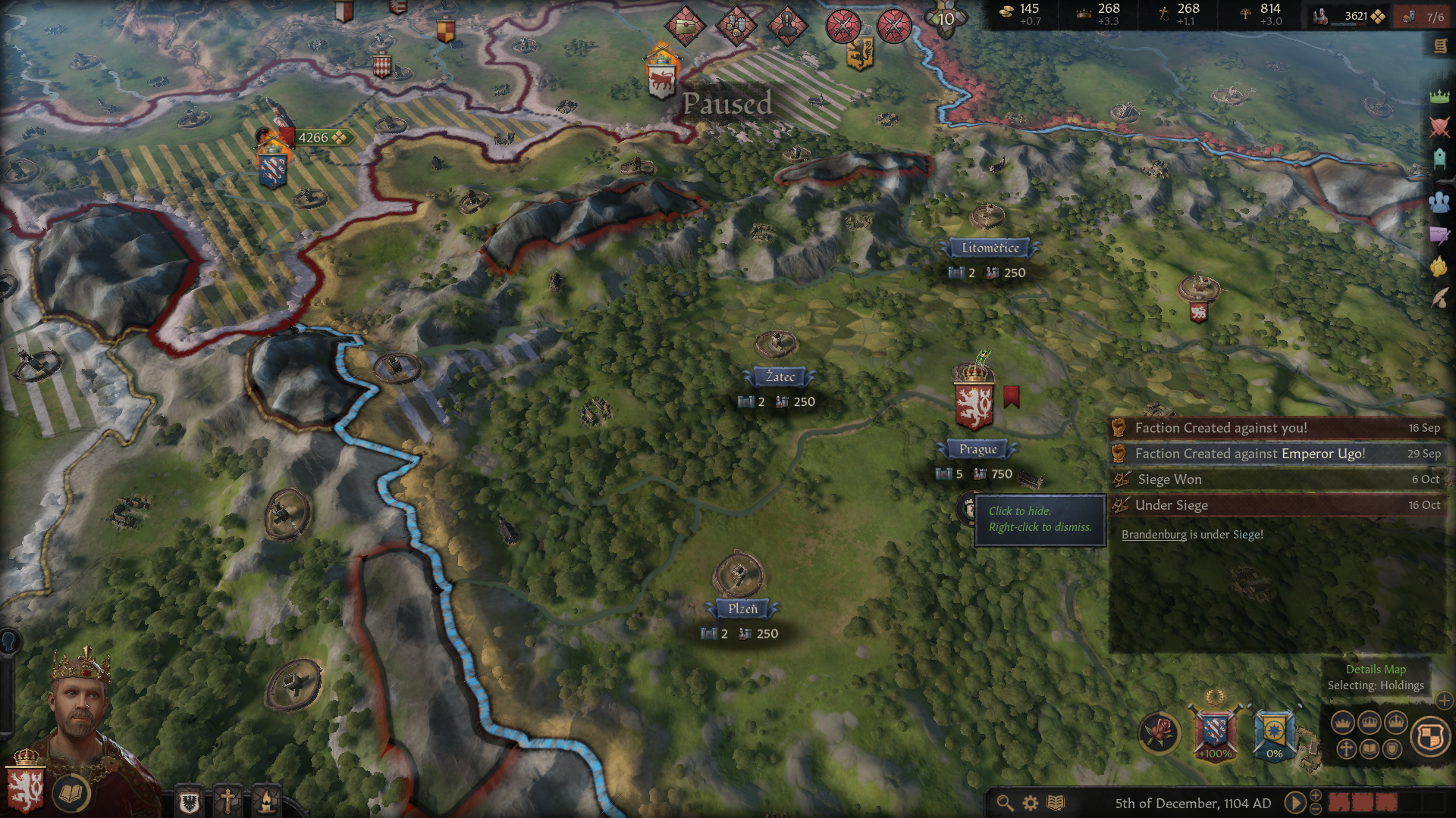
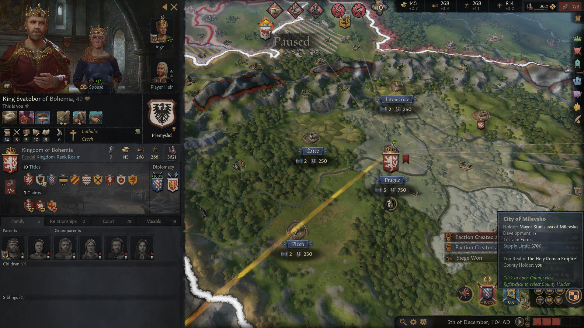
(the result of right clicking two times in a row)
Trying to hover over one of the numbers of a county to view the details of it is too difficult because it's just two digits in a small font. A rectangle going around them and further to the left would help.

There's this banner that appears sometimes. It's kind of rare and the selection of things is quite random as a lot of them are insignificant. It stays there for like 10 seconds, blocking other parts of the screen. Notably, it can block the button to close menus which are taking up a lot of the screen. Basically stopping my ability to look at anything else for the duration of the banner, which I didn't even need because it just told me that I did the thing I pressed the button to do. These notifications could be moved somewhere else entirely like the notifications at the bottom right, they could not block other parts of the UI, their duration could be shortened significantly. There's many options to improve this.
As seen in the picture, I can't get rid of that decision because my liege went to war and I have to wait for ten seconds.

Speaking of the notifications at the bottom right, trying to dismiss them by right clicking is annoying because they'll take time to move so you can't keep right clicking the same spot or you'd click on the map. I suggest a button to clear all of them at once.


(the result of right clicking two times in a row)
- 4
- 1
Upvote
0

