• We have updated our Community Code of Conduct. Please read through the new rules for the forum that are an integral part of Paradox Interactive’s User Agreement.
I know a few people already mentioned it, but we really value your hard work and everything you did so far. The core mechanics and historical flavour is just breathtaking. And we know you've worked very hard on the graphics also. But we do believe it can look much better, especially the terrain graphics and more realistic castle sizes, soldier models, more realistic coasts, forests, rivers and mountain/hill shapes.

We do not tell you this because we want to be rude, but because we think that players deserve the best looking 3D terrain mod that you can create. And we've seen in IR that you can create masterpieces.

But not only do the players deserve a beautiful map, most of all I think YOU deserve it. Since you put so much effort into creating this, into researching history and geography, into coding, into gameplay balance and everything else. And we think that YOU also deserve that all this effort is crowned with a beautiful map, that portrays this civilization defining era of human history in all of its glory.
 
  • 11
  • 6Like
Reactions:
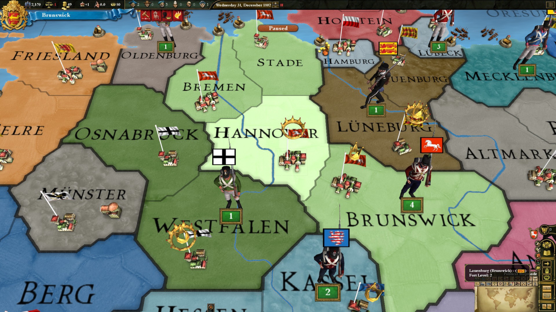
Even though they are vital I stil don’t want to see big castles. Maybe we can have a special mapmode for forts, where they can be highlited diferently?
...or just have them show up as icons? Like in EU4? It's simple and it works. I don't know why we need to show gameplay elements in the world like that. The terrain mapmode is eye-candy, it can show gameplay info (specifically the terrain lol), but that's a secondary function. Immersion should be the goal.
 
  • 8Like
  • 6
  • 2
Reactions:
I know that most of the main things have already been mentioned but I'm just gonna add my thoughts as well to reinforce what others have said..

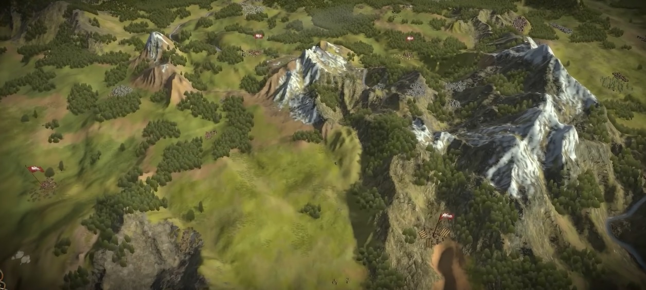
Mountains look amazing, especially with vegetation, but having different "types" of mountains would be cool, such that the Scandinavian Mountains look different from the alps or the Andes look different from the Himalayas, as well as mountain ranges having different heighs compared to each other..

I'm missing more complex color schemes.. especially in vegetation and water.. Making places like Northern Europe, Russia and Canada darker and cooler with deeper colors, while a place the the Caribbean would look much brighter, and the Mediterranean a bit dryer would make a massive difference..

More nuance in elevation would add a lot, if possible.. places like France or russia almost look too flat.. having coastal areas be "lower" than inland areas, even when they're all technically flatlands will help a lot.. I think having something like a gradual "sloping" from the highest inland points towards the oceans would make the map feel more real..

Coasts needs work, but you already know this..

All that being said, the map generally look amazing and I'm very excited to see more.. I really appreciate the effort you put into creating beautiful terrain for those of us who don't want to play with paper maps, it means a lot, so thank you all for that
 
  • 4
  • 3Like
Reactions:
I love all the disagrees on my post, which admittedly has a negative tone, but seriously, this is the same story as has been with PDS the last 8 or so years. And, for clarification I'm also in no way faulting the artists here, I'm sure they're masters at their craft as should be for someone working for a large company like Paradox. But Imperator proves me right, if they wanted a realistic/stylized/beautiful map, they could have done it; this is a conscious choice made by higher ups who care about sales first and foremost, and you know were most sales are.

Candy-like buttons of all colors, with no consistent or elegant design, is what I said the very day the UI was first teased, and it's still the same. Mark my words, what we're going to get in the end is not going to be much different than what we're seeing now, because this isn't a mistake, it's a choice.
 
  • 4
  • 2Like
  • 1
Reactions:
Candy-like buttons of all colors, with no consistent or elegant design, is what I said the very day the UI was first teased, and it's still the same. Mark my words, what we're going to get in the end is not going to be much different than what we're seeing now, because this isn't a mistake, it's a choice.
Prioritising function over form is the right thing for them to do for a UI, it's for using not eye candy. Ideally we could have both but it's clear which is more important.
 
  • 3Like
Reactions:
if they wanted a realistic/stylized/beautiful map, they could have done it; this is a conscious choice made by higher ups who care about sales first and foremost, and you know were most sales are.
I'm not even sure what you're trying to say here. Most sales happen when the map isn't beautiful?

Given the last paragraph I assume you mean either mobile game or cartoony graphics, but a) this is about the map, not the UI, b) I don't see what about the current map looks specifically like a mobile game, c) they're clearly not going for truly cartoony graphics, and d) you say a "stylized" map is one of the things they could have done if they wanted to, so you don't even seem opposed to a non-realistic map.

And also, you say they could have done a realistic or stylized map if they wanted do. Which means you seem to think they're not doing either, which makes me ask what on earth you think they are doing? What options are there other than realistic, stylized, or somewhere in between?
 
  • 1
Reactions:
I'm not even sure what you're trying to say here. Most sales happen when the map isn't beautiful?

Given the last paragraph I assume you mean either mobile game or cartoony graphics, but a) this is about the map, not the UI, b) I don't see what about the current map looks specifically like a mobile game, c) they're clearly not going for truly cartoony graphics, and d) you say a "stylized" map is one of the things they could have done if they wanted to, so you don't even seem opposed to a non-realistic map.

And also, you say they could have done a realistic or stylized map if they wanted do. Which means you seem to think they're not doing either, which makes me ask what on earth you think they are doing? What options are there other than realistic, stylized, or somewhere in between?
I think what he meant is that it can be stylized, but you can have a cartoony vibe like CK3 or a "realistic" vibe like Imperator Rome. or at least kinda more rustic vibe would be better word? idk, but I do understand the point of it looking a bit too cartoony and mobile game like for example when textures and terrain are very perfectly smooth and simplistic rather than sharp, complex and a bit rustic/natural/old school?

It is kinda hard to explain with words, especially if your english is as bad as mine is:p
 
  • 2
Reactions:
I think what he meant is that it can be stylized, but you can have a cartoony vibe like CK3 or a "realistic" vibe like Imperator Rome. or at least kinda more rustic vibe would be better word? idk, but I do understand the point of it looking a bit too cartoony and mobile game like for example when textures and terrain are very perfectly smooth and simplistic rather than sharp, complex and a bit rustic/natural/old school?

It is kinda hard to explain with words, especially if your english is as bad as mine is:p
Imperator had every slight elevation be grey rocks, which was certanly a choice but not a realitic one.

I would prefer a more realistic hight map for EU5, I would prefer the high hue to remain for the textures.
 
  • 1
Reactions:
Imperator had every slight elevation be grey rocks, which was certanly a choice but not a realitic one.

I would prefer a more realistic hight map for EU5, I would prefer the high hue to remain for the textures.
I know what you mean for heightmap and I'm all for realistic look. But to me, imperator looks more realistic than ck3 which looks more cartoony vibe to me. I mean neither of them are 100% realistic terrain maps, afterall they're not satelite pictures overlayed over a real scale heightmap. Both are stylized but I prefer IR rustic looks more personally.
 
  • 3
Reactions:
I miss simple, but clear and easy to use EU3 political map mode.

Eu3_map_2.jpg


I know that many people these days love all these fancy 3D "Civilization like" graphics but maybe they should add optional "old style map without fancy 3D" settings to the graphics menu? I know that political map mode still exists but it...seems like a downgrade compared to EU3 and EU4 political map mode? It's also kind of blurry and still has tons of 3D distractions with big CK3 like cities etc.

Also to be honest, some part of these 3D maps look very blurry and 2000s like.
It's like textures are not sharp. Victoria 3 and CK3 (to a lesser degree) had the same problem. Which was weird since these games consume quite a lot of vRAM.

Especially if you look at the mountains and flat terrain below. Why is this so blurry on Ultra? (dev mentioned that it's on Ultra and not Low).
Graphics below kind of remind me of unmodded 2006 Medieval 2 Total War.

EU5 3dmap.jpg

EU5 3dmap2.jpg
 
  • 1
Reactions:
Thank you Johan!

Can't wait for a proper showcase of this since all streamers/Youtubers I saw played the game with a default map. I miss that old school 2D papermap feeling.
At least 2 of them played on with the papermap because they had older PCs.
Check out this thread from here and further comments:
By the way, he’s the only one, or maybe one of the very few, who played EU5 with the 2D paper map. He probably has an older PC.

Do you happen to know his specs, or if he mentioned anything about the performance? Just curious, it would be interesting as a reference :)

Reportedly, performance has greatly improved since April, but as far as I understand, it's mostly related to 3D map rendering.
In this case, with the 2D map, there wasn't a GPU bottleneck, so it could shed some light on how an older processor handles the game.
 
  • 1
Reactions:
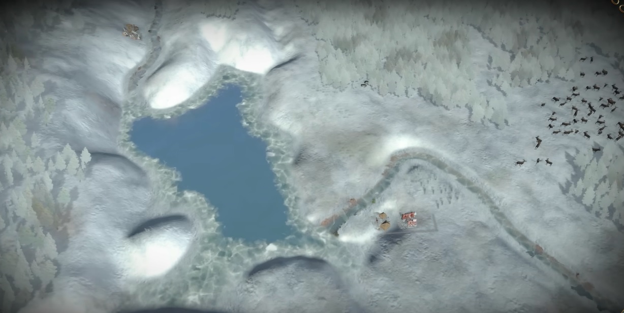
I strongly support and agree with all the comments mentioning the same trees across Europe, the artificially harsh borders between different types of vegetation, and the compliments to the Imperator map.
Here I'd like to add two more things I noticed – boring wetlands and giant RGO deposits.


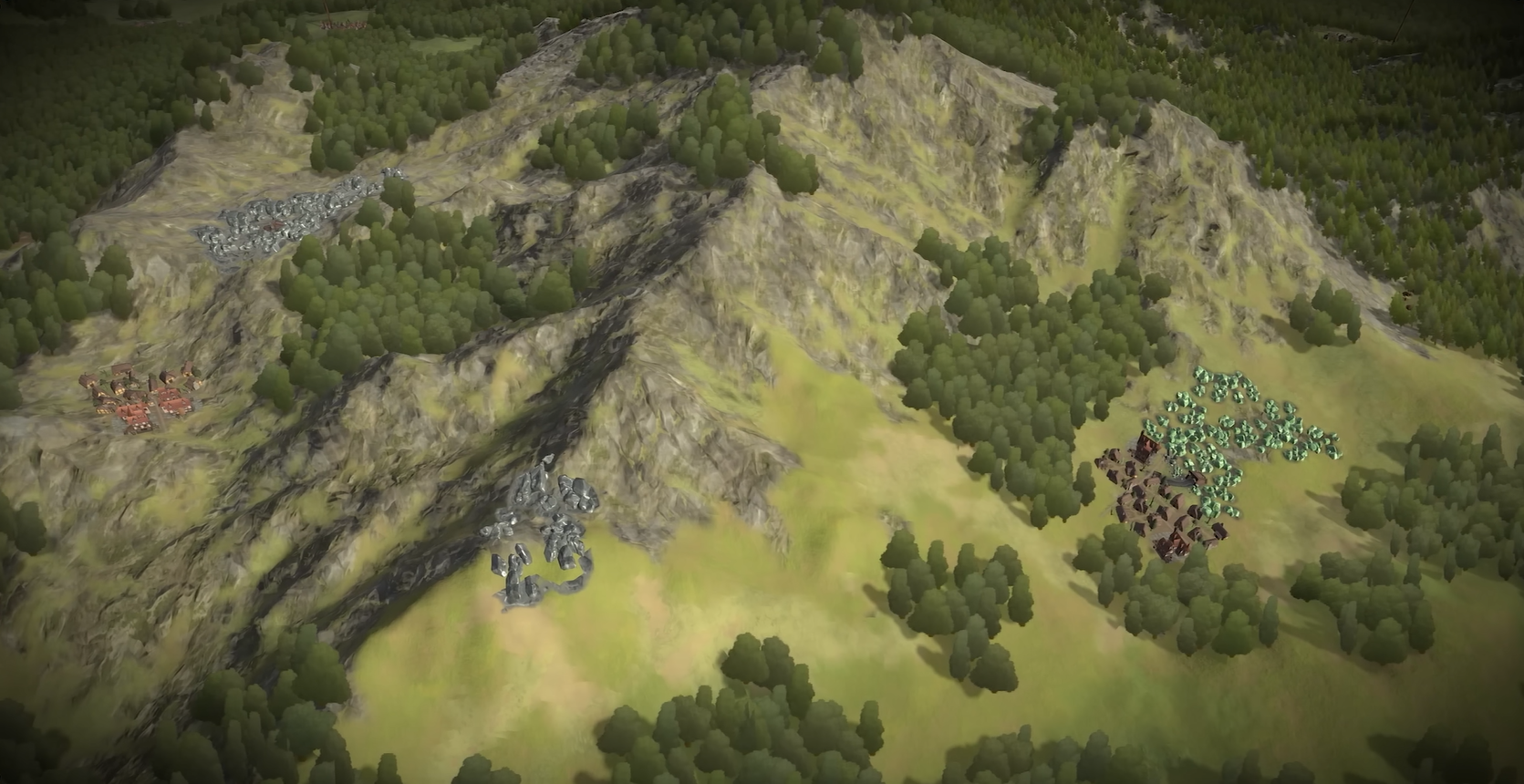
GIANT RGO DEPOSITS
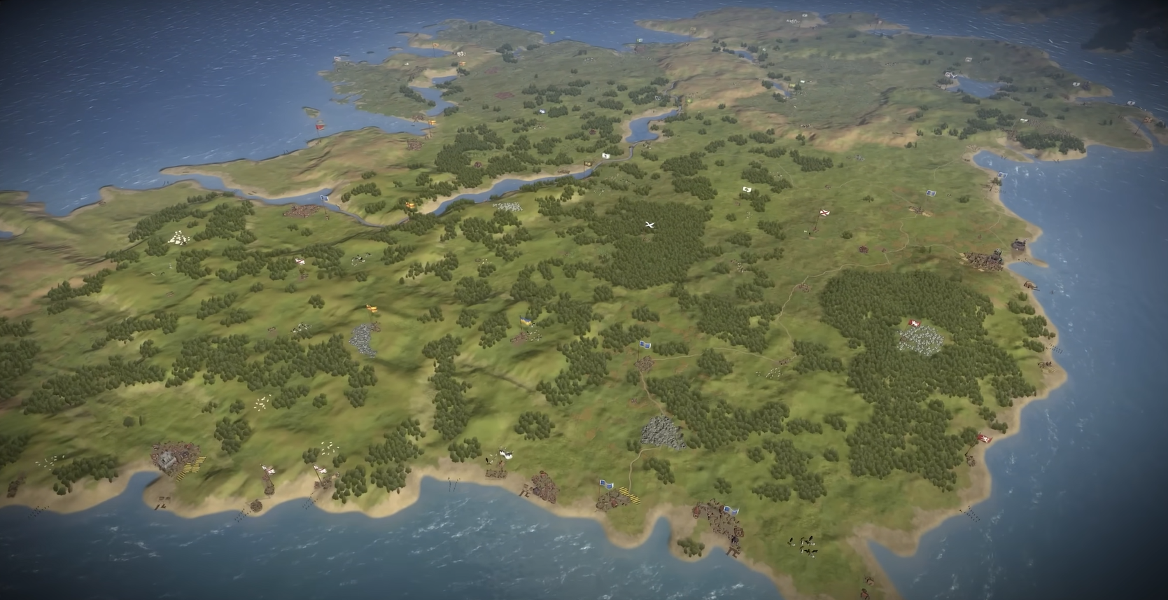
I'd like to point out that giant concentrated ore and mineral deposits that are larger than cities look gamey and does not look natural at all:
1753344968454.png
1753345210361.png

I believe they grow with RGO levels, but honestly I'd prefer the map to be more natural and beautiful, rather then informing me the exact RGO levels in each location based on the deposit size or number of sheep in herds.

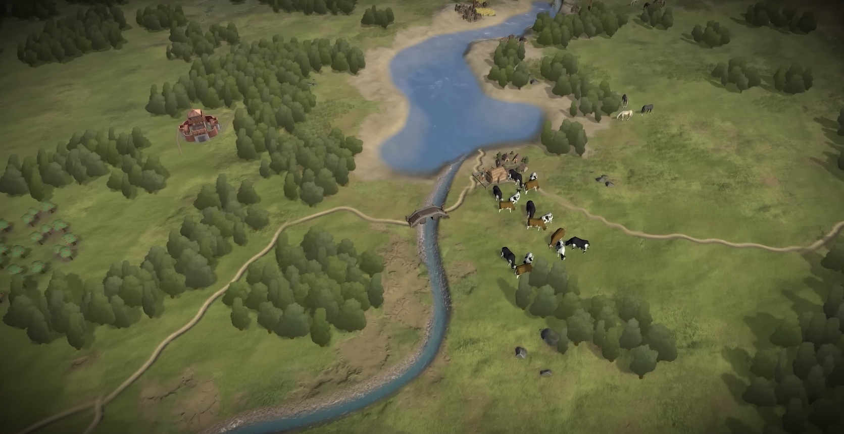
Small occasional stones, deposits, clay pits, animals across the map look much nicer, like here:
1753345607392.png


WETLANDS
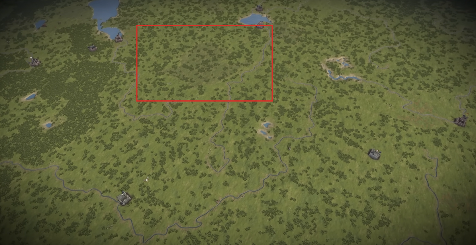
Looks like marshes have absolutely the same texture as flatlands, just with hardly recognisable darker colour.
I think it can be significantly improved to look more like wetlands.
1753346751370.png


I hope, it's not too late.
 
Last edited:
  • 7
  • 2Like
  • 1
Reactions:
I strongly support and agree with all the comments mentioning the same trees across Europe, the artificially harsh borders between different types of vegetation, and the compliments to the Imperator map.
Here I'd like to add two more things I noticed – boring wetlands and giant RGO deposits.


GIANT MINERAL DEPOSITS
I'd like to point out that giant concentrated ore and mineral deposits that are larger than cities look gamey and does not look natural at all:

I believe they grow with RGO levels, but honestly I'd prefer the map to be more natural and beautiful, rather then informing me the exact RGO levels based on the deposit size or number of sheep in herds.

Small occasional stones, deposits, clay pits, animals across the map look much nicer, like here:
View attachment 1338071


WETLANDS
Looks like marshes have absolutely the same texture as flatlands, just hardly recognisable darker colour.
I think it can be significantly improved to look more like wetlands.
View attachment 1338072

I hope, it's not too late.
1000026929.jpg


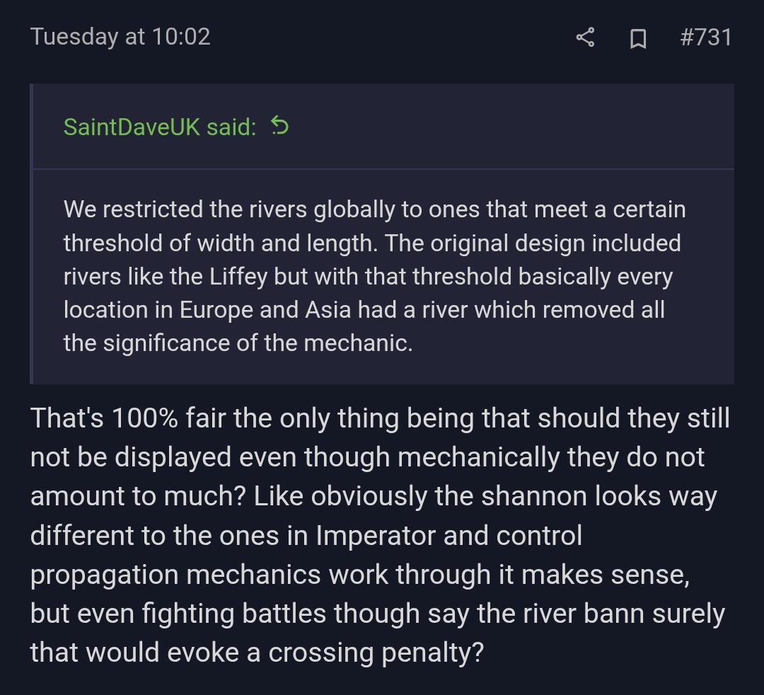
From another thread but thought it was relevant here, but rivers even though they mechanically dont do anything should still be displayed on the map and still should evoke crossing penalties when crossed. If you can't see them on the map how would you know if you crossed a river? These rivers dont have to propagate control just be visible, imo
 
  • 3
  • 1Like
Reactions: