• We have updated our Community Code of Conduct. Please read through the new rules for the forum that are an integral part of Paradox Interactive’s User Agreement.

Vilochka

First Lieutenant
23 Badges
Apr 24, 2019
275
167
  • Hearts of Iron 4: Arms Against Tyranny
  • Europa Universalis IV
  • Hearts of Iron IV: No Step Back
  • Hearts of Iron IV: By Blood Alone
  • Battle for Bosporus
  • Victoria 2
  • Hearts of Iron IV: La Resistance
  • Hearts of Iron IV: Expansion Pass
  • Hearts of Iron IV: Expansion Pass
  • Hearts of Iron IV: Death or Dishonor
  • Hearts of Iron IV: Together for Victory
  • Hearts of Iron IV: Colonel
  • Hearts of Iron IV: Cadet
  • Victoria 2: Heart of Darkness
  • Victoria 2: A House Divided
  • Supreme Ruler: Cold War
  • Semper Fi
  • Victoria: Revolutions
  • Hearts of Iron III: Their Finest Hour
  • Hearts of Iron III
  • For the Motherland
  • Darkest Hour
  • Arsenal of Democracy
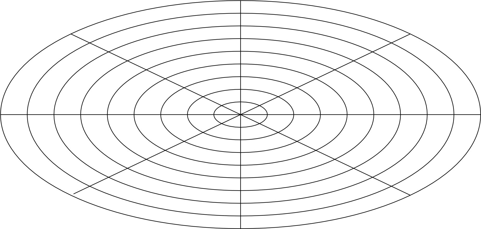
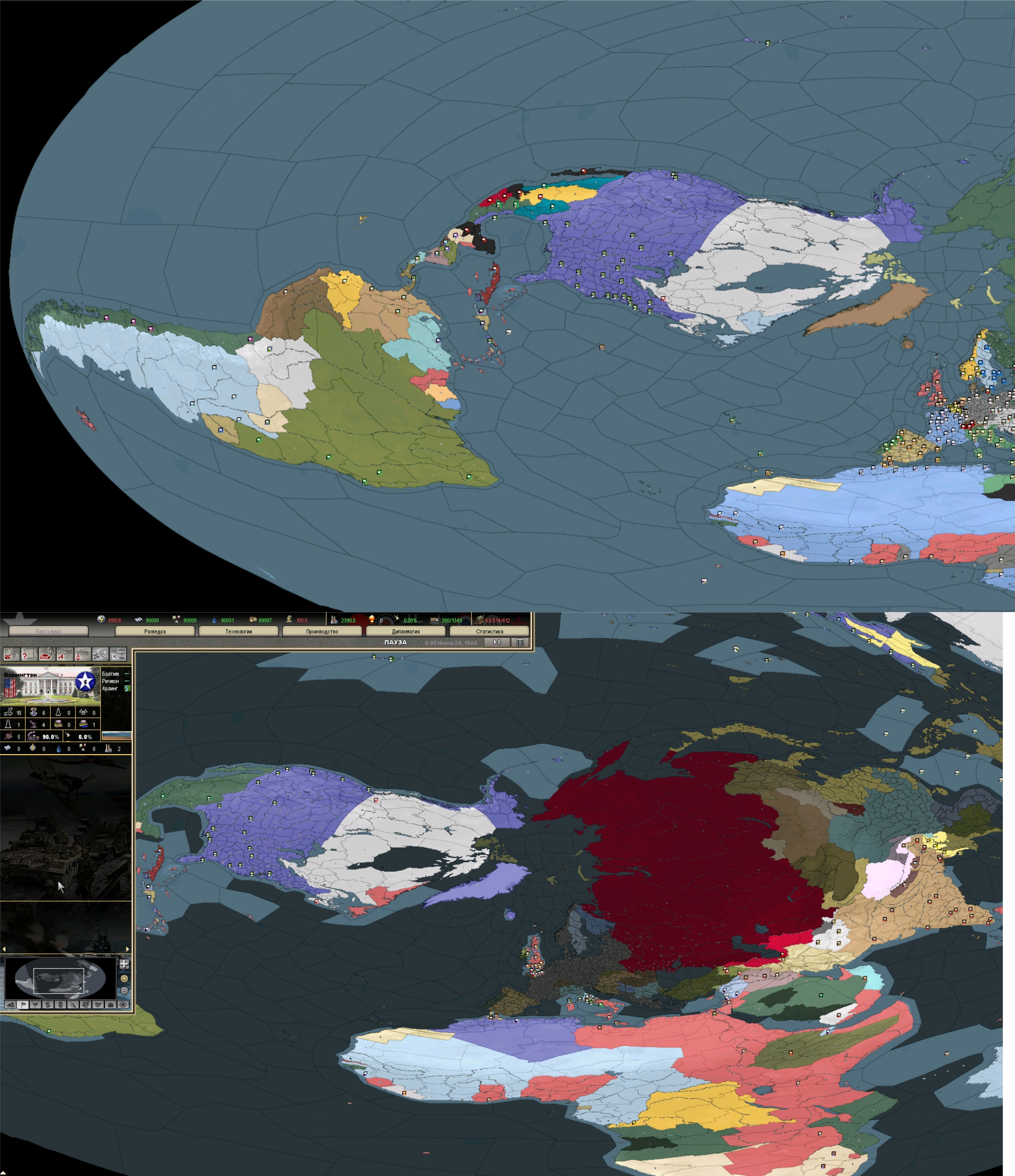
Perhaps it's time to create a separate post. After some experience with working on DH and E3 maps, I decided to change the map's projection. The work turned out to be very difficult. The basis was a circle divided into sectors.
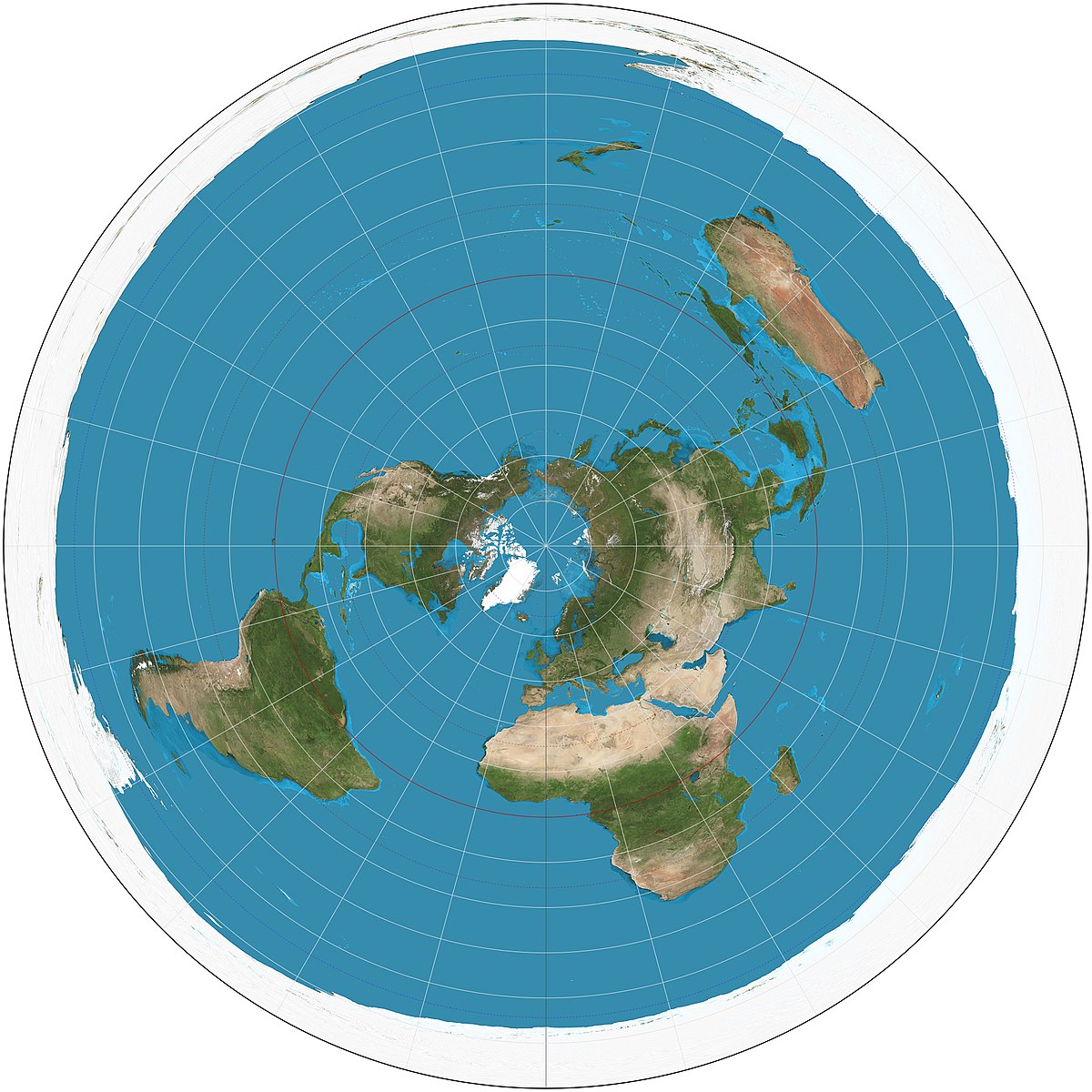
Azimuthal_equidistant_projection_SW.jpg
123.jpg

The size of the world had to be adjusted and rotated slightly clockwise - Australia and New Zealand did not fit on the map. Unfortunately America suffered
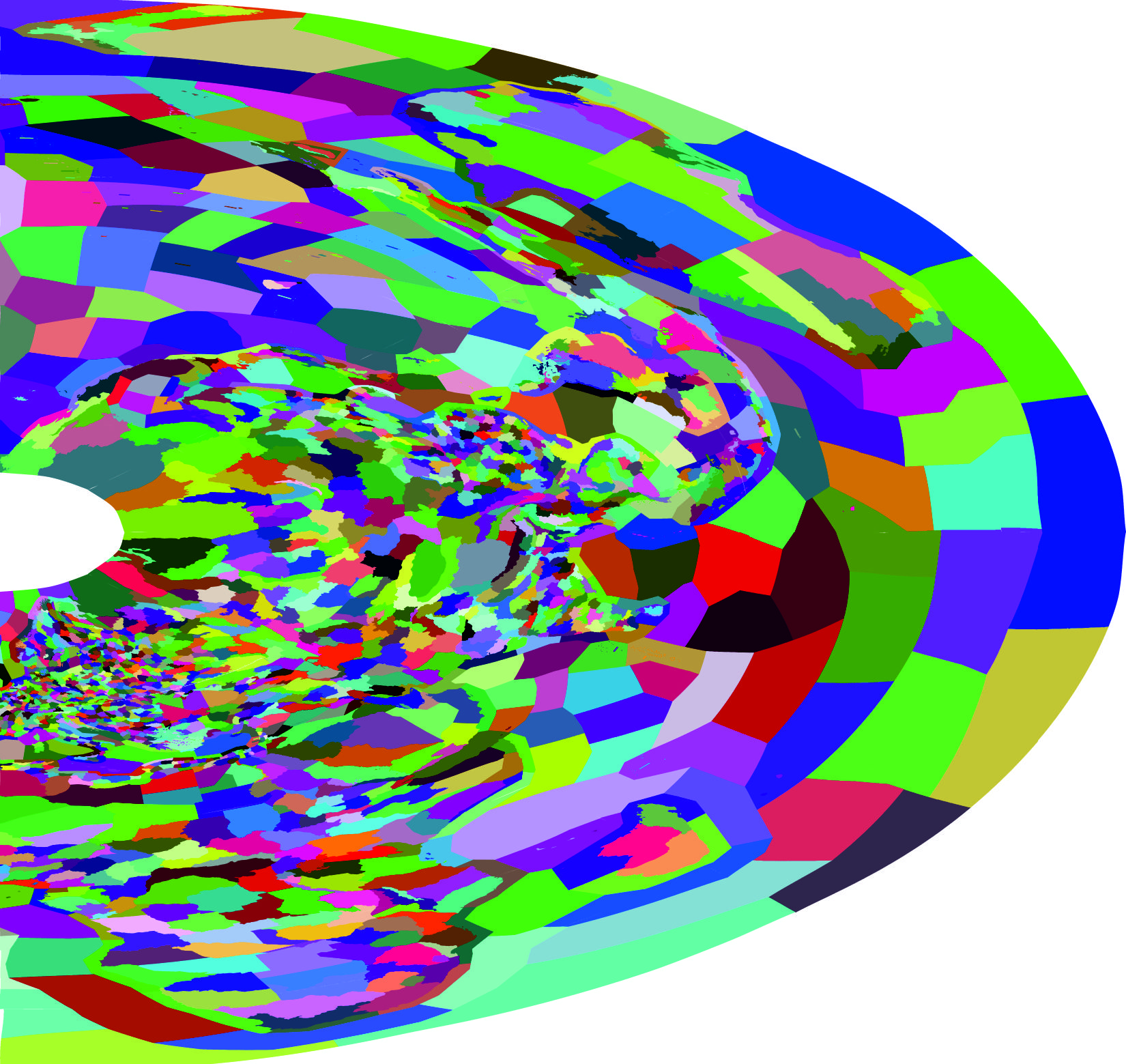
In the ArcGIS program, I started linking all images to sectors - files tiles, ProvID, colorscales, border. As it turned out, ProvID files survived this transformation relatively well
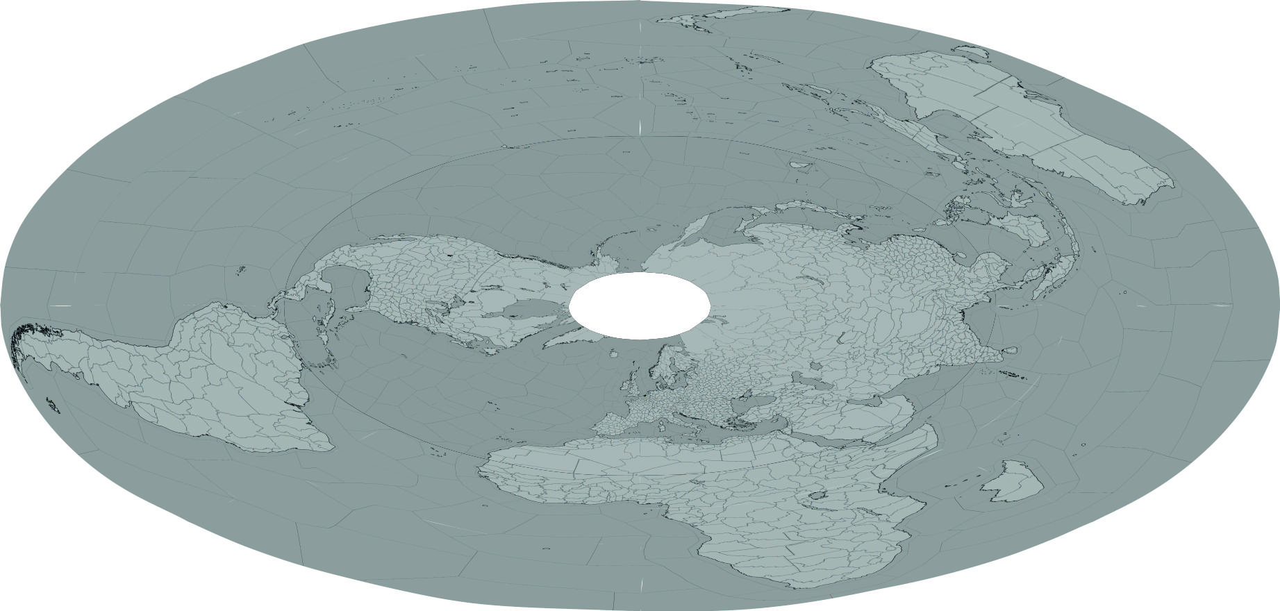
4.jpg
5.jpg

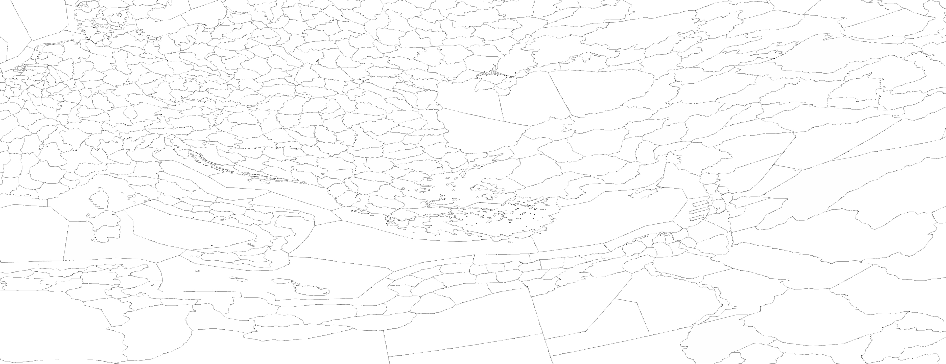
Unfortunately, Colorscales files have lost their neat appearance after transformation and are impossible to use. Therefore, from the combined ProvID, all boundaries (automatically), rivers and colorscales were re-created.
With the help of trial and error, I managed to remove the seams (as I did on DH Rus Map and E3). Colorscales - I created 3 samples and not one of them completely suits me, it always seems too rough to me. Further there are many errors along the boundaries.
Yes, I did not describe the work process in detail, just the ArcGIS and CorelPhotoPaint tools. I had to get rid of the CorelDraw vector editor because he is the source of the problem in the form of seams between images.
As for compatibility with original files - full compatibility. Only in the Province.csv file you need to set the position of all objects to 0. The work is not finished here. Compatible with all mods (unless the Province.csv file is modified
What are the problems:
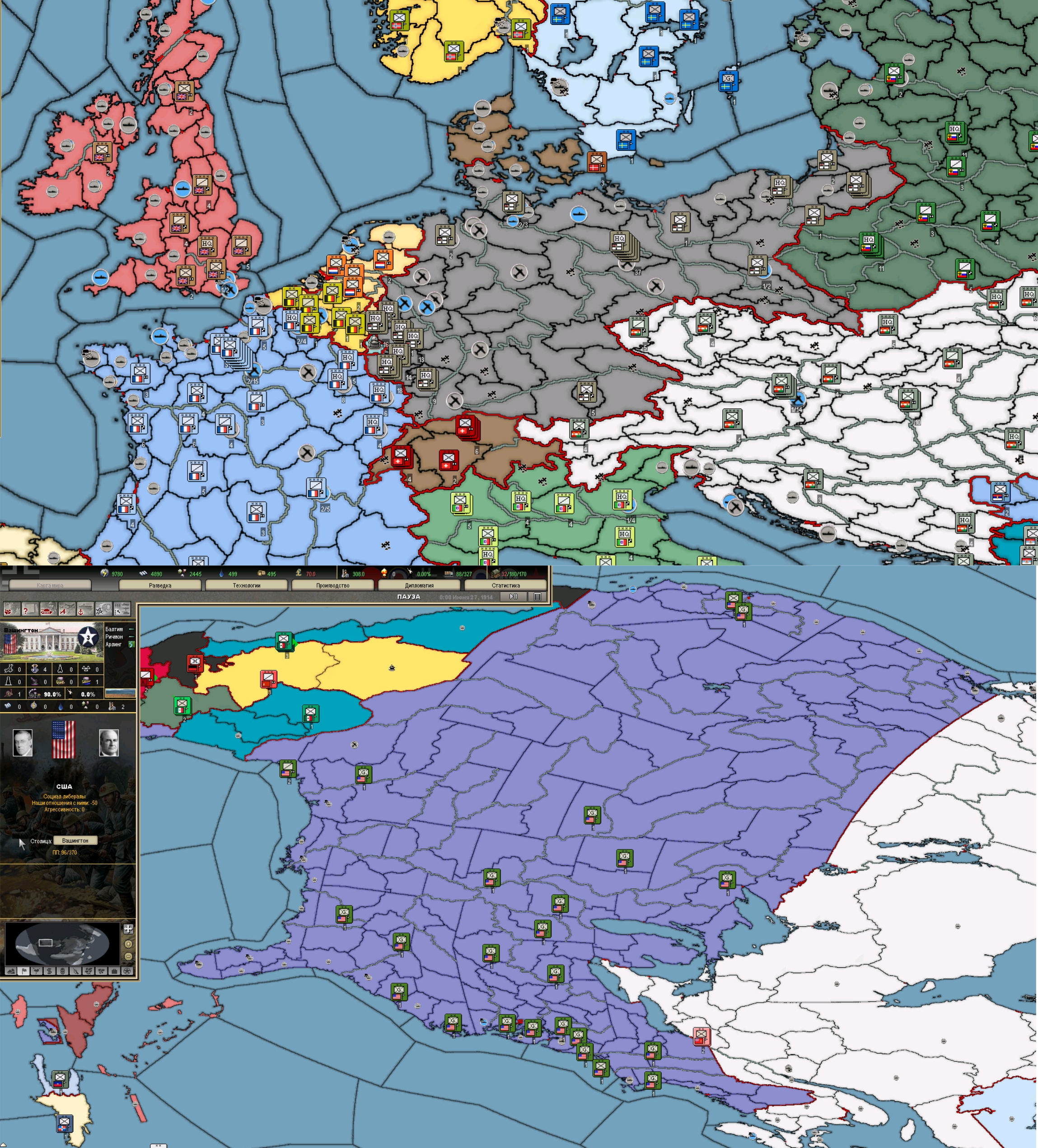
Layer three, as usual border (Germany, Netherlands image problem)
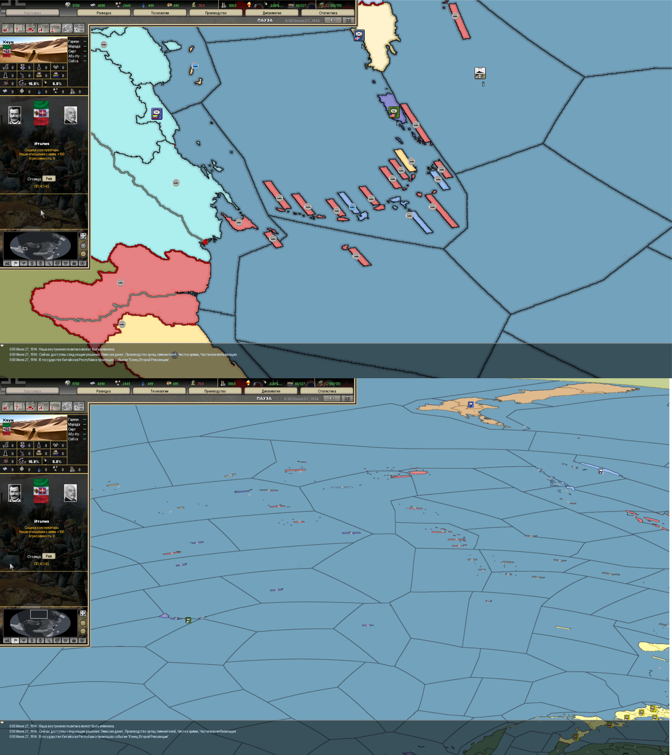
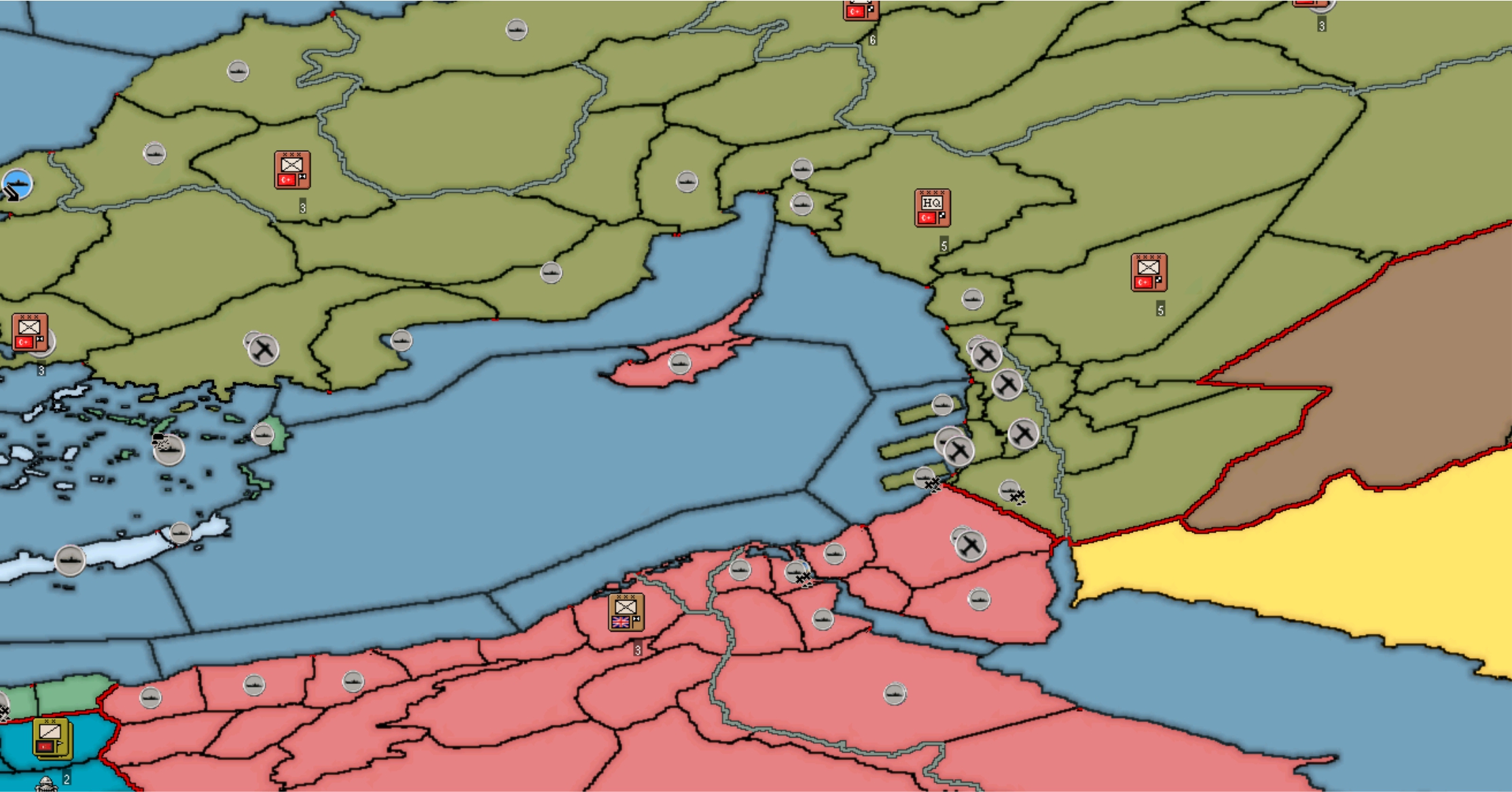
Division icons in large deformation zones do not correctly match the province (Australian coastal waters)
Europe seems to have become unplayable:)
Colorscales.scv file needs adjustment
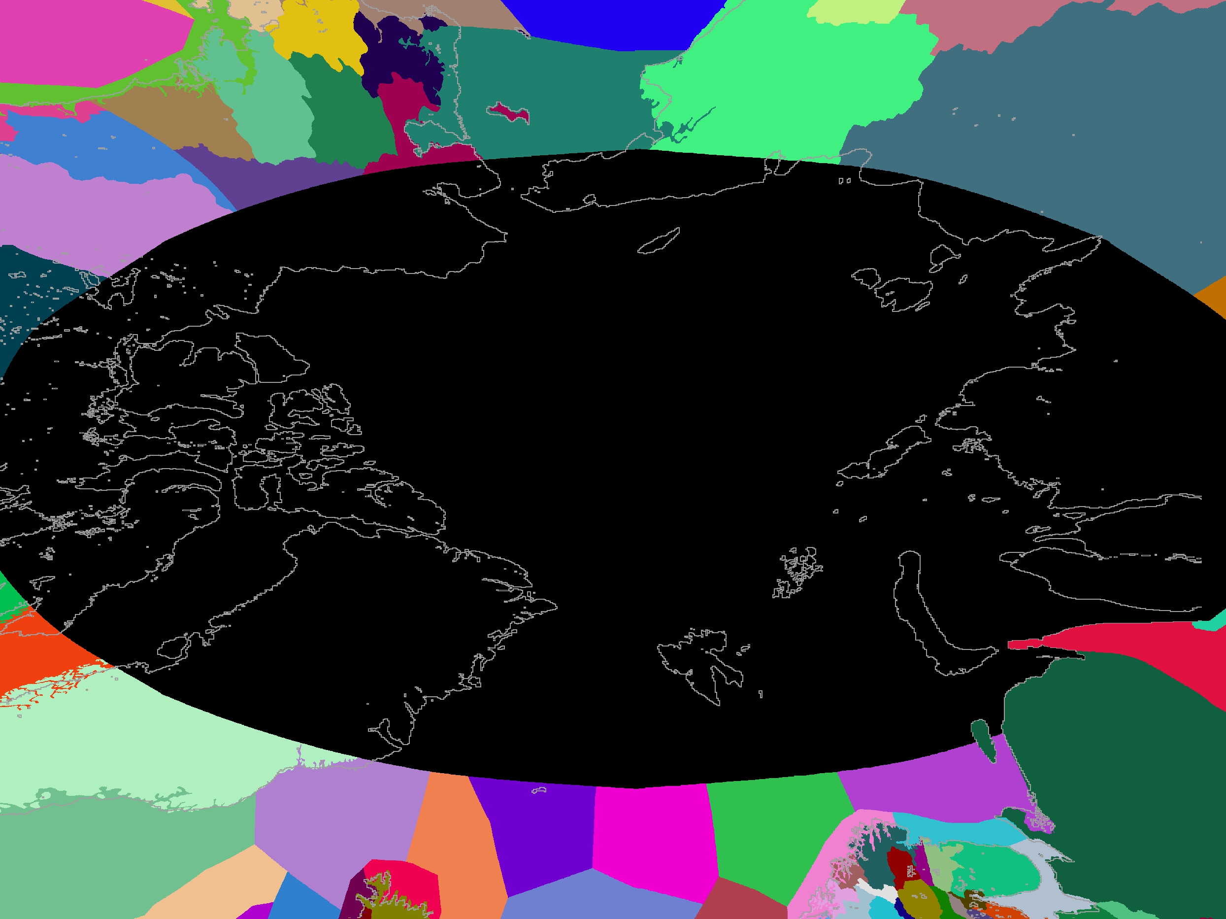
The work is not finished. The borders at the North Pole are ready, but the seas are not ready.
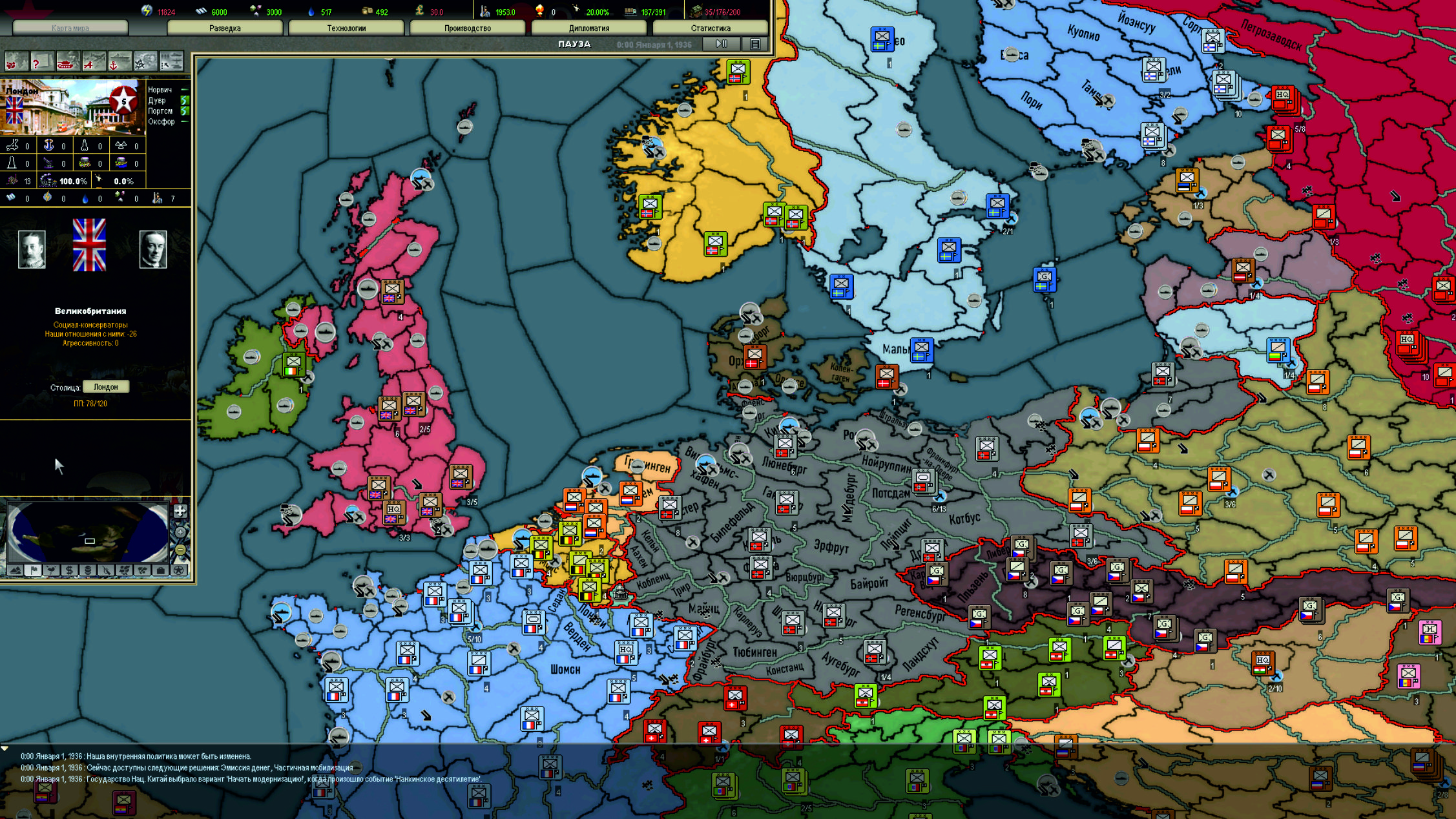
6.jpg

7.jpg

Install: copy files, make backup copies of files first.
Map_1 (topo) contains a view with a satellite (image transparency 50%) in layers layer 1, 2. In layer 4 there is a satellite without transparency
Map_1 does not contain satellite images
 

Attachments

  • Map_1 (topo).rar
    25,9 MB · Views: 0
  • Map_1.rar
    24 MB · Views: 0
Last edited:
  • 1
  • 1
  • 1Like
Reactions:
Fascinating.
Everybody has learned in school about the problems of making a worldmap, of transforming a globe into a 2d-map. And that there is not really a solution. But rather you have to decide what you want to preserve and this will be at the cost of other aspects.
And here we are hearing and watching it in pactice: a mapmaker in pain and tearing at his hair.

So, what were your decisions?
 
  • 2Like
Reactions:
Fascinating.
Everybody has learned in school about the problems of making a worldmap, of transforming a globe into a 2d-map. And that there is not really a solution. But rather you have to decide what you want to preserve and this will be at the cost of other aspects.
And here we are hearing and watching it in pactice: a mapmaker in pain and tearing at his hair.

So, what were your decisions?
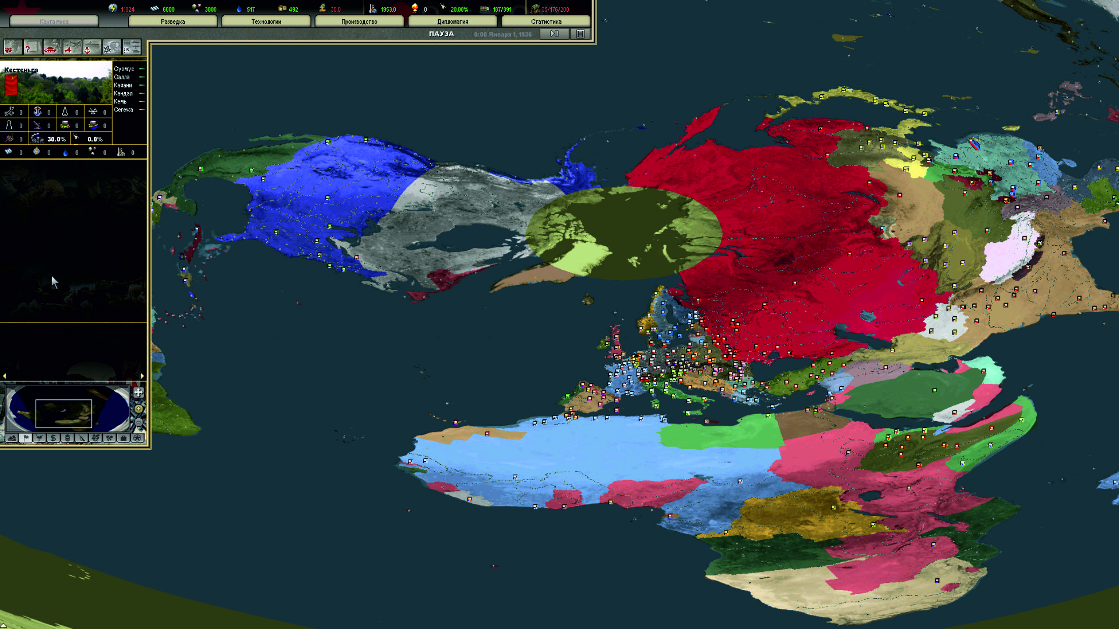
For me the most important thing was to make sure that the USA and Canada were not upside down, but at the same time Australia and New Zealand fit into the overall view. Africa is quite thick - the reason for this is that the DH map projection was used, not the real world, although I can't say what would have happened if I had transformed the real world map (Mercator projection). In general, it would have been ideal to slightly increase Europe by reducing Africa and redraw all the islands in the Pacific Ocean for better interaction with the player.
 
  • 1Like
Reactions:
Well, the advantages of the mercator projection, if I recall correctly... it has been a while since school...
Ok, so before writing complete rubbish I decided to better look up a few things...

Yeah, remembered it surprisingly correct:
Mercator is great for being true to longitude and latitude, good for navigating and calculating distances. Size goes wild towards the poles but the shape of the countries/continents keeps quite close to how we can see it on a globe which makes it less bewildering to look at.

This are probably the 2 most important bits for DH as well: true to longitude and latitude and not giving a bewildering surprise shapewise while we are rather used to the completly off sizes of the countries in relation to each other (eg. Greenland looking much bigger than India while in reality it is the other way around by far). There should be a globe in every classroom or mandatory to stare as long on true size projections of the earth as on mercator to get no weird impressions.

Thinking about it... there is probably no way to get sizes right without loosing shapes and longitude/latitude and with that distance calculation gets a pain.

Did I understand you right, the DH map is not a mercator projection? How is distance calculation done then?
 
  • 1Like
Reactions:
In the entire HOI, EU and CK series, Paradox developed its own projection based on Mercator - the main differences are in the location of America relative to Eurasia and Africa. In reality, the American continent should be shifted to the south. The islands are also larger than they should be. They changed it for greater clarity and ease of use. In DH, the map also retains these features. But DH introduced a new system for calculating distances, and it already takes coordinates from the standard Mercator projection, despite the fact that the map has a different projection. Yes, Mercator greatly increases the sizes of countries towards the poles - look how huge Russia is, it is as big as Africa. But in reality, this is not so. The globe perfectly conveys the sizes of all countries and continents.
 
  • 1
  • 1Like
Reactions:
As it turned out, the climate is not tied to the province id and therefore it is broken - frosts cover Europe in June. I don't know how it works. It seems to me that this is connected with the hemispheres of the earth - they cannot be replaced or changed in any way
 
Last edited:
  • 1
  • 1Like
Reactions:
Reading distances from map\map_1\airdist.tbl... ERROR in provinces (expected: 2796, found: 2769)! Switching to old distance calculation!
Hmm... Currently this error occurs. I wasn't too lazy and finished the north pole. Now French and English ships often sail there. They told me about the climate - at the moment the ector line cannot be moved, it is hard-coded. It would be better if each province had a separate field where you can indicate the hemisphere of the land.
 

Attachments

  • Безымянный-1.jpg
    23,4 MB · Views: 0
  • 2Like
Reactions:
I want to note that working with the distance.csv file requires caution. For some reason, airdist was not found and the game switched to the old distance calculation. Okay. I completely restored all the files to the original: the game stopped finding this file anyway! I even rebooted the computer and it still continued. In the end, a complete deletion and restoration helped. And suddenly everything worked. There is still a lot that is unclear. For some reason, my last sea province is not clickable, this is very strange. But ships can sail into it.
 
  • 1Like
Reactions:
As it turned out, the climate is not tied to the province id and therefore it is broken - frosts cover Europe in June. I don't know how it works. It seems to me that this is connected with the hemispheres of the earth - they cannot be replaced or changed in any way
First of all, impressive work ! Congratulations, I say it again but you're a magician.
About the weather system it seems indeed that it is linked to the map, I've seen someone pointing out a bug were balkan weren't as snowy as they should and after looking from the origin of this, an invisible equator line seems to impact the weather
 
  • 2Like
Reactions:
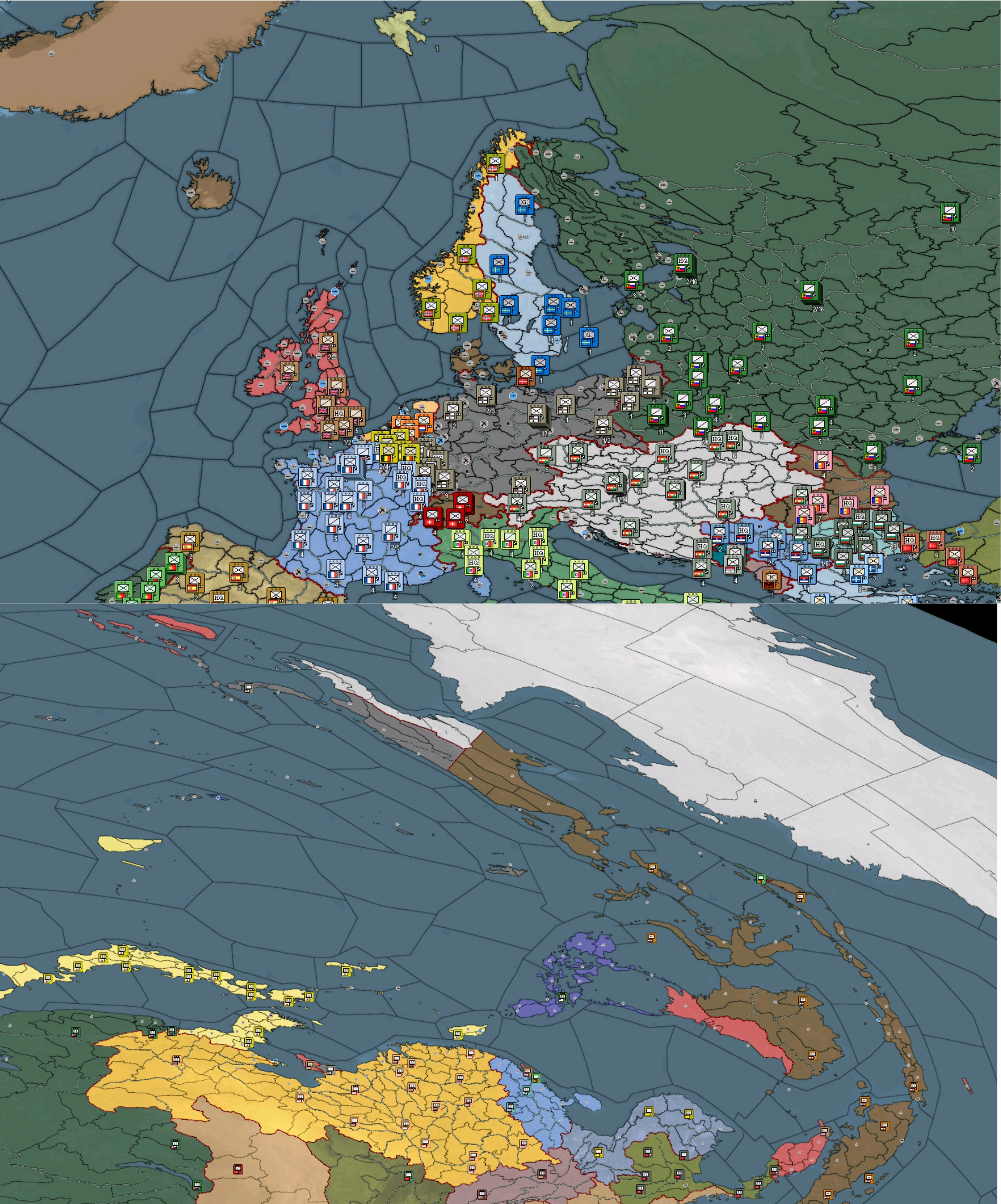
Hello, I've been gone for a long time! I managed to make two versions of the map a little. I like the map without a satellite base much more - it looks very light and does not strain the eyes. I used a shadow effect on the borders and a slight blurring of the image so that the borders do not seem so rough. But since the map distortion was not done manually, but by software, some things look very rough. I managed to master the seamless connection between different titles. I added a minimap that matches this round world. Now there are no joints between the provinces. The map with a satellite base looks too dark and rougher. North Pole - it was very easy to draw the coastline. And the division into provinces took time - purely technically very simple, but problematic for the game balance:
- in northern Canada, I may have gotten carried away with the division of maritime provinces, while the coast of Eurasia is not so detailed;
- Greenland is one big province - perhaps this is a mistake;
- I tried to divide the sea zones according to the geological map of the shelf - especially the area of Greenland and Iceland, the more northern parts are already to my taste. I tried to adhere to the "limitation" of 5 neighboring provinces.
1.jpg
2.jpg

7.jpg

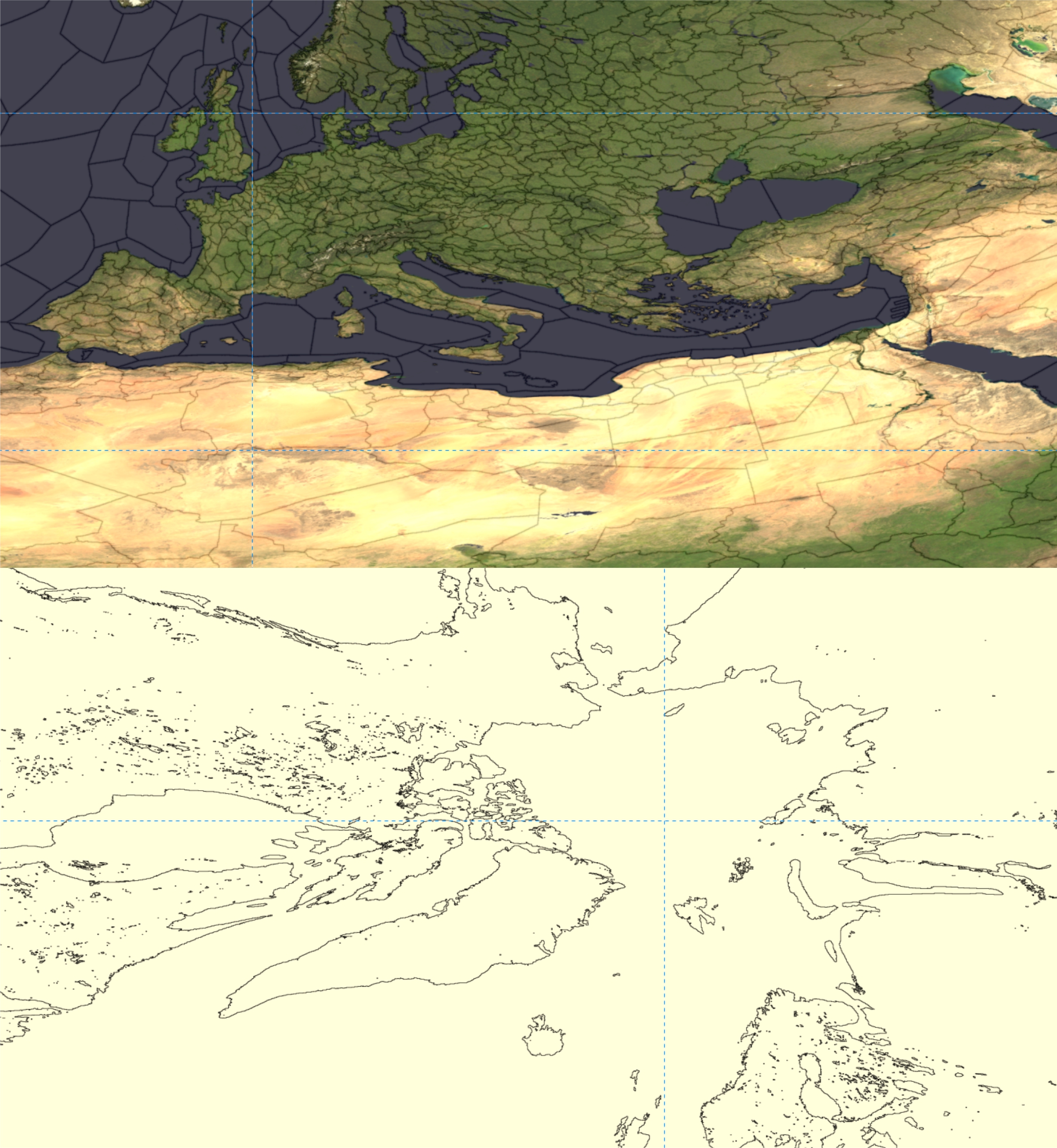
As a result, there is an active movement of sea units through the Arctic. As for drawing - as it turned out, you can draw with software, but it is impossible to achieve a beautiful picture, only manually. I made all the borders based on the joints of the identification titles. The original map survived the transformation very poorly and looks terrible.
3.jpg
5.jpg

As for the problems: there are a significant number of visual errors:
- the borders of the sea zones end incorrectly;
- too distorted sea labels of the provinces. The same applies to Israel;
- the hemisphere of the earth is not tied to the provinces - the climate is incorrect;
- for unknown reasons, the North Pole is not clickable, but it is reachable for sea units;
- no names added to new provinces and there is a coordinate error - for example in Russia, where there are 5 km between provinces, everything is fine in Canada;
- no pictures added to new provinces. I planned to use ice;
- an error displaying divisions in provinces (In Australia for sure).
6.jpg
8.jpg

As a result of very slow work, I have highlighted for myself that dividing the map into 64 titles is excessive and slows down the work very much. If there were 16 titles, it would be great and much simpler.

What needs to be done: fix graphic errors, redraw island labels.
The map is compatible with the game and any mod - identifiers are not changed. Yes, there will be errors in the script, due to the fact that new provinces have not been added to countries, but everything works. You can add the Moon in the corner of the map.

And this is an example of the boundaries I dream about:
map_468_225.colorscales2.png


DOWNLOAD:
Map without topo
Map with topo
 

Attachments

  • Map_1 (Topo).rar
    23,7 MB · Views: 0
  • Map_1 (NoTopo).rar
    19,4 MB · Views: 0
  • 2Like
Reactions: