• We have updated our Community Code of Conduct. Please read through the new rules for the forum that are an integral part of Paradox Interactive’s User Agreement.
unlike the capital font they use on the videos which is kind-of bordering between serif and sans-serif that gave me the ick (though my remark that it was "AI generated" was ungrounded at best)
I never meant they should use the exact same font as in the videos. My main concern was about other aspects.
However, since the developers and marketing present the game as the most immersive GSG (that is true), I believe a relevant and interesting font is essential. Not necessarily unique, but immersive.

Then what kind of font makes it soulful and un-dull?
Even CK3 and Vicky3 are good examples of utilising un-dull fonts (though I dislike the fact that Vicky3 uses a ton of different fonts throughout the game).
KCD2 was a great example as well.
I’d use something like this as inspiration (XV–XVI centuries) for English localisation:
1752922749157.png


A quick Google search showed me various options:
1752923196622.png

1752923813894.png

1752924410499.png

and many others.
 
  • 4Like
Reactions:
Yes! The fact EU5's UI doesn't seem to be progressing past what I'd consider a "beta" look really disturbs me. But those screenshots you posted (specifically the "Tinto Flavor" title) are exactly the sort of direction the actual in-game UI (and the in-game buttons in particular) should go in.
 
  • 5
Reactions:
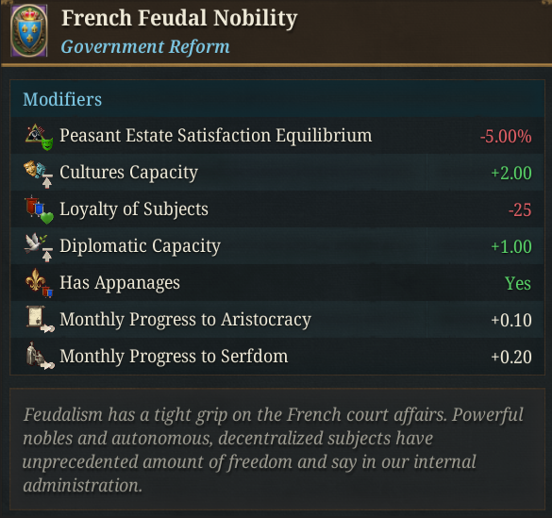
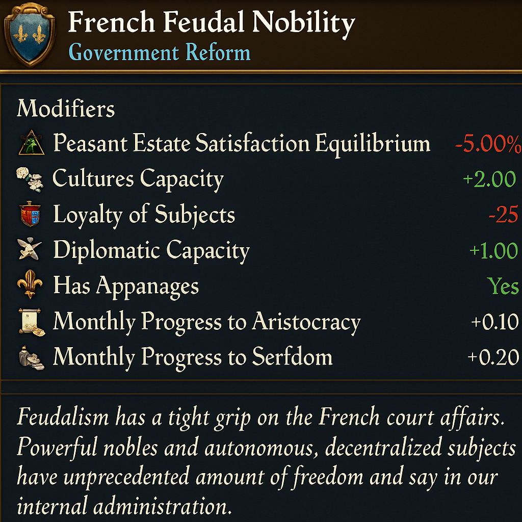
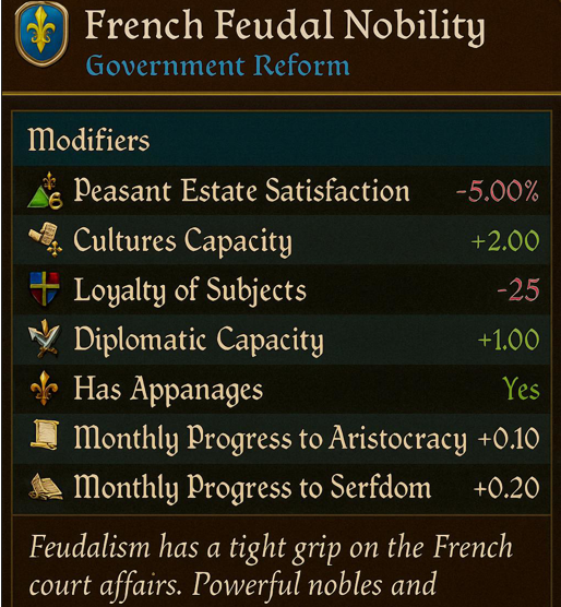
It's better to show something once than to describe it in a dozen posts, so I tried experimenting with ChatGPT to see how it might look in-game.
Please consider the examples as illustrative only and it's only about the font.

Original
Example 1
Example 2
1753429046634.png
1a.PNG
2.PNG
Fonts like those in Example 1 could be used for headers and titles, while fonts from Example 2 could work well for body text.

Another illustrative examples:

Original
Example 3
Example 4
1753430787488.png
1753430821233.png
1753431292050.png
-

Personally, I'd also prefer a more saturated background and higher-contrast texts – the original style looks pale now :D
 
Last edited:
  • 3Love
  • 2Like
  • 2
Reactions:
It's better to show something once than to describe it in a dozen posts, so I tried experimenting with ChatGPT to see how it might look in-game.
Please consider the examples as illustrative only and it's only about the font.

Original
Example 1
Example 2
Fonts like those in Example 1 could be used for headers and titles, while fonts from Example 2 could work well for body text.

Another illustrative examples:

Original
Example 1
Example 2
-

Personally, I'd also prefer a more saturated background and higher-contrast texts – the original style looks pale now :D
The examples remind me more of Bannerlord, or CK3, rather than EU series.
EU series (EU3, EU4) have always used the Enlightenment-era serif font, and while I do agree to an extent that the current font is a basic one, I personally think this kind-of bard-like font would fit well for the scope of the game. Maybe for a medieval game it'd be nicer to have.
 
Nevermind the font, can we please have this

1753434353975.png


instead of this?

1753434387605.png


I appreciate that the detailed texture probably wouldn't come through at the smaller scale and so could be scrapped, but just that little flair at the corners would do so much to alleviate some of the blandness in the UI.
 
  • 3
Reactions:
The examples remind me more of Bannerlord, or CK3, rather than EU series.
EU series (EU3, EU4) have always used the Enlightenment-era serif font, and while I do agree to an extent that the current font is a basic one, I personally think this kind-of bard-like font would fit well for the scope of the game. Maybe for a medieval game it'd be nicer to have.
Some of the examples above represent mid-game period styles – something between bard-like and Enlightenment aesthetics. I believe this should be a benchmark for a game that spans 500 years.
  • The problem with EU4 was that almost no one played until the late game. Hopefully, that will be improved, though I’m not sure it can be completely fixed, as players abandoning campaigns seems inevitable.
  • The Tinto flavour content shown clearly has around 80% of its focus on the early and mid-game.
  • Even in EU4, the font looks a bit nicer – though perhaps only because of its unique and legendary overall UI style.
So, to me, some kind of middle ground between Medieval and Enlightenment styles seems reasonable and more immersive.
 
  • 2
Reactions: