I've been following Tinto Talks for over a year now, and I always assumed all the terrain screenshots are just temporary alpha/beta stuff (I mean every single one always comes with a big "STILL WIP!!" qualifier). But, uh, if Paradox are releasing this sort of video on their main EU5 channel, I guess this is supposed to be "close to complete"? Sorry, but this just looks unfinished. It looks good in some places, but absolutely terrible in most others. The fact they layer this epic music on top of it and do these 'cinematic' shots is nothing short of embarrassing.
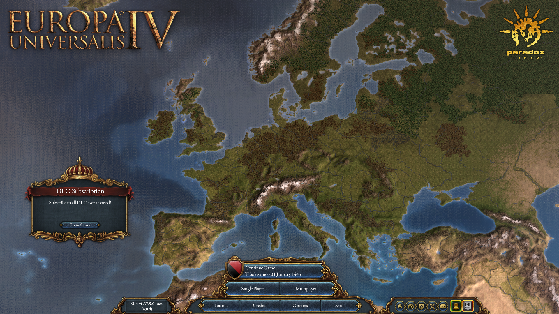
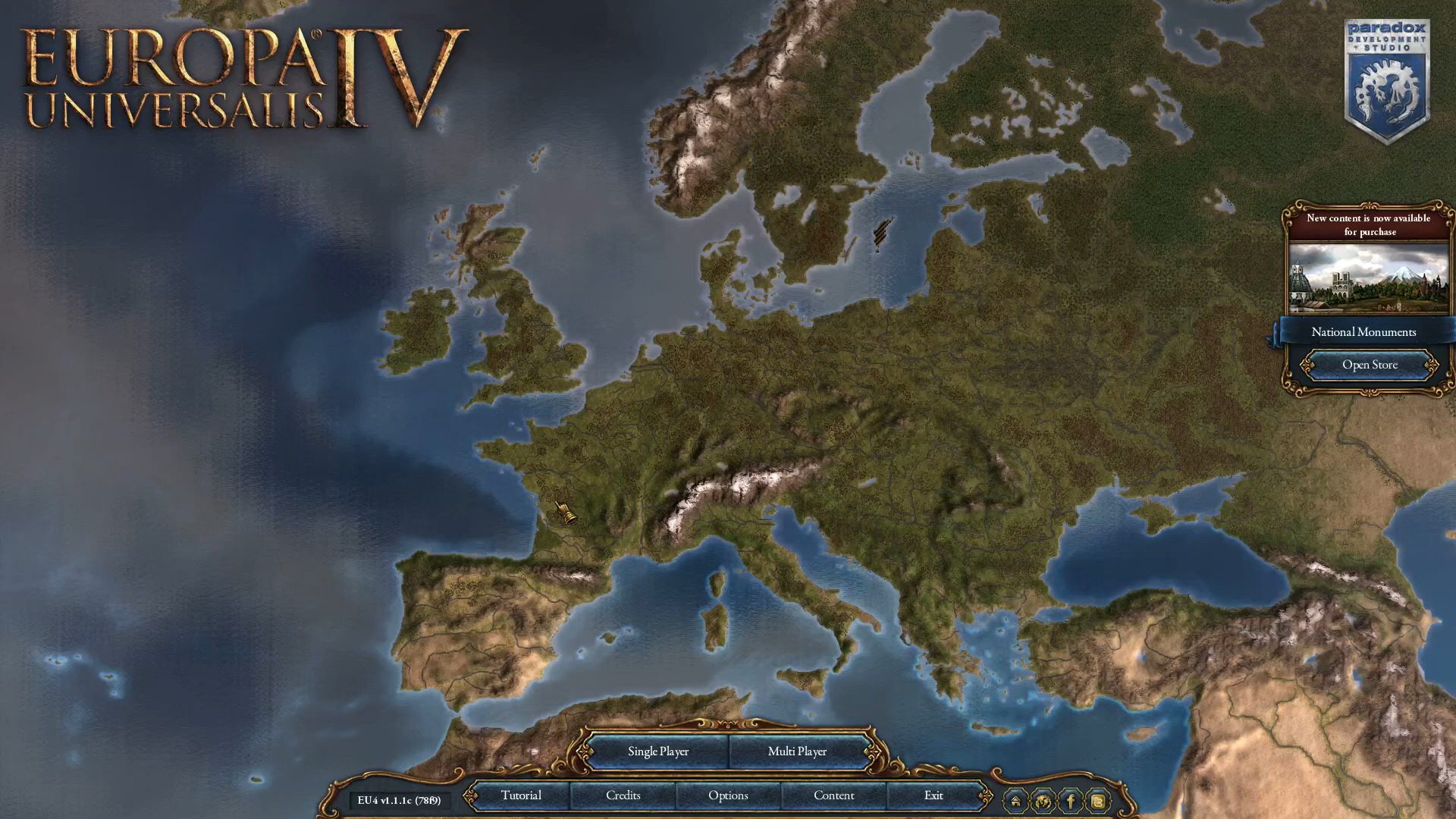
I'm not an artist or game designer or anything so I'm not going to pretend I know exactly what's wrong, I just know it looks very... bland. It doesn't look like a living world, it looks like an old 2000s tycoon game or something. And I don't think the level of graphical fidelity is the issue, because there's clearly more polygons on display here compared with EU4, and yet EU4's terrain is so so so much more pleasant to look at, even if it's terribly simplistic/blob-y.
Paradox, this isn't ready. AT ALL. Rearrange your development roadmap and push back the release date if required, but this is a major problem. People in the YouTube comments keep mentioning Imperator Rome and yeah, I haven't thought about it until now, but it
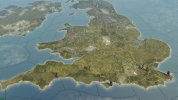
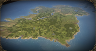
is your most pretty terrain map. Just as a quick and dirty comparison, look at this:


Imperator just looks so "sharp" and "alive". It looks like a stylized birds-eye view of the world, like a place where you have actual tiny people living around in. It's an actual island in the shape of Great Britain that just happens to be about ~30 times smaller, and you look at it from airliner altitude. Meanwhile EU5 looks... bleh. Just some vaguely earth-shaped blobs that someone spray-painted green & yellow, then glued a bunch of houses/trees of inappropriate scale to it.
And while we're on the subject of aesthetics, I keep waiting for the UI to be updated, but it still looks like a mobile game or something.
Look at the feedback Civilization 7 received, and how much the blandless of the UI there is a consistent complaint. The UI is the thing the player actually interacts with in these strategy games for 80% of the time. The "baroque" style of EU4, the "stoney" look of CK2 and the "marble-y" feel of Imperator were all wonderful. The UI should look pretty, it should feel like something from the game's time period. EU5's current UI is so drab by comparison. And the shiny candy-like buttons make it feel like a mobile cashgrab. Again, I'm not an artist so I can't put to words
what is wrong, but I just know it doesn't look good. Maybe take some inspiration from period-accurate chests/cabinets/devices/instruments?
EDIT:
I just realized that actual developers/artists working at Paradox read these messages so I'll also add this:
Please don't let this discourage you. I am still extremely excited for EU5 and it's clear you've put a lot of effort into this game (and into the terrain!). We want this game to be the best version of itself it can be, something that can really live up to the title of "Paradox's flagship game". I think I can speak for most of the community when I say we're okay with waiting a bit longer if it means that the game we'll get to play will be a 10/10 experience. Take a deep breath, take your time. Be creative and make it as pretty as you care to make it.
And as the guy above mentioned, it's easy to complain and forget to point out the good, so I'll also say that the actual towns and the armies look wonderful.
