• We have updated our Community Code of Conduct. Please read through the new rules for the forum that are an integral part of Paradox Interactive’s User Agreement.
Also, I'm sure it's been mentioned, but the coastlines still look pretty bad. Why are they so... tall? And... soft/blobby? IR did coasts sooooo much better.

1752845603639.png
 
Last edited:
  • 35Haha
  • 1Like
Reactions:
  • 14Like
  • 5Love
  • 2
Reactions:
RoboJohan.jpg

Pictured: May 18th, 2018
A robot Johan is sent to eliminate his past self before the announcement of Imperator: Rome and its terrain.
 
  • 23Haha
  • 1
Reactions:
Dude, so far, so good. if you optimize this, then the project will fire, if the FPS is around 20 frames, then there will be negative user reviews. it is clear that those who have tops can be pretty, but those who play on calculators need official settings for reduced graphics "already out of the box"
 
  • 4
  • 1Like
Reactions:
Luckily when you zoom out enough the papermap kicks in because the following picture looks horrendous in my opinion. Not sure if it's the colors, the lack of vegetation, shadows or something else:
View attachment 1335628

In comparison even the EUIV terrain map looks great (on release at least, later I think it changed):View attachment 1335625

Zoomed in it improves a lot and things generally look quite nice but coasts for sure is the biggest thing has to change, they look very abrupt and unnatural.

I'm mostly concerned about the medium level of zoom (let's say a zoom that allows you to see a whole region). I'm not good at pointing specific things on graphics, but here are some pictures that don't look good for me:

View attachment 1335640
View attachment 1335641
View attachment 1335642

Summary:
- Very zoomed out: looks very bad but you will probably never see it because it's the intended zoom for the papermap I think.
- Medium zoom: looks a bit better but still pretty bad.
- Very zoomed in: looks clearly the best but specific things like coasts still stand out too much.
I think you forgot you have Graphical Map Improvements turned on, this is the vanilla EU4 map:
Screenshot 2025-07-18 131650.png
 
  • 1
Reactions:
I think you forgot you have Graphical Map Improvements turned on, this is the vanilla EU4 map:
View attachment 1335804
I got it from Google so you might be right, but yours is how the map is now, on release it was a bit different:

1752859475284.jpeg

In some updated they decided to match the terrain types with the visual representation 1:1 and it made trees an other things look in blocks and weird.
 

Attachments

  • 1752859475393.jpeg
    1752859475393.jpeg
    631,6 KB · Views: 0
  • 1752859475676.png
    1752859475676.png
    2,9 MB · Views: 0
  • 3Like
  • 1
Reactions:
I got it from Google so you might be right, but yours is how the map is now, on release it was a bit different:

View attachment 1335809
In some updated they decided to match the terrain types with the visual representation 1:1 and it made trees an other things look in blocks and weird.
It's a pretty big shame they did that honestly. I know it was probably for gameplay reasons, but it just looks so much worse to see large swathes of Europe completely tree free.
 
  • 6
  • 1Like
Reactions:
Are the devs looking into creating better boundaries between locations so the difference between them isn't so dramatic? Imperator is a good example of this, even Egypt's desert, which is about as sharp a change as anything on the map should be, is still smoother than what we see here.
 
  • 1
Reactions:
Please note graphical textures may not be final
While the textures definitely need some work, that's not the only problem I see with the map that is holding it back:
  • Forests are way to uniform and most of them too bright too: Northen forests should look much darker then say Mediterranean forests, and tropical forests should be more lush (although we haven't seen any examples of these, just pointing it out). This could be tied to climate for instance.
  • Coastlines are very ugly: Sardinia looks like it's made of plastic, it feels fake. A good example (and in my opinion the best example) of a good coastline look is I:R. The main problems I see are:
    • The shading and the shape of coasts. Not all coasts in the world are 100 m high cliffs, and I believe this​
    • The textures: I know they are WIP, but still, I:R had a mix of rocky cliffs and sandy beaches. Most of what we have seen are ugly brownish, uniform coasts.​
  • The water is also too bright: imo the mediterranean should be the colour of the current Atlantic, while the Atlantic should look a little darker. Lakes are also not that bright blue colour irl, lake pollution aside.
    Also, waves around coasts are way to big and out of proportion. In general I would preferer a more "open sea" look for waves, generally more caotic, rather then the beach-like look and their perfect movement towards the coasts, even in places that would be like 100+ km away from the beach irl.​
  • The divisions between different locations with different terrain is way too marked. It should be as gradual as possible. (again textures, I know WIP, but still)​
And now for the good parts:
  • Mountains are gorgeous, the way they interact with the trees is fantastic
  • Cities are also beautiful, what we had in eu4 cannot even compare
  • Armies for the first time in a paradox game feel like actual armies, rather then giant dudes fighting (although the perfectly still horses during combat are kinda ugly)
  • Volcano are cool ig
Overall I think the map looks good, but it still is far away from the map I:R had, easly the best ever made by pdx. But I am optimistic that that level is achivable by eu5, with some work on textures, trees and coastline shape I think it could really rival I:R.
 
  • 11
  • 3Like
Reactions:
Man, the imperator map was gorgeous, I wonder why it is being so difficult to translate the best aspects of it to EUV
Because they're obsessed with making their games "accesible" and new-player-friendly, so it has to look like a toy set or diorama like CK3 and V2 for the new people who need to see a big playmobile castle plopped right there on the map to know it's a defense location. Same with coastlines, they need to look like the elevation sinks 5km right there where the land meets the sea so they're able to tell that yes, land is over and now there's water there instead, etc.
 
  • 4
Reactions:
While the textures definitely need some work, that's not the only problem I see with the map that is holding it back:
  • Forests are way to uniform and most of them too bright too: Northen forests should look much darker then say Mediterranean forests, and tropical forests should be more lush (although we haven't seen any examples of these, just pointing it out). This could be tied to climate for instance.
  • Coastlines are very ugly: Sardinia looks like it's made of plastic, it feels fake. A good example (and in my opinion the best example) of a good coastline look is I:R. The main problems I see are:
    • The shading and the shape of coasts. Not all coasts in the world are 100 m high cliffs, and I believe this​
    • The textures: I know they are WIP, but still, I:R had a mix of rocky cliffs and sandy beaches. Most of what we have seen are ugly brownish, uniform coasts.​
  • The water is also too bright: imo the mediterranean should be the colour of the current Atlantic, while the Atlantic should look a little darker. Lakes are also not that bright blue colour irl, lake pollution aside.
    Also, waves around coasts are way to big and out of proportion. In general I would preferer a more "open sea" look for waves, generally more caotic, rather then the beach-like look and their perfect movement towards the coasts, even in places that would be like 100+ km away from the beach irl.​
  • The divisions between different locations with different terrain is way too marked. It should be as gradual as possible. (again textures, I know WIP, but still)​
And now for the good parts:
  • Mountains are gorgeous, the way they interact with the trees is fantastic
  • Cities are also beautiful, what we had in eu4 cannot even compare
  • Armies for the first time in a paradox game feel like actual armies, rather then giant dudes fighting (although the perfectly still horses during combat are kinda ugly)
  • Volcano are cool ig
Overall I think the map looks good, but it still is far away from the map I:R had, easly the best ever made by pdx. But I am optimistic that that level is achivable by eu5, with some work on textures, trees and coastline shape I think it could really rival I:R.

Thanks! Coasts is something we're working on asap, after which we'll be continuing to make changes and refinements based on all the community feedback we've received.
 
  • 19Like
  • 1Love
  • 1
Reactions:
Thanks! Coasts is something we're working on asap, after which we'll be continuing to make changes and refinements based on all the community feedback we've received.
Thank you for the information on what tinto are working towards, hopefully all the feedback has been useful and applicable. I want to see this game more than anyone but take all the time in the world to cook if needed :)
 
  • 1Like
Reactions:
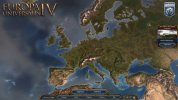
I've been following Tinto Talks for over a year now, and I always assumed all the terrain screenshots are just temporary alpha/beta stuff (I mean every single one always comes with a big "STILL WIP!!" qualifier). But, uh, if Paradox are releasing this sort of video on their main EU5 channel, I guess this is supposed to be "close to complete"? Sorry, but this just looks unfinished. It looks good in some places, but absolutely terrible in most others. The fact they layer this epic music on top of it and do these 'cinematic' shots is nothing short of embarrassing.

I'm not an artist or game designer or anything so I'm not going to pretend I know exactly what's wrong, I just know it looks very... bland. It doesn't look like a living world, it looks like an old 2000s tycoon game or something. And I don't think the level of graphical fidelity is the issue, because there's clearly more polygons on display here compared with EU4, and yet EU4's terrain is so so so much more pleasant to look at, even if it's terribly simplistic/blob-y.

Paradox, this isn't ready. AT ALL. Rearrange your development roadmap and push back the release date if required, but this is a major problem. People in the YouTube comments keep mentioning Imperator Rome and yeah, I haven't thought about it until now, but it 
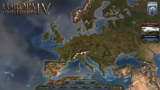
is your most pretty terrain map. Just as a quick and dirty comparison, look at this:

imperator.jpg
eu5.png

Imperator just looks so "sharp" and "alive". It looks like a stylized birds-eye view of the world, like a place where you have actual tiny people living around in. It's an actual island in the shape of Great Britain that just happens to be about ~30 times smaller, and you look at it from airliner altitude. Meanwhile EU5 looks... bleh. Just some vaguely earth-shaped blobs that someone spray-painted green & yellow, then glued a bunch of houses/trees of inappropriate scale to it.

And while we're on the subject of aesthetics, I keep waiting for the UI to be updated, but it still looks like a mobile game or something. Look at the feedback Civilization 7 received, and how much the blandless of the UI there is a consistent complaint. The UI is the thing the player actually interacts with in these strategy games for 80% of the time. The "baroque" style of EU4, the "stoney" look of CK2 and the "marble-y" feel of Imperator were all wonderful. The UI should look pretty, it should feel like something from the game's time period. EU5's current UI is so drab by comparison. And the shiny candy-like buttons make it feel like a mobile cashgrab. Again, I'm not an artist so I can't put to words what is wrong, but I just know it doesn't look good. Maybe take some inspiration from period-accurate chests/cabinets/devices/instruments?

EDIT:
I just realized that actual developers/artists working at Paradox read these messages so I'll also add this: Please don't let this discourage you. I am still extremely excited for EU5 and it's clear you've put a lot of effort into this game (and into the terrain!). We want this game to be the best version of itself it can be, something that can really live up to the title of "Paradox's flagship game". I think I can speak for most of the community when I say we're okay with waiting a bit longer if it means that the game we'll get to play will be a 10/10 experience. Take a deep breath, take your time. Be creative and make it as pretty as you care to make it.

And as the guy above mentioned, it's easy to complain and forget to point out the good, so I'll also say that the actual towns and the armies look wonderful.
 
Last edited:
  • 14Like
  • 3
Reactions: