• We have updated our Community Code of Conduct. Please read through the new rules for the forum that are an integral part of Paradox Interactive’s User Agreement.
Originally posted by Kaiser Bill
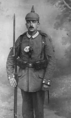
You chaps have done some great work here; but I am sad there is still no sign of the infamous Picklehaub, or a dashing rolls-royce armoured car.

Never mind... The Zeppelins almost make up for it!

I suspect that our search for a German soldier wearing the pickelhaube will culminate in one of us going through the standard HOI sprites and drawing a little grey spike on every frame...

Poppy.jpg
 
LOL

:rofl:

For some reason your answer amused me greatly Allenby.
 
Well not exactly. I am just wonder if you will even be able to tell if there is a little spike there or not.
 
My thoughts exactly. I mean, that british "soupdish" helmet wearing guy, it took a lot of goodwill to "see" the shape of the helmet.
 
To be honest, when I think of German WW1 troops I think of coal-scuttle helmets, not pickelhaube.

gertroops.jpg


Which has the advantage of not requiring any changes to the sprite. :)
 
Yeah I got to go with StephenT on this. I always thought the pickelhaube was dress uniform, and for cartoons (before the PC craze of recent times) way of making fun of Germans. :D
 
Originally posted by shdwknightx
Yeah I got to go with StephenT on this. I always thought the pickelhaube was dress uniform, and for cartoons (before the PC craze of recent times) way of making fun of Germans. :D

Such as the 'First World War German Soldier Recreation Graduation Ceremony' from The Simpsons whereby the graduates throw their pickelhaubes into the air and duck as they hurtle back down again? :D

I disagree wholeheartedly - when I think of the First World War and Germany, I think of the mass of pickelhaube wearing, field grey clad infantry trudging through Belgium with their rifles by their hips, ready to be picked off by our plucky Tommies...

gph003.jpg
 
Originally posted by Allenby
Such as the 'First World War German Soldier Recreation Graduation Ceremony' from The Simpsons whereby the graduates throw their pickelhaubes into the air and duck as they hurtle back down again? :D

I disagree wholeheartedly - when I think of the First World War and Germany, I think of the mass of pickelhaube wearing, field grey clad infantry trudging through Belgium with their rifles by their hips, ready to be picked off by our plucky Tommies...

Okay, I am biased here, but I am with Allenby. The coal scuttle wasn't widely available until 1917. But I suppose it has to be a pretty low priority in the grand scheme of things.
 
Pickelhaube helmets were the norm until the Allied blockade deprived Germany of the necessary materials - then they moved to Ersatz pickelhaubes, and when even that was hard, the plain coal scuttle helmet.

I am definitely for pickelhaubes with black and gold colouring.
 
Originally posted by ptan54
I am definitely for pickelhaubes with black and gold colouring.

That sounds a bit 1866 don't you think? ;)

They were leather covered during the First World War, with a big number on the front.

I've already started a process of pickelhaubisation with regard to the German infantry sprites and it literally involves making two pixels above the Boche's head grey. :D
 
Looks like there's a glitch in the German flag. :D
 
Um...I think I see a pixel change.

Gwalcmai, if the house doesn't work for the Home Front icon. What about the outline of some people. Like a papercut out.
 
I've noticed it for a while - but is the German soldier sprite wearing short sleeves?

Looks like the colour of the forearm isnt grey - perhaps we can alter that a bit?

And while you're at it, can we alter the cavalry also to simulate the Uhlans?

And for "dramatic effect", the Hohenzollern eagle on top of the Guard du Korps Pickelhaubes.......:D
 
Last edited:
Hmm, he does look like he's wearing short sleeves.

About the house icon, I didn't mean exactly that it didn't work, I was just saying that that particular version of it looked like sh**. I've since made one that didn't look quite as bad, but it's still in dire need of tweaking.

Tell you what, could you open mspaint (or your paint app of choice) and make a rough sketch of some ideas, and then put it up? Then people could give their opinions and make counter-proposals.

edit: to ilustrate:
home1.bmp
home2.bmp

And this is supposed to be the better one... :)
 
Last edited:
Hey that house icon is not too bad. The color of the Gold one seems a bit off, compared to your industrial factory one (at least I think so).

You don't want me to try and post any of my ideas, it would consist of a stick figure...


EX)

\0/
-U
/ \
 
Slight change to give more of a 3d feel to them. (look up, I substituted in the previous post)
 
Looks better Gwalcmai. I don't know if it would make it look better or not, but have you tried to move the lighter area (in the center), where it looks like a light is shining on it to the upper left hand corner?