• We have updated our Community Code of Conduct. Please read through the new rules for the forum that are an integral part of Paradox Interactive’s User Agreement.
So, yes. CK2 portraits were ass. There are a few crucial differences I think are worth noting, though:
  • CK2 portraits were small. They looked terrible, but for all that it's a supposedly character-centric game you never actually look all that closely at them; the game does a very good job actually of leading your eyes back out towards the places that things are actually happening (the map, other menus), and your character in the top left mostly became a quick button to reach familial interactions. The 3D models always seem to end up being enormous, for reasons known only to Paradox. No one yet knows what the UI will look like for this game or how it will impact the UX; it could be as tight as EU4 and the 3D will hardly matter or it could be as bloated as V3 where vast tracts of screen real estate are dedicated to portraying unattractive images that convey no information. What little we have seen does seem to indicate that it's not huge, referring to the family tree image on the dev diary, but I'm the very last person to blame people for being sensitive to UI/UX issues from Paradox of late (even if Johan himself has had a pretty good track record on that, to my awareness).
  • CK2 alone was seen in such a poor light. Vic II has no shortage of both praises and criticisms thrown its way but the one thing I've never even heard someone say in the context of it is character portrait (lest anyone argue they don't get them - generals and admirals did). They were at least innocuous. HoI4's lavish oil paintings are, even I must confess, a little impractical for a more widely scoped game but are also clear evidence of what 2D art Paradox has put out in the past.
I don't think it's unfair to point out that 2D art can be poor and refer to CK2 as evidence. I think it's also fair to point out that Paradox's track record with both types of art definitely leans stronger in 2D overall than 3D, where they've yet to have a clear and absolute win. Even with CK3 (which I have not played), the consensus seems to me to be quibbling about how they are the best of the 3D models but was it worth the cost in the modding scene.

Completely agree. I've posted this before in one of the dozens of merged threads so I don't even know if it is in this one, but the problem for me isn't 2d vs 3d. It is the size and distraction that can bother me. Ideally I would want to play a Caeu5ar game and not be bothered by how characters look. When I hire an EU4 advisor I don't even know how they look, I just look at the level and what bonuses they bring. Heck, most of the time I don't even know what my ruler's name is, I just look at the stats and traits and I am up to date.
If the designers of Caeu5ar want to add some extra's and have images of rulers I can life with that, as long as it doesn't distract from the gameplay, doesn't take to much screen-space and doesn't require me to do a bunch of additional clicks.

The difference between the four choices in Lord Lamberts poll is completely negligible to me. If this is the size of the ruler on my screen, does it really matter whether its 1,2,3 or 4? Are people here really so passionate about that small difference? That guilded destiny image looks as 3d as the Tinto Talks 3d model? You could even trick me into believing the CK2 is a 3d-model.
1717886069246.png
 
  • 6Like
  • 3
  • 1Love
  • 1
Reactions:
Personal preference:
I loved Imperator models
Ck3 is fine. I dont really like it but I dont hate it either.
V3: lets just say horrible

What we have been shown so far in totally not EU5 I would say I regard as fine.

Edit: I didnt know about guilded destiny but it looks really good
 
  • 4Like
Reactions:
  • 3
  • 1
Reactions:
the situation bubble in CK3 and Vic3 that Johan is on record as hating.
Oh that! I don't love the Vic3 one but i think the CK3 one is excellent.
 
  • 1
Reactions:
Oh that! I don't love the Vic3 one but i think the CK3 one is excellent.
I think they're both completely worthless and I am glad that it's already confirmed that they will not be in PCaesar.
1718116353732.png
 
  • 10
  • 4Like
  • 1
Reactions:
Check out the comments here to see the phenomenon of this forum being overtly pro-Paradox I mentioned. I am copying exactly from the top comments, with the upvote numbers in parantheses.
  • Not sure how I feel about the 3D models. They kinda look like Thomas the Tank Engine figures (269 upvotes)
  • In my opinion paintings would work better. It would fit the time period and the theme of the game better, but let’s see what they do with 3D models. Maybe it’ll turn out great. (173 upvotes)
  • I hate the 3d models. It makes the game feel dated before it even comes out. (105 upvotes)
  • Man, those 3d models are damn ugly (65 upvotes)
  • There was nothing wrong with 2d portraits, I hate that they're spending time on something that looks so bad and out of place (72 upvotes)
  • The 3d models look so cheap (23 upvotes)
  • Graphics look like it's 2009 (9 upvotes)
  • I hate 3d models I hate 3d models I hate 3d modelsI hate 3d modelsI hate 3d modelsI hate 3d modelsI hate 3d modelsI hate 3d modelsI hate 3d models I hate 3d models I hate 3d modelsI hate 3d modelsI hate 3d modelsI hate 3d modelsI hate 3d modelsI hate 3d modelsI hate 3d models I hate 3d models I hate 3d modelsI hate 3d modelsI hate 3d modelsI hate 3d modelsI hate 3d modelsI hate 3d modelsI hate 3d models I hate 3d models I hate 3d modelsI hate 3d modelsI hate 3d modelsI hate 3d modelsI hate 3d modelsI hate 3d models (21 upvotes)

The only positive comments are "Hope these get better" or "It's pre-alpha". Today's Tinto Talks once again proved that these will continue to be an eyesore, as the ones shown in this TT sucked royally, unlike the okay-ish handpicked ones from last week. As expected. They also look out of place in their out of place clothes and the throne room is weirdly sized, taking up really unnecessary amounts of visual space. This week killed all my copes, I am modding this crap out day one. Hope they FINALLY take a clue, stop listening to people on the forum and change the portraits substantially. (No offense to the artists by the way. These just do not fit in and you do not have the tools. This is a mistake higher up in the command chain, and a waste of your talents.)
 
Last edited:
  • 17
  • 3Like
  • 2
  • 1Haha
  • 1
Reactions:
Check out the comments here to see the phenomenon of this forum being overtly pro-Paradox I mentioned. I am copying exactly from the top comments, with the upvote numbers in parantheses.
  • Not sure how I feel about the 3D models. They kinda look like Thomas the Tank Engine figures (269 upvotes)
  • In my opinion paintings would work better. It would fit the time period and the theme of the game better, but let’s see what they do with 3D models. Maybe it’ll turn out great. (173 upvotes)
  • I hate the 3d models. It makes the game feel dated before it even comes out. (105 upvotes)
  • Man, those 3d models are damn ugly (65 upvotes)
  • There was nothing wrong with 2d portraits, I hate that they're spending time on something that looks so bad and out of place (72 upvotes)
  • The 3d models look so cheap (23 upvotes)
  • Graphics look like it's 2009 (9 upvotes)
  • I hate 3d models I hate 3d models I hate 3d modelsI hate 3d modelsI hate 3d modelsI hate 3d modelsI hate 3d modelsI hate 3d modelsI hate 3d models I hate 3d models I hate 3d modelsI hate 3d modelsI hate 3d modelsI hate 3d modelsI hate 3d modelsI hate 3d modelsI hate 3d models I hate 3d models I hate 3d modelsI hate 3d modelsI hate 3d modelsI hate 3d modelsI hate 3d modelsI hate 3d modelsI hate 3d models I hate 3d models I hate 3d modelsI hate 3d modelsI hate 3d modelsI hate 3d modelsI hate 3d modelsI hate 3d models (21 upvotes)

The only positive comments are "Hope these get better" or "It's pre-alpha". Today's Tinto Talks once again proved that these will continue to be an eyesore, as the ones shown in this TT sucked royally, unlike the okay-ish handpicked once from last week. As expected. They also look out of place in their out of place clothes and the throne room is weirdly sized, taking up really unnecessary amounts of visual space. This week killed all my copes, I am modding this crap out day one. Hope they FINALLY take a clue, stop listening to people on the forum and change the portraits substantially.

I don't think we will get purely 2D portraits.

But I really hope the final presentation of the 3D portraits will be improved considerably.

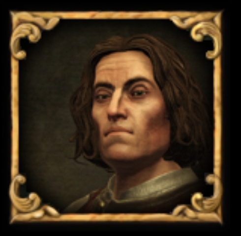
Even small changes to the UI alone can improve things I think. What do people think about this sort of presentation with standardised frames?
IMG_20240613_065640.jpg

(With some adjustments to the rest of the UI made too ofc)

And some filters or overlays over 3D images can also help too, what do people think of this?
IMG_20240613_065704.jpg
 
Last edited:
  • 14
  • 5Like
  • 1
Reactions:
I don't think we will get purely 2D portraits.

But I really hope the final presentation of the 3D portraits will be improved considerably.

Even small changes to the UI alone can improve things I think. What do people think about this sort of presentation with standardised frames?
View attachment 1147712
(With some adjustments to the rest of the UI made too ofc)

And some filters over 3D images can also help too, what do people think of this?
View attachment 1147715
I prefer a full 2d system like CK2, random enough and easy enough to make new assets
 
  • 2Like
  • 1
Reactions:
I prefer a full 2d system like CK2, random enough and easy enough to make new assets

I would too, in fact I would be happier with just a range of 2D portraits not necessarily like ck2's modular face system.

But I don't think 3D is going to go away.

Better looking 3D is probably the best to hope for.
 
  • 3
  • 2Like
Reactions:
I would too, in fact I would be happier with just a range of 2D portraits not necessarily like ck2's modular face system.

But I don't think 3D is going to go away.

Better looking 3D is probably the best to hope for.
I dont remember when I did last play EU4 unmodded. Traditions it seems I will keep up come EU5.
 
I don't think we will get purely 2D portraits.

But I really hope the final presentation of the 3D portraits will be improved considerably.

Even small changes to the UI alone can improve things I think. What do people think about this sort of presentation with standardised frames?
View attachment 1147712
(With some adjustments to the rest of the UI made too ofc)

And some filters or overlays over 3D images can also help too, what do people think of this?
View attachment 1147715
This is the best solution! I think it needs a separate discussion thread, with describing which filters and overlays can be used to achieve a painting effect.

Frames can easily depict the status of the character (king, duke, etc)

Also can you make an example with a government cabinet?
 
Last edited:
  • 2
  • 2
  • 1Like
Reactions:
And some filters or overlays over 3D images can also help too, what do people think of this?
View attachment 1147715
As someone who likes the 3D portraits, I think they would look even better with a gilded frame and a filter, so I'm all for this.

Even small changes to the UI alone can improve things I think. What do people think about this sort of presentation with standardised frames?
View attachment 1147712
Do you mean the little square silver frame? In which case... sure, its okay.
Or do you mean the whole arrangement? Because in that case, no way! As someone who like the Vicky3 UI, the worst think about that UI is how much wasted space there is... and this shield arrangement is mostly wasted space, with far less information shown. By the time you had 8 cabinet ministers, you'd never fit them on the screen.
 
  • 2Like
  • 2
Reactions:
Do you mean the little square silver frame? In which case... sure, its okay.
Or do you mean the whole arrangement? Because in that case, no way! As someone who like the Vicky3 UI, the worst think about that UI is how much wasted space there is... and this shield arrangement is mostly wasted space, with far less information shown. By the time you had 8 cabinet ministers, you'd never fit them on the screen.

I just mean the little square frame :)

Standardised frames across the board preferably.
 
  • 3Like
Reactions:
I don't care about portraits in terms of appearance, I believe that is subjective. If the debate is just about what most people think "looks the best" then naturally there's no objectivity to be found anywhere besides aesthetic preferences and people will argue about it forever.

The most important points to me are:

Moddability
Resource Usage

Moddability of 2d portraits is as easy as replacing and adding images. Modding of 3d portraits, especially for mods where renaissance or early modern attire would look very out of place, will be more tedious.


With 2D portraits the game naturally is also less resource heavy. Now you might say "well then why not remove all graphical elements to have a purely performance based game?" Then it's a thing of trade offs. Modern pdx map games use a 3d map because the increase in visual eyecandy outscales the drawbacks of a game that has more taxing resource costs. I'm fine with this. The question is are 3d portraits the same? They could be the sexiest most pristine visually stunning 3d models ever, but if it sinks the game performance to a crawl as new and more models get generated over hundreds of years then I personally don't see it as a good trade off. If PDX has somehow insanely optimised them then this argument isn't a factor, but we have no way of knowing how smooth they run longterm.
 
  • 4
  • 2Like
  • 1
Reactions:
As someone who likes the 3D portraits, I think they would look even better with a gilded frame and a filter, so I'm all for this.


Do you mean the little square silver frame? In which case... sure, its okay.
Or do you mean the whole arrangement? Because in that case, no way! As someone who like the Vicky3 UI, the worst think about that UI is how much wasted space there is... and this shield arrangement is mostly wasted space, with far less information shown. By the time you had 8 cabinet ministers, you'd never fit them on the screen.
I believe the big shield was the attempt to change the dynasty panel to use the framed image.
bj%C3%A4lbo.png
 
  • 1
  • 1
Reactions:
I don't care about portraits in terms of appearance, I believe that is subjective. If the debate is just about what most people think "looks the best" then naturally there's no objectivity to be found anywhere besides aesthetic preferences and people will argue about it forever.

The most important points to me are:

Moddability
Resource Usage

Moddability of 2d portraits is as easy as replacing and adding images. Modding of 3d portraits, especially for mods where renaissance or early modern attire would look very out of place, will be more tedious.


With 2D portraits the game naturally is also less resource heavy. Now you might say "well then why not remove all graphical elements to have a purely performance based game?" Then it's a thing of trade offs. Modern pdx map games use a 3d map because the increase in visual eyecandy outscales the drawbacks of a game that has more taxing resource costs. I'm fine with this. The question is are 3d portraits the same? They could be the sexiest most pristine visually stunning 3d models ever, but if it sinks the game performance to a crawl as new and more models get generated over hundreds of years then I personally don't see it as a good trade off. If PDX has somehow insanely optimised them then this argument isn't a factor, but we have no way of knowing how smooth they run longterm.
As a modder, it actually is not all that hard all things considered to have a culture in CK3 generate 2d portraits instead of 3d. I plan to do so for my own fantasy mod once the game comes out and I genuinely only wish we had been getting official 2D art so I would have a style to replicate, haha!
 
I don't think we will get purely 2D portraits.

But I really hope the final presentation of the 3D portraits will be improved considerably.

Even small changes to the UI alone can improve things I think. What do people think about this sort of presentation with standardised frames?
View attachment 1147712
(With some adjustments to the rest of the UI made too ofc)

And some filters or overlays over 3D images can also help too, what do people think of this?
View attachment 1147715
True, I don't think that Vicky 3 models are all that bad either I just feel that the rendering system is not tuned enough. I.e. I'm not sure whether it changed but for at least some time, the lightning on the models was horrible and unnatural with shadows being sharp and pitch-black. If someone would paint a painting with this lightning for a loading screen then it would also look crude. Someone with 2D painting skills should take a look on them and tell an engineer what would need to be adjusted for it to look good.
 
  • 2
  • 2
Reactions:
True, I don't think that Vicky 3 models are all that bad either I just feel that the rendering system is not tuned enough. I.e. I'm not sure whether it changed but for at least some time, the lightning on the models was horrible and unnatural with shadows being sharp and pitch-black. If someone would paint a painting with this lightning for a loading screen then it would also look crude. Someone with 2D painting skills should take a look on them and tell an engineer what would need to be adjusted for it to look good.

It's all about the final presentation.

It's not about the contrast of the shadows though, I don't think. Great portraits more often than not have very dark shadows.

Vic 3 portraits could look good, in theory. if you open the character editor you can see the groundwork needed to create something decent.
I think they look irredeemably bad in-game at the moment though, and they probably won't look good for the foreseeable future.

Lighting is one issue, and a big one, but it's very hard to have good lighting with a completely automated system because good lighting is dependant pose, facial expression, facial features, clothing and the sort of emotion you want to express in the final image.

Take these pre-rendered placeholders as an example.
nfb8gp831i2a1.png


The lighting is good because the lighting compliments thier faces, outfits and poses, and it reinforces the personality of the characters faces.

Vic 3 can't do this today because the damn portraits keep wriggling around, popping out of frames with static lighting over the top of them, it looks terrible and will never look good until they fix the fundamental problem with how they present the portraits, which they won't anytime soon.
 
  • 14Like
  • 1
Reactions:
It's all about the final presentation.

It's not about the contrast of the shadows though, I don't think. Great portraits more often than not have very dark shadows.

Vic 3 portraits could look good, in theory. if you open the character editor you can see the groundwork needed to create something decent.
I think they look irredeemably bad in-game at the moment though, and they probably won't look good for the foreseeable future.

Lighting is one issue, and a big one, but it's very hard to have good lighting with a completely automated system because good lighting is dependant pose, facial expression, facial features, clothing and the sort of emotion you want to express in the final image.

Take these pre-rendered placeholders as an example.
nfb8gp831i2a1.png


The lighting is good because the lighting compliments thier faces, outfits and poses, and it reinforces the personality of the characters faces.

Vic 3 can't do this today because the damn portraits keep wriggling around, popping out of frames with static lighting over the top of them, it looks terrible and will never look good until they fix the fundamental problem with how they present the portraits, which they won't anytime soon.
Honestly these models are of superior quality, note the amount of face details that cast shadow. I suppose these could also be normalmaps but it's hard to tell for sure.

What I meant about lighting is visible here: screenshoot

Look at the woman and the general color palette that the shadows create. This doesn't really look like skin. You can even notice a green tint in her shadows.
The dude looks way better (ignoring the ridiculous pose), because his skin is naturally warmer so it doesn't hit as much.

You could argue that it's the fault of complexion, but you actually have a quite significant control over undertones when you code shaders, it wouldn't be a bad idea to give each skin group a different reflection properties.
 
  • 1
Reactions: